react-shimmer-skeleton
A react library for generating custom skeleton loading components automatically
Installing
You can install it using npm:
npm install react-shimmer-skeleton
or yarn:
yarn add react-shimmer-skeleton
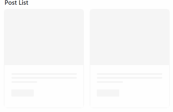
Basic Usage
Just pass the component you want to load as a children to the Skeleton component.
If the children is receiving any props, you should also pass to the Skeleton component a
component prop, which is the function of the children component
and an exampleProps prop, which is an object with the same props that your component receives,
that will be used to determine, for example, the length of the texts.
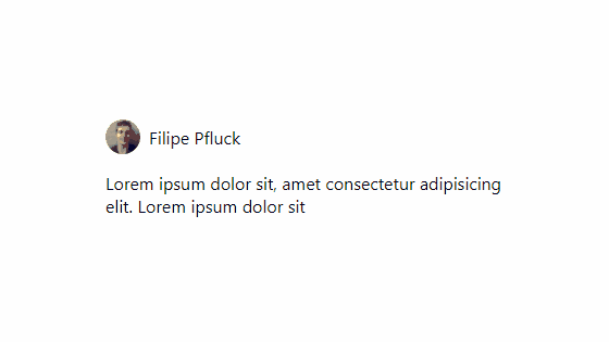
Here is a basic example:
import Skeleton from 'react-shimmer-skeleton'

import {UserCard} from '../Components/UserCard'

//This mimics a delay from the api
const [isLoading, setIsLoading] = useState(true)
useEffect(()=>{
  setTimeout(()=>{
    setIsLoading(false)
  },2000)
},[])

//imagine this data is coming from an api
const user = {
  name: 'Filipe Pfluck',
  avatar: 'https://avatars.githubusercontent.com/u/62773200?v=4',
  description: 'Fullstack developer focused in typescript.'
}

//Now let's create an example user:
const fakeUser = {
  name: 'Joe Doe',
  avatar: 'https://cdn.pixabay.com/photo/2015/10/05/22/37/blank-profile-picture-973460__340.png',
  description: 'Lorem ipsum dolor sit, amet consectetur adipisicing elit.'
}

...

return(
  <Skeleton
    isLoading={isLoading}
    component={UserCard}
    exampleProps={{user: fakeUser}}
  >
    <UserCard user={user}/>
  </Skeleton>
)

Documentation
The skeleton component accepts the following props:
- isLoading: boolean
- exampleProps: any object (should have the same props that your component receives)
- component: a React Component
- defaultStyles: CSSProperties (those will be added to every element considered as content, in other words, the ones that have a background)
- className: string (will be added to the same elements as above)
Considerations
If you want to change the background, it is done through the background-image property. This is the default background:
background-image: linear-gradient(
    -90deg,
    #28262E 0%,
    #605e67 50%,
    #28262E 100%
);
background-size: 400% 400%;
You can change it passing defaultStyles, className, or even styling it other way, such as using styled-components
For now, while the component is loading, the library creates a copy of your component using the function received through the component property and using the exampleProps, but keeping it invisible. When it is not loading anymore, it is substituted with the actual component, that comes trough the children. Keep in mind that if the component you’re loading makes any requests, it will be done twice. Also, it is not recomended to set the isLoading prop to true if you’re refatching the data, because any state of your component will be lost. I know this is a issue, so I’m trying to come up with a better solution. For now, this lib is best suited for interface only components, that receives all the data they need through props.