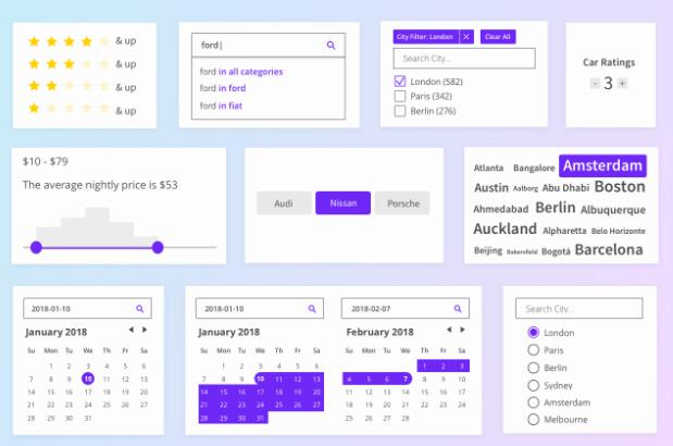
Search UI
Libraries for the fast development of modern, engaging search experiences.
A React library that allows you to quickly implement search experiences without re-inventing the wheel.
Use it with Elastic App Search or Elastic Site Search to have a search experience up and running in minutes.

Getting started ?
Install React Search UI and the App Search connector.
# Install React Search UI and a Connector, like the Elastic App Search Connector
npm install --save @elastic/react-search-ui @elastic/search-ui-app-search-connector
Creating a search experience
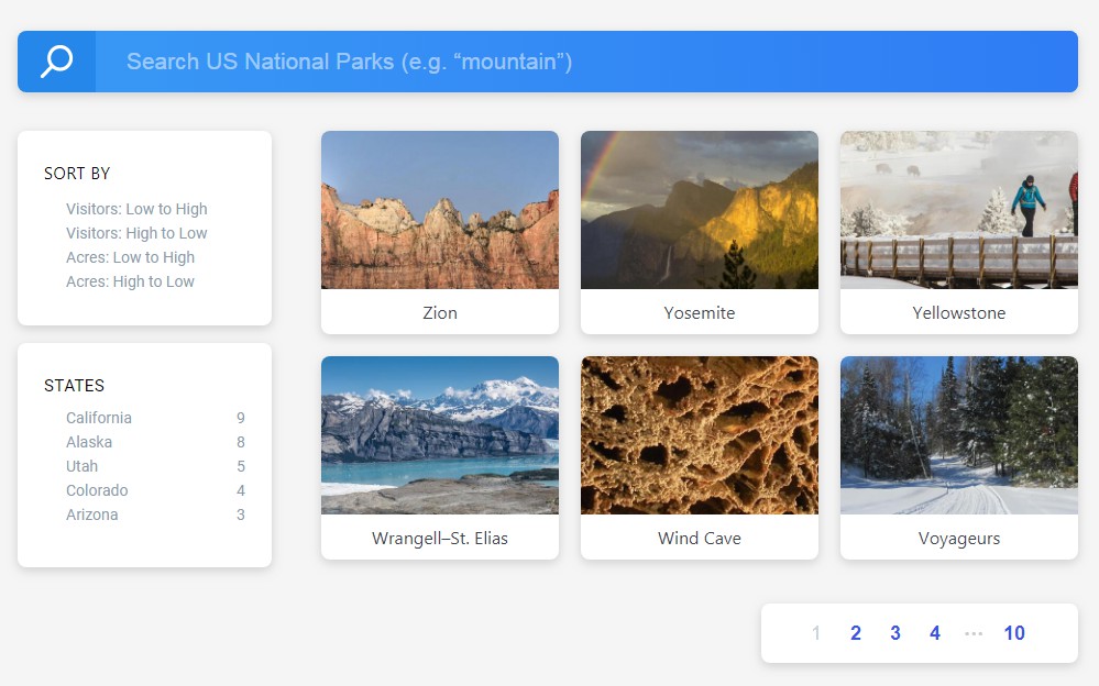
Use out of the box components, styles, and layouts to build a search experience in a matter of minutes.
import React from "react";
import AppSearchAPIConnector from "@elastic/search-ui-app-search-connector";
import { SearchProvider, Results, SearchBox } from "@elastic/react-search-ui";
import { Layout } from "@elastic/react-search-ui-views";

import "@elastic/react-search-ui-views/lib/styles/styles.css";

const connector = new AppSearchAPIConnector({
  searchKey: "search-371auk61r2bwqtdzocdgutmg",
  engineName: "search-ui-examples",
  hostIdentifier: "host-2376rb"
});

export default function App() {
  return (
    <SearchProvider
      config={{
        apiConnector: connector
      }}
    >
      <div className="App">
        <Layout
          header={<SearchBox />}
          bodyContent={<Results titleField="title" urlField="nps_link" />}
        />
      </div>
    </SearchProvider>
  );
}
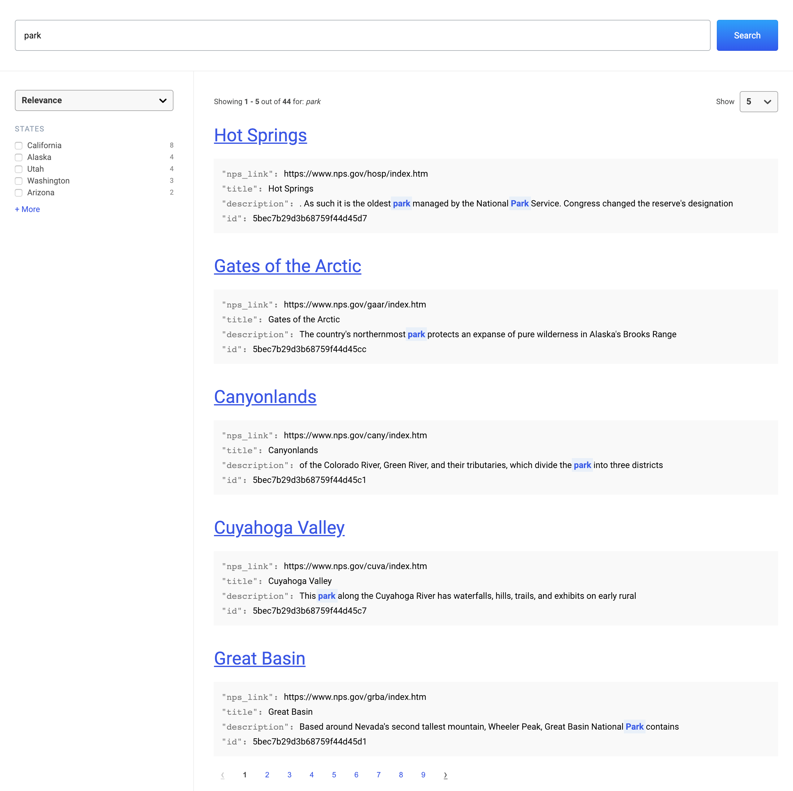
Or go "headless", and take complete control over the look and feel of your search experience.
<SearchProvider config={config}>
  <WithSearch
    mapContextToProps={({ searchTerm, setSearchTerm, results }) => ({
      searchTerm,
      setSearchTerm,
      results
    })}
  >
    {({ searchTerm, setSearchTerm, results }) => {
      return (
        <div>
          <input
            value={searchTerm}
            onChange={e => setSearchTerm(e.target.value)}
          />
          {results.map(r => (
            <div key={r.id.raw}>{r.title.raw}</div>
          ))}
        </div>
      );
    }}
  </WithSearch>
</SearchProvider>
A search experience built with Search UI is composed of the following layers:
Styles and Layout -> Components -> SearchProvider -> Connector -> Search API
1. Search API
A Search API is any API that you use to search data.
We recommend Elastic App Search.
It has Elasticsearch at its core, offering refined search UIs, robust documentation, and accessible dashboard tools.
You can start a 14 day trial of the managed service or host the self managed package for free.
Once your data is indexed into App Search or a similar service, you're good to go.
2. Connectors
A connector is a module that tell Search UI how to connect and communicate with your Search API.
It generates Search API calls for you so that Search UI will "just work", right out of the box.
const connector = new AppSearchAPIConnector({
  searchKey: "search-371auk61r2bwqtdzocdgutmg",
  engineName: "search-ui-examples",
  hostIdentifier: "host-2376rb"
});
3. SearchProvider
SearchProvider is the top level component in your Search UI implementation.
It is where you configure your search experience and it ties all of your components together, so that they work as a cohesive application.
<SearchProvider
  config={{
    apiConnector: connector
  }}
>
  <div className="App">{/* Place Components here! */}</div>
</SearchProvider>
While components can be handy, a search experience can have requirements that don't quite fit what components provide "out of the box". Use WithSearch to access "actions" and "state" in a Render Prop, giving you maximum flexibility over the experience.
<SearchProvider
  config={{
    apiConnector: connector
  }}
>
  <WithSearch
    mapContextToProps={({ searchTerm, setSearchTerm }) => ({
      searchTerm,
      setSearchTerm
    })}
  >
    {({ searchTerm, setSearchTerm }) => (
      <div className="App">{/* Work directly with state and actions! */}</div>
    )}
  </WithSearch>
</SearchProvider>
4. Components
Components are the building blocks from which you craft your search experience.
Each Component - like SearchBox and Results - is a child of the SearchProvider object:
<SearchProvider
  config={{
    apiConnector: connector
  }}
>
  <div className="App">
    <div className="Header">
      <SearchBox />
    </div>
    <div className="Body">
      <Results titleField="title" urlField="nps_link" />
    </div>
  </div>
</SearchProvider>
The following Components are available:
- SearchBox
- Results
- Result
- ResultsPerPage
- Facet
- Sorting
- Paging
- PagingInfo
- ErrorBoundary
5. Styles and Layout
For basic styles, include:
import "@elastic/react-search-ui-views/lib/styles/styles.css";
For a basic layout, which helps quickly get a UI bootstrapped, use the Layout Component.
import { Layout } from "@elastic/react-search-ui-views";

<Layout header={<SearchBox />} bodyContent={<Results />} />;