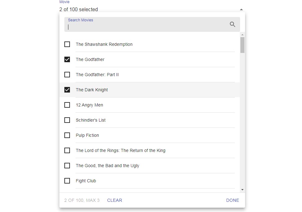
MultiSelect
A component to select multiple items from a list of options using the Material-UI Autocomplete component.
Quick start
To use, you must provide at least the value, onChange, and options props.
You should also provide a label and labelPlural prop. By default, the
component is in multi-select mode and values are strings.
<MultiSelect
  value={value} // From useState
  onChange={setValue} // From useState
  options={['The Shawshank Redemption', 'The Godfather', ...]}
  label="Movie"
  labelPlural="Movies"
/>
options prop
The simplest value for the options prop is an array of strings.
If you need more control over the value returned by MultiSelect, pass an array
of Option objects, which must follow this type:
type Option<T = string> = {
  value: T;
  label: string;
  disabled?: boolean;
};
value and onChange prop types depend on the multiple prop
value must be an array of T in multi-select mode.
In single-select mode, it must be either T itself or null.
The first parameter of onChange follows the same type as value.