react stepzilla
is a multi-step, wizard component for sequential data collection. It basically lets you throw a bunch of react components at it (data forms, text / html components etc) and it will take the user through those components in steps. If it's a data-entry form it can trigger validation and only proceed if the data is valid.
:tada: whats new:
v4.7.2: optimised react, react-dom dependency loading (peerDependencies)
v4.5.0: ported to react and react-dom 15.5.4
v4.3.0: now supporting higer order component based validation via react-validation-mixin!
v4.2.0: now supporting pure, dumb components!
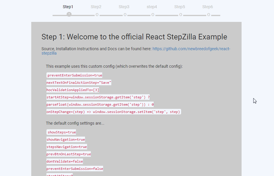
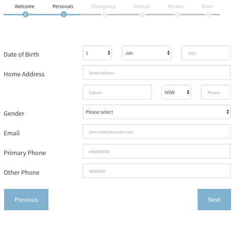
what does it do?
something like this of course:
better yet, have a look at a live example
:metal::metal::metal::metal::metal::metal::metal:
Full example usage code is available in the src/examples directory. Have a look at a live working version here
get started
- run
npm install --save react-stepzilla
- require into your project via
var StepZilla = require('react-stepzilla')
- define the list of all the components* you want to step through. The
nameindicates the title of the UI step and component is what loads.
const steps =
    [
      {name: 'Step 1', component: <Step1 />},
      {name: 'Step 2', component: <Step2 />},
      {name: 'Step 3', component: <Step3 />},
      {name: 'Step 4', component: <Step4 />},
      {name: 'Step 5', component: <Step5 />}
    ]
as of v4.2.0 you can also use Pure Components but they wont support validation, see Step2.js in the examples directory for more info.
- and now render it out somewhere in your app
    <div className='step-progress'>
        <StepZilla steps={steps}/>
    </div>
- pass in following options as well if you want to customise it further
// hide or show Next and Previous Buttons at the bottom
showNavigation: true | false

// disable or enable the steps UI navigation on top
showSteps: true | false

// disable or enable onClick step jumping from the UI navigation on top
stepsNavigation: true | false

// show or hide the previous button in the last step (maybe the last step is a thank you message and you don't want them to go back)
prevBtnOnLastStep: true | false

// dev control to disable validation rules called in step components **
dontValidate: true | false

// by default if you hit the Enter key on any element it validates the form and moves to next step if validation passes. Use this to prevent this behaviour
preventEnterSubmission: true | false

// specify what step to start from in the case you need to skip steps (send in a 0 based index for the item in the steps array. e.g. 2 will load <Step3 /> initially)
startAtStep: [stepIndex]

// specify the next button text (if not given it defaults to "Next")
nextButtonText: "Siguiente"

// specify the back button text (if not given it default to "Previous")
backButtonText: "Espalda"

// specify the next button class (if not given it defaults to "btn btn-prev btn-primary btn-lg" which depends on bootstrap)
nextButtonCls: "btn btn-prev btn-primary btn-lg pull-right"

// specify the back button text (if not given it default to "btn btn-next btn-primary btn-lg")
backButtonCls: "btn btn-next btn-primary btn-lg pull-left"

// specify what the next button text should be in the step before the last (This is usually the last "Actionable" step. You can use this option to change the Next button to say Save - if you save the form data collected in previous steps)
nextTextOnFinalActionStep: "Save"

// its recommended that you use basic javascript validation (i.e simple validation implemented inside your step component. But stepzilla steps can also use 'react-validation-mixin' which wraps your steps as higher order components. If you use this then you need to specify those steps indexes that use 'react-validation-mixin' below in this array)
hocValidationAppliedTo: [1, 2]

// function, which is called every time the index of the current step changes (it uses a zero based index)
onStepChange: (step) => console.log(step)
example options usage:
<div className='step-progress'>
    <StepZilla steps={steps} stepsNavigation={false} prevBtnOnLastStep={false} startAtStep=2 />
</div>
-
if one of your components is a form that requires validation before moving to the next component, then that component needs to implement a
isValidated()public method which validates the form and returns true/false if the data is valid. For an e.g. on this have a look at thesrc/examples/Step3component. -
validation can also be Async and therefore Promise based. This is useful if you do server side validation or you want to save data to a server and only proceed if it was a success. For an e.g. on this have a look at the
src/examples/Step5component. -
also if you want some default style, copy the source from
src/css/main.csscode into your project (the above look in the picture also requires bootstrap) -
check out
src/examples/for howonStepChangecan be used to persist last known step state across browser reloads (usingstartAtSteppulled from session storage)
jumpToStep() utility
- stepzilla injects an utility method called
jumpToStepas a prop into all your react step components - this utility methods lets you jump between steps from inside your react component
e.g.
this.props.jumpToStep(2)will jump to your 3rd step (it uses a zero based index) - check out
src/examples/Step2for an actual usage example - important!! this jumpToStep() utility method will not validate data! so use with caution. its only meant to be a utility to break from the standard flow of steps
step validation
- your individual react steps can implement some checks to prevent moving onto the next step, this is called "validation" in stepzilla.
- to use this feature, you need to implement a public
isValidated()method in your react step component. - this
isValidated()method can return a statictrue/false(true to proceed and false to prevent). It can also return aPromisewhich in turn shouldresolveorreject(which maps to the statictrue/falsebehaviour) - stepzilla also supports advanced form validation via
react-validation-mixin - check out sample code in the
src/examplesdirectory. (Step3.js and Step4.js show you all this in action)
dev
- all node source is in src/main.js
- you need to install dependencies first
npm install - make any changes and run
npm run buildto transpile the jsx intodist - the transpilation is run as an auto pre-publish task so it should usually be up to date when consumed via npm
npm run build-examplebuilds and packs the example app into the 'docs' folder so it can be accessed via ghpages
run and view example in browser
A full example is found in the src/examples directory.
- run
npm install - then run
npm run example - then go to
http://localhost:8080/webpack-dev-server/src/examples/index.htmlin your browser - hot reload will work as you dev
tests
- tests are written in the mocha, chai, sinon, enzyme stack
- located in the 'tests' folder and supports es6
- run the
npm run testcommand run tests - run the
npm run test:watchcommand run test in watch mode
code test coverage
- test coverage is done via istanbul
- run the
npm run test:coveragecommand to generate full coverage report (shown in terminal and as lcov report in coverage directory) - all code is run against coverage, not just the unit tested modules
- test coverage improvement is currently a work in progress
Current coverage sitting at v4.7.2:
Statements   : 87.43% ( 160/183 ), 11 ignored
Branches     : 76.07% ( 124/163 ), 23 ignored
Functions    : 84.78% ( 39/46 ), 3 ignored
Lines        : 83.33% ( 105/126 )