React Form Wizard Component
A react form wizard component with validation and progress bar with no external dependencies which simplifies tab wizard management.
Installation
To install the package, you can use npm or yarn:
npm install react-form-wizard-component
or
yarn add react-form-wizard-component
Usage
Import the FormWizard component and use it in your React application:
import FormWizard from "react-form-wizard-component";
import "react-form-wizard-component/dist/style.css";

function App() {
  const handleComplete = () => {
    console.log("Form completed!");
    // Handle form completion logic here
  };
  const tabChanged = ({
    prevIndex,
    nextIndex,
  }: {
    prevIndex: number;
    nextIndex: number;
  }) => {
    console.log("prevIndex", prevIndex);
    console.log("nextIndex", nextIndex);
  };

  return (
    <>
      <FormWizard
        shape="circle"
        color="#e74c3c"
        onComplete={handleComplete}
        onTabChange={tabChanged}
      >
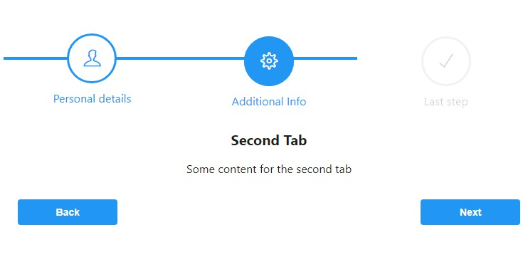
        <FormWizard.TabContent title="Personal details" icon="ti-user">
          {/* Add your form inputs and components for the frst step */}
          <h1>First Tab</h1>
          <p>Some content for the first tab</p>
        </FormWizard.TabContent>
        <FormWizard.TabContent title="Additional Info" icon="ti-settings">
          <h1>Second Tab</h1>
          <p>Some content for the second tab</p>
        </FormWizard.TabContent>
        <FormWizard.TabContent title="Last step" icon="ti-check">
          <h1>Last Tab</h1>
          <p>Some content for the last tab</p>
        </FormWizard.TabContent>
      </FormWizard>
      {/* add style */}
      <style>{`
        @import url("https://cdn.jsdelivr.net/gh/lykmapipo/[email protected]/css/themify-icons.css");
      `}</style>
    </>
  );
}

export default App;
Props
The FormWizard component accepts the following props:
title(optional): The title of the form wizard. It can be a string or a ReactNode.subtitle(optional): The subtitle or description of the form wizard.shape(optional): The shape of the wizard tabs (e.g., "circle", "square").color(optional): The color of the wizard tabs and progress bar.children(required): The content of the form wizard, including the form tabs and their content.nextButtonText(optional): The text for the "Next" button.backButtonText(optional): The text for the "Back" button.finishButtonText(optional): The text for the "Finish" button.stepSize(optional): The size of the steps (e.g., "xs", "sm", "md", "lg").layout(optional): The layout of the form wizard (e.g., "horizontal", "vertical").onComplete(optional): A callback function to be called when the form wizard is completed.onTabChange(optional): A callback function to be called when the active tab is changed.
The FormWizard.TabContent component is used to define each tab's content and accepts the following props:
title(required): The title of the tab.icon(required): The icon for the tab.children(required): The content of the tab.
Refer to the component's source code or documentation for additional props and details.
Examples
You can find examples of using the react-form-wizard-component in the examples directory.
License
This package is licensed under the MIT License.


