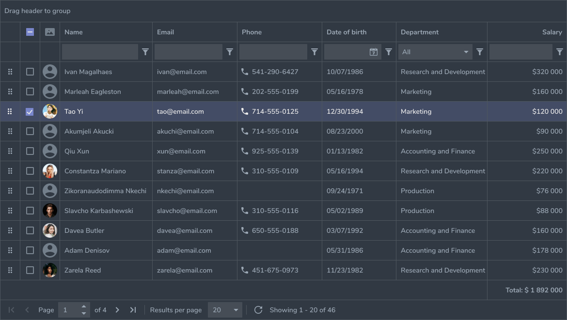
React Collapsing Table
Thanks for taking a look at the react collapsping table. This was inspired by the the jquery datatables library.
Table of Contents
- Features
- Installing
- Props
- Add your Own Components
- Styling
- Contributing
Features
- Expandable Row that makes the table mobile friendly
- Prioritization of when columns are shown or hidden as the table expands and shrinks
- Search built in with highlighting of content
- Creating your own custom react components for each cell
- The ability for your custom component to call a function you made outside of the table
- The ability to create your own custom pagination component and still call the table functions
- The ability to listen for pagination events, like if you need to know if you were on the last page
- Ability to overwrite built in icons for sorting and open/closing a row
Installing
To install simply run
npm install react-collapsing-table
This has currently only been tested with react 16.
To use in your project just import it by doing
import ReactCollapsingTable from 'react-collapsing-table'

const yourComponent({ rows, columns }) => {
    <h1>My Cool Collapsing Table!</h1>
    <ReactCollapsingTable rows={ rows } columns={ columns } />
}
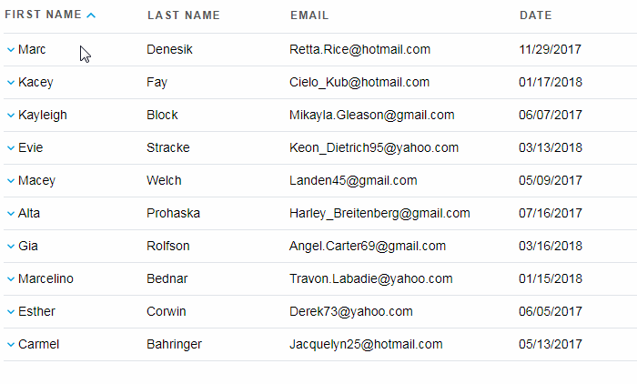
Rows and Columns for the above example may look like
rows = [
  { id: 1, firstName: 'Paul', lastName: 'Darragh', }
]
columns = [
  { accessor: 'firstName', label: 'First Name', priorityLevel: 1, position: 1, minWidth: 150, },
  { accessor: 'lastName', label: 'Last Name', priorityLevel: 2, position: 2, minWidth: 150, },
]
Props
Rows (default: [])
This is a list of objects. You can pass more data in than you use and the table will ignore the extra values passed in.
Columns (default: this is required with the following keys also required on each column object)
This is a list of objects that define what data from each row that you want to show the user and where this row should line up.
Each object in this list has the following required attributes that define how and when a column should be hidden or what to display to the user.
- accessor: This is used to extra the correct value from a row by setting this to the row's key
row: { firstName: 'Paul' }The accessor to get the value Paul would beaccessor: 'firstName'
- label: This is what a user sees at the top of each column
- priorityLevel: This tells the table in which order should the columns be popped off in. The higher the number the sooner it will be popped of.
- position: This tells the table where to put each column, do you want this to be the first column or the fourth?
- minWidth: This tells the table how wide the table can be total and is used to calculate when to pop off columns when the screen width is smaller than the total minWidths of the visible columns
These objects also have several optional attributes that can make the cells displayed under each column do extra work
- CustomComponent: This lets you write your own component and pass it to the table
- You must import this component into the file you define where you columns.
- CustomFunction: This lets you pass a custom function to help enhance the cell.
- You must pass this to the table as a callbacks object with the key as the
accessorand you function as the value.
- You must pass this to the table as a callbacks object with the key as the
- sortType: This allows you to pass an additional sort type
- currently only the allowed option is 'date' and that sorts assuming the date format is
mm/dd/yyyy
- currently only the allowed option is 'date' and that sorts assuming the date format is
- sortable: This allows you to disable the sort function for a column.
true(default): Clicking on the column header will sort by that columnfalse: Clicking on the column header will have no effect
showSearch (default: false)
This is a boolean to tell the table whether or not show the search component
showPagination (default: false)
This is a boolean to tell the table whether or not show the pagination component
rowSize (default: 15)
This is a number that tells the table how many rows it should display on a table.
currentPage (default: 1)
This is used to tell the row what page to display if the results are on a different page on the initial load.
column (default: first column in array)
This is used to tell the table if sorting which column should be displayed as sorted (use accessor of the column as the value)
direction (default: 'ascending')
This is used to tell the table which direction the sorted column is displayed in. The 2 valid options are 'ascending' and 'descending'
callbacks
This is an object that is expecting keys that match the accessors of the columns and will allow each column access to a custom function that is mapped to that key.
id
This is a string that you can use to set an id for the table if you need to
paginationEventListener
This is a function that you can pass to the table and when the next or previous button is clicked it will invoke this function and pass a pagination object back that has the the current page, how many pages there are, and the row size
CustomPagination
This is a function that you can pass to the table when you don't want to use the built in pagination component. You will still need to have showPagination set to true.
This function will receive:
currentPage: What page it is ontotalPages: How many pages are there (or the last page)previousPage: The function to let you go back one page on the tablenextPage: The function to let you go forward a page on the tablegoToPage: A function that lets you go to any page.- Let the user specify the page they want to go to with onChange and it will pick up your value. example
<input onChange={ goToPage } /> - Specify the exact page by giving it a newPage value. example
goToPage({ newPage: 25 })
- Let the user specify the page they want to go to with onChange and it will pick up your value. example
inputtedPage: The value to use forgoToPagefunction if you are allowing a user to input a value. example<input value={ inputtedPage } onChange={ goToPage } />
icons
This is an object that allows you to customize the ascending and decending icons on the columns and the open and close row icons on the rows
This object required you use set the following values: openRow, closeRow, ascending, descending. If you want to overRide openRow you must also do the same with closeRow and same for ascending and descending.
These values that can be set can take a icon file or regular html.
Example:
import ArrowUp from 'react-icons/lib/fa/arrow-up';
import ArrowDown from 'react-icons/lib/fa/arrow-down';

icons: {
        ascending: <svg width="10" height="10"><circle cx="5" cy="5" r="4" stroke="blue" strokeWidth="1" fill="red" /></svg>,
        descending: <svg width="10" height="10"><circle cx="5" cy="5" r="4" stroke="red" strokeWidth="1" fill="blue" /></svg>,
        openRow: ArrowDown,
        closeRow: ArrowUp,
    }
theme
This string is applied as a class name to the container element generated by the ReactCollapsingTable component. You can use this to selectively style different tables, and to remove the default styles applied by this component. See the Styling section for more information.
Add your Own Components
This table allows you to create and display your own components. Each column can have their own component and you can pass custom functions or extra information into it.
To pass a custom component you must pass it in a columns prop with the key being CustomComponent and the value being the imported component
Example from the travel-receipts initial state
import EmailIcon from '../components/EmailIcon';

columns[
    { accessor: 'email', label: 'Email', priorityLevel: 6, position: 3, minWidth: 150, CustomComponent: EmailIcon },
]
If you decide that you want to pass that custom component the ability to do something you can by passing the table a callBack object with the accessor name as the key and the function you defined as the value
Example from the travel-receipts container
import { getEmailIcon } from '../assets/icons/Icon';

clickedImage = ({ imageURL }) => {
    this.props.actions.clickedImage({ imageURL });
}

getEmailLogo = ({ email }) => {
    return getEmailIcon({ email });
}

const tableCallbacks = { photo: this.clickedImage, email: this.getEmailLogo }

<ReactCollapsingTable callbacks={ tableCallbacks } />
Styling
We have given most of the components defined class names to make them easy to add your own styles to. A default stylesheet is bundled with the project.
It uses descendant combinators so it only affects elements which are inside a container with class="react-collapsible-theme" which
is applied by default to the container generated by the component.
You can override that by passing an alternative theme name, which can be an empty string.
<ReactCollapsingTable theme="" />
We tried to make each this table easy to make your own and have added a number of class names and ids to help make it easy to style and giving them each unique names to avoid name collisions.
Table Data Cell (td)
- id:
td-${currentRowIndex}-${currentColumnIndex}- This uses the generated row and column indexes
- class name:
${ accessor }- This uses the column defined attribute as the class name so that you can see all of the attributes that line up to a class name
Table Row (tr)
- id:
tr-normal-${ rowIndex }- This uses the genereated row index to define which row it is on
- class name:
normal-row
Expanded Table Row (tr)
- id:
tr-expanded-${ rowIndex }- This uses the genereated row index to define which row it is on
- class name:
expanded-row
Columns (th)
- id:
column-${accessor}- This uses the data accessor as a unique column name
Table (table)
- class name:
react-collapsible
Search (div)
- class name:
react-collapsible-search
Clear Search (button)
- class name:
react-collapsible-clear
Pagination (div)
- class name:
react-collapsible-page