React CRUD Table
A table that includes all the CRUD operations.
Basic Example
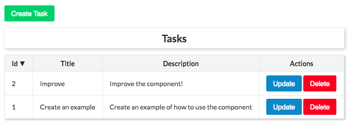
This example shows the basics CRUD (Create, Read, Update, and Delete) and sorting operations.
$ npm install react-crud-table --save
import React from 'react';
import ReactDOM from 'react-dom';
import CRUDTable,
{
  Fields,
  Field,
  CreateForm,
  UpdateForm,
  DeleteForm,
} from 'react-crud-table';

// Component's Base CSS
import './index.css';

const DescriptionRenderer = ({ field }) => <textarea {...field} />;

let tasks = [
  {
    id: 1,
    title: 'Create an example',
    description: 'Create an example of how to use the component',
  },
  {
    id: 2,
    title: 'Improve',
    description: 'Improve the component!',
  },
];

const SORTERS = {
  NUMBER_ASCENDING: mapper => (a, b) => mapper(a) - mapper(b),
  NUMBER_DESCENDING: mapper => (a, b) => mapper(b) - mapper(a),
  STRING_ASCENDING: mapper => (a, b) => mapper(a).localeCompare(mapper(b)),
  STRING_DESCENDING: mapper => (a, b) => mapper(b).localeCompare(mapper(a)),
};

const getSorter = (data) => {
  const mapper = x => x[data.field];
  let sorter = SORTERS.STRING_ASCENDING(mapper);

  if (data.field === 'id') {
    sorter = data.direction === 'ascending' ?
      SORTERS.NUMBER_ASCENDING(mapper) : SORTERS.NUMBER_DESCENDING(mapper);
  } else {
    sorter = data.direction === 'ascending' ?
      SORTERS.STRING_ASCENDING(mapper) : SORTERS.STRING_DESCENDING(mapper);
  }

  return sorter;
};


let count = tasks.length;
const service = {
  fetchItems: (payload) => {
    let result = Array.from(tasks);
    result = result.sort(getSorter(payload.sort));
    return Promise.resolve(result);
  },
  create: (task) => {
    count += 1;
    tasks.push({
      ...task,
      id: count,
    });
    return Promise.resolve(task);
  },
  update: (data) => {
    const task = tasks.find(t => t.id === data.id);
    task.title = data.title;
    task.description = data.description;
    return Promise.resolve(task);
  },
  delete: (data) => {
    const task = tasks.find(t => t.id === data.id);
    tasks = tasks.filter(t => t.id !== task.id);
    return Promise.resolve(task);
  },
};

const styles = {
  container: { margin: 'auto', width: 'fit-content' },
};

const Example = () => (
  <div style={styles.container}>
    <CRUDTable
      caption="Tasks"
      fetchItems={payload => service.fetchItems(payload)}
    >
      <Fields>
        <Field
          name="id"
          label="Id"
          hideInCreateForm
          readOnly
        />
        <Field
          name="title"
          label="Title"
          placeholder="Title"
        />
        <Field
          name="description"
          label="Description"
          render={DescriptionRenderer}
        />
      </Fields>
      <CreateForm
        title="Task Creation"
        message="Create a new task!"
        trigger="Create Task"
        onSubmit={task => service.create(task)}
        submitText="Create"
        validate={(values) => {
          const errors = {};
          if (!values.title) {
            errors.title = 'Please, provide task\'s title';
          }

          if (!values.description) {
            errors.description = 'Please, provide task\'s description';
          }

          return errors;
        }}
      />

      <UpdateForm
        title="Task Update Process"
        message="Update task"
        trigger="Update"
        onSubmit={task => service.update(task)}
        submitText="Update"
        validate={(values) => {
          const errors = {};

          if (!values.id) {
            errors.id = 'Please, provide id';
          }

          if (!values.title) {
            errors.title = 'Please, provide task\'s title';
          }

          if (!values.description) {
            errors.description = 'Please, provide task\'s description';
          }

          return errors;
        }}
      />

      <DeleteForm
        title="Task Delete Process"
        message="Are you sure you want to delete the task?"
        trigger="Delete"
        onSubmit={task => service.delete(task)}
        submitText="Delete"
        validate={(values) => {
          const errors = {};
          if (!values.id) {
            errors.id = 'Please, provide id';
          }
          return errors;
        }}
      />
    </CRUDTable>
  </div>
);

Example.propTypes = {};

ReactDOM.render(
  <Example />,
  document.getElementById('root')
);
Pagination Example
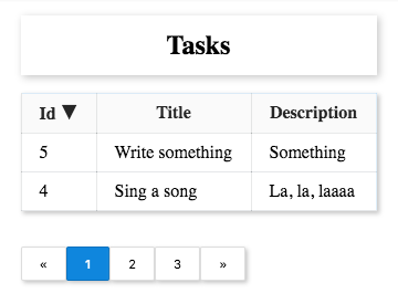
This simple example illustrates how to use the pagination component.
In Code Sandbox
  import React from "react";
import ReactDOM from "react-dom";
import CRUDTable, { Fields, Field, Pagination } from "react-crud-table";
// Component's Base CSS
import "./index.css";

const styles = {
  container: { margin: "auto", width: "fit-content" }
};

let tasks = [
  {
    id: 1,
    title: "Create an example",
    description: "Create an example of how to use the component"
  },
  {
    id: 2,
    title: "Improve",
    description: "Improve the component!"
  },
  {
    id: 3,
    title: "Create a pagination example",
    description: "Yeah!! It will be created."
  },
  {
    id: 4,
    title: "Sing a song",
    description: "La, la, laaaa"
  },
  {
    id: 5,
    title: "Write something",
    description: "Something"
  }
];

const SORTERS = {
  NUMBER_ASCENDING: mapper => (a, b) => mapper(a) - mapper(b),
  NUMBER_DESCENDING: mapper => (a, b) => mapper(b) - mapper(a),
  STRING_ASCENDING: mapper => (a, b) => mapper(a).localeCompare(mapper(b)),
  STRING_DESCENDING: mapper => (a, b) => mapper(b).localeCompare(mapper(a))
};

const getSorter = data => {
  const mapper = x => x[data.field];
  let sorter = SORTERS.STRING_ASCENDING(mapper);

  if (data.field === "id") {
    sorter =
      data.direction === "ascending"
        ? SORTERS.NUMBER_ASCENDING(mapper)
        : SORTERS.NUMBER_DESCENDING(mapper);
  } else {
    sorter =
      data.direction === "ascending"
        ? SORTERS.STRING_ASCENDING(mapper)
        : SORTERS.STRING_DESCENDING(mapper);
  }

  return sorter;
};

let count = tasks.length;
const service = {
  fetchItems: payload => {
    const { activePage, itemsPerPage } = payload.pagination;
    const start = (activePage - 1) * itemsPerPage;
    const end = start + itemsPerPage;
    let result = Array.from(tasks);
    result = result.sort(getSorter(payload.sort));
    return Promise.resolve(result.slice(start, end));
  },
  fetchTotal: payload => {
    return Promise.resolve(tasks.length);
  }
};

export default service;

const Example = () => (
  <div style={styles.container}>
    <CRUDTable
      caption="Tasks"
      fetchItems={payload => service.fetchItems(payload)}
    >
      <Fields>
        <Field name="id" label="Id" hideInCreateForm readOnly />
        <Field name="title" label="Title" placeholder="Title" />
        <Field name="description" label="Description" />
      </Fields>
      <Pagination
        itemsPerPage={2}
        fetchTotalOfItems={payload => service.fetchTotal(payload)}
      />
    </CRUDTable>
  </div>
);

Example.propTypes = {};

ReactDOM.render(<Example />, document.getElementById("root"));
Components Properties
CRUDTable Component
The CRUDTable Component is the parent component. All the others component should be children of it.
caption: string
Items table caption
actionsLabel: string
To specify the text of the header of the column that contains the update/delete actions.
fetchItems: function
A function that returns the read items asynchronously. This should return a promise.
items: array
Items to be shown in the table. Alternative to the fetchItems property.
showQueryBuilder: bool
To indicate that the query/search builder component should be shown.
The QueryBuilder component is used to perform search and filtering based on matching rules.
onChange: func
A callback to be called everytime either the pagination, the sorting or the search parameters change.
This function is called with an object like following being passed:
{
  sort: {
    field: 'foo',
    direction: 'descending',
  },
  queryRules: [
    {
      field: 'bar',
      condition: 'CONTAINS',
      value: 'test',
    },
    {
      field: 'name',
      condition: 'ENDS_WITH',
      value: 'ry',
    },
  ],
  pagination: {
    itemsPerPage: 5,
    totalOfItems: 52,
    activePage: 3,
  },
}
Fields Component
A child of the CRUDTable Component. This Component should contain the individual fields definition.
Its children are Field components.
Field Component
A child of the Fields Component. This Component is the individual definition of the fields.
name: string
The name of the field (required).
label: node
The label of the field(required)
type: string
The type of the field. This can be (text, number, date, etc). It is useful when you want to make it queryable and/or sortable.
tableValueResolver: any
It is the mapper of the field value in the table. It can be a string representing a query to the object (For example company.name) or an function that takes the item as an argument and returns a value.
hideInCreateForm: bool
To hide this field in the Create Form.
hideInUpdateForm: bool
To hide this field in the Update Form.
hideFromTable: bool
To hide the field from the table.
queryable: bool
To indicate this field is queryable. Default is true
sortable: bool
To indicate this field is sortable. Default is true.
readOnly: bool
To indicate this field is read only. Default is false.
CreateForm, UpdateForm, and DeleteForm Components
These components are used to configure the forms to create, update and delete the items. Not including one of this forms means that you dont want support for the corresponding operation of the form and therefore will be hidden.
title: node
The title of the form.
message: node
A message to be shown below the title.
trigger: node
Title of the button that triggers the form to appear.
onSubmit: function
A function that is called when the form is submitting. This functions receives the item data and should return a promise.
submitText: node
Title of the form submission button.
validate: function
Validation function. Receives the values of the fields in the form and should return an object whose keys are the field names and the value is an error message.
Pagination Component
The Pagination Component is used to configure the pagination of the table.
defaultActivePage: number
This is the initial active page. The default value is 1.
totalOfItems: number
The total number of items. This is used to calculate the number of pages links to show.
itemsPerPage: number
This is to control how many items are to be shown per page. The number of pages is calculated by dividing the totalOfItems by the itemsPerPage.
onChange: function
A function to be called everytime the current page changes. This returns an object that has the following properties: activePage, totalOfItems, and itemsPerPage.
fetchTotalOfItems: function
Loads the total number of items in asynchronous way. This function should return a function that resolves in a number which is the total of items.

