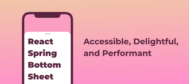
react-spring-bottom-sheet
react-spring-bottom-sheet is built on top of react-spring and react-use-gesture. It busts the myth that accessibility and supporting keyboard navigation and screen readers are allegedly at odds with delightful, beautiful and highly animated UIs. Every animation and transition is implemented using CSS custom properties instead of manipulating them directly, allowing complete control over the experience from CSS alone.
Install
npm i react-spring-bottom-sheet
Basic
MVP example, showing what you get by implementing open, onDismiss and a single snap point always set to minHeight.
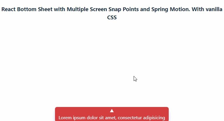
Snap points & overflow
A more elaborate example that showcases how snap points work. It also shows how it behaves if you want it to be open by default, and not closable. Notice how it responds if you resize the window, or scroll to the bottom and starts adjusting the height of the sheet without scrolling back up first.
Sticky header & footer
If you provide either a header or footer prop you'll enable the special behavior seen in this example. And they're not just sticky positioned, both areas support touch gestures.
Non-blocking overlay mode
In most cases you use a bottom sheet the same way you do with a dialog: you want it to overlay the page and block out distractions. But there are times when you want a bottom sheet but without it taking all the attention and overlaying the entire page. Providing blocking={false} helps this use case. By doing so you disable a couple of behaviors that are there for accessibility (focus-locking and more) that prevents a screen reader or a keyboard user from accidentally leaving the bottom sheet.
Get started
API
props
All props you provide, like className, style props or whatever else are spread onto the underlying <animated.div> instance, that you can style in your custom CSS using this selector: [data-rsbs-root].
Just note that the component is mounted in a @reach/portal at the bottom of <body>, and not in the DOM hierarchy you render it in.
open
Type: boolean
The only required prop. And it's controlled, so if you don't set this to false then it's not possible to close the bottom sheet.
onDismiss
Type: () => void
Called when the user do something that signal they want to dismiss the sheet:
- hit the
esckey. - tap on the backdrop.
- swipes the sheet to the bottom of the viewport.
snapPoints
Type: (state) => number | number[]
This function should be pure as it's called often. You can choose to provide a single value or an array of values to customize the behavior. The state contains these values:
headerHeight– the current measured height of theheader.footerHeight– if afooterprop is provided then this is its height.height– the current height of the sheet.minHeight– the minimum height needed to avoid a scrollbar. If there's not enough height available to avoid it then this will be the same asmaxHeight.maxHeight– the maximum available height on the page, usually matcheswindow.innerHeight/100vh.
defaultSnap
Type: number | (state) => number
Provide either a number, or a callback returning a number for the default position of the sheet when it opens.
state use the same arguments as snapPoints, plus two more values: snapPoints and lastSnap.
header
Type: ReactNode
Supports the same value type as the children prop.
footer
Type: ReactNode
Supports the same value type as the children prop.
initialFocusRef
Type: React.Ref
A react ref to the element you want to get keyboard focus when opening. If not provided it's automatically selecting the first interactive element it finds.
blocking
Type: boolean
Enabled by default. Enables focus trapping of keyboard navigation, so you can't accidentally tab out of the bottom sheet and into the background. Also sets aria-hidden on the rest of the page to prevent Screen Readers from escaping as well.
ref
Methods available when setting a ref on the sheet:
export default function Example() {
  const sheetRef = React.useRef()
  return <BottomSheet open ref={sheetRef} />
}
snapTo
Type: (numberOrCallback: number | (state => number)) => void
Same signature as the defaultSnap prop, calling it will animate the sheet to the new snap point you return. You can either call it with a number, which is the height in px (it'll select the closest snap point that matches your value): ref.current.snapTo(200). Or ref.current.snapTo(({headerHeight, footerHeight, height, minHeight, maxHeight, snapPoints, lastSnap}) => Math.max(...snapPoints)).