LVD-FluentUi-PasswordRecoveryBox
A ReactJS password recovery box built using the FluentUI library, comprised of two steps:
- password identification step - user provides some sort of identification to kick of the process;
- password change step - user enters a new password, after a password recovery link has been sent to the user's e-mail address.
For the password change step, the LVD-FluentUi-PasswordChangeBox is used, to which all its documented props are forwarded.
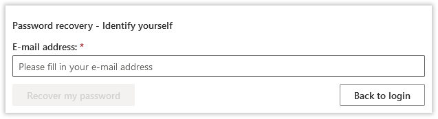
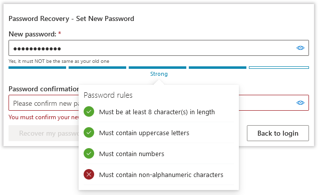
Here's a set screenshots of how it all looks like using the default styling:
Installation
npm install --save lvd-fluentui-passwordrecoverybox
Demo
The demo directory contains a compiled and ready-to-run example. Just open up the index.html file.
- For step 1, use
[email protected]to advance to next step. Any other value will display an error message. - On the second step, enter any password you like.
Basic Usage
Handling the first step of the password recovery process:
import React from 'react';
import { PasswordRecoveryBox, PasswordRecoverySteps } from 'lvd-fluentui-passwordrecoverybox';

class PasswordRecoveryBoxStep1SamplePage extends React.Component {
	constructor(props) {
		super(props);

		this._handlePasswordRecoveryInitiationValuesChanged =
			this._handlePasswordRecoveryInitiationValuesChanged.bind(this);
		this._handlePasswordRecoveryInitiationRequested =
			this._handlePasswordRecoveryInitiationRequested.bind(this);
	}

	_handlePasswordRecoveryInitiationValuesChanged(oldValues, newValues) {
		//do something, if desired
	}

	_handlePasswordRecoveryInitiationRequested(newValues) {
		//lookup identification, send recovery link if valid
	}

	render() {
		return (
			<PasswordRecoveryBox
				step={PasswordRecoverySteps.CollectUserIdentifier}
				messageProps={/* use this to display a message after processing */}
				onPasswordRecoveryInitiationValuesChanged={this._handlePasswordRecoveryInitiationValuesChanged}
				onPasswordRecoveryInitiationRequested={this._handlePasswordRecoveryInitiationRequested}
			/>
		);
	}
}
Handling the second step of the password recovery process:
import React from 'react';
import { PasswordRecoveryBox, PasswordRecoverySteps } from 'lvd-fluentui-passwordrecoverybox';

class PasswordRecoveryBoxStep2SamplePage extends React.Component {
	constructor(props) {
		super(props);

		this._handlePasswordChangeValuesChanged =
			this._handlePasswordChangeValuesChanged.bind(this);
		this._handlePasswordChangeRequested =
			this._handlePasswordChangeRequested.bind(this);
	}

	_handlePasswordChangeValuesChanged(oldValues, newValues) {
		//do something, if desired
	}

	_handlePasswordChangeRequested(values) {
		//validate and change new password
	}

	render() {
		return (
			<PasswordRecoveryBox
				step={PasswordRecoverySteps.EnterNewPassword}
				messageProps={/* use this to display a message after processing */}
				onPasswordChangeValuesChanged={this._handlePasswordChangeValuesChanged}
				onPasswordChangeRequested={this._handlePasswordChangeRequested}
			/>
		);
	}
}
You can find a full working example here.
Styling
You can either directly include the dist/style.css into your html web page or use the @import directive inside your stylesheet if building using webpack:
@import '~lvd-fluentui-passwordrecoverybox/dist/style.css';
Also see the component itself.
Building
To build the demo application:
npm run build-app
To build the library:
npm run build-dist
To build both in one sitting:
npm run build
Forwarded APIs
For convenience, the following API artefacts are forwarded from the underlying password change box component (which itself, forwards them from the underyling password box component):
-
PasswordCallbackRule, -
PasswordRegexRule, -
PasswordEvaluator, -
PasswordLengthRule, -
PasswordStrengthIndicator, -
StrengthIndicatorStyles, -
PasswordStrengthLevels, -
getAllAvailableLevels, -
getAvailableLevelCount.
Customization Options
| What | Prop Name | Type | Notes |
|---|---|---|---|
| Disable component | disabled |
boolean |
Cascades to all fields and buttons. Defaults to false. |
| Configure whether to use framed container layout or not | framed |
boolean |
If true, it will display the default shadow-box frame. Defaults to true. |
| Configure whether to use built-in fixed-width container layout or not | fixed |
boolean |
If true, it will set the container width to the default width of 600px. Defaults to true. |
| Configure whether to center the container or not | centered |
boolean |
If true, it will attempt to center the container. Defaults to true. |
| Set additional master container css class name | className |
string |
Defaults to null. |
| Set additional master inline css style properties | style |
object |
Key-value plain javascript object. Defaults to {}. |
| Make component readonly | readOnly |
boolean |
Cascades to all fields. Defaults to false. Can be overridden at step level. |
| Display fields in underlined style. | underlined |
boolean |
Defaults to false. Can be overridden at step level. |
| Message | messageProps |
Message Object |
See below. By default no message is shown. |
| Current step | step |
PasswordRecoverySteps |
What is the currently active step. Defaults to PasswordRecoverySteps.CollectUserIdentifier, which is the first step. See below for available values. |
| Customize the first step | step1Props |
User Identification Customization Object |
See below. |
| Customize the second step | step2Props |
Password Change Box Customization Object |
All the properties supported by the underlying password change box, with the exception of framed, centered and fixed, which are set to false. See here for default values provided by this component. |
| Customize the back button | backActionButtonProps |
Back Button Customization Object |
Can be used to customize the back button for both steps. Can be overridden at step level. See below. |
Message Object
A plain javascript object with the following properties:
| Name | Type | Notes |
|---|---|---|
message |
string |
The actual message to be displayed. Defaults to null if not specified. |
type |
PasswordRecoveryBoxMessageType |
Type of message - used for formatting (error, warning etc.). Defaults to null if not specified. See here for all supported values. |
Example:
<PasswordRecoveryBox
	...
	messageProps={{
		message: "The existing password you entered was invalid",
		type: PasswordRecoveryBoxMessageType.error
	}}
	...
/>
Steps
The following steps are available.
| Name | Usage | Notes |
|---|---|---|
| Collect user identification data | PasswordRecoverySteps.CollectUserIdentifier |
First step |
| Collect new user password information data | PasswordRecoverySteps.EnterNewPassword |
Second step |
Example:
<PasswordRecoveryBox
	...
	step={PasswordRecoverySteps.EnterNewPassword}
	...
/>
User Identification Customization Object
A plain javascript object with the following properties:
| Name | Type | Notes |
|---|---|---|
className |
string |
Set additional container class name. Defaults to null. |
style |
object |
Set additional container inline css style properties. Key-value plain javascript object. Defaults to {}. |
userIdentifierProps |
User Identifier Customization Object |
Configure user identifier field. See below. |
titleProps |
Title Customization Object |
Configure title. See below. Title defaults to Password recovery - Identify yourself. |
passwordRecoveryInitiationButtonProps |
Password Recovery Initiation Button Configuration Object |
Configure the password recovery initiation button. See below. |
backActionButtonProps |
Back Button Customization Object |
Configure the back button. See below. |
Example:
<PasswordRecoveryBox
	...
	step1Props={{
		className: 'x-class-step1',
		userIdentifierProps: {
			label: 'We need your e-mail',
			description: 'You will receive a password recovery link and further instructions to this e-mail, if valid.'
		}
	}}
	...
/>
User Identifier Customization Object
A plain javascript object with the following properties:
| Name | Type | Notes |
|---|---|---|
label |
string |
Field label. Defaults to E-mail address:. |
placeholder |
string |
Field placeholder. Defaults to Please fill in your e-mail address. |
description |
string |
Field descriptive text, displayed below the field. Defaults to empty string. |
emptyErrorMessage |
string |
Error message displayed when the field is left empty. Defaults to You must fill in your e-mail address. |
Title Customization Object
A plain javascript object with the following properties:
| Name | Type | Notes |
|---|---|---|
show |
boolean |
Defaults to true if not specified. |
text |
string |
Defaults depending on the current step if not specified or empty. |
Password Recovery Initiation Button Configuration Object
A plain javascript object with the following properties:
| Name | Type | Notes |
|---|---|---|
label |
string |
Defaults to Recover my password. |
Back Button Customization Object
A plain javascript object with the following properties:
| Name | Type | Notes |
|---|---|---|
label |
string |
Defaults to Back to log-in for both steps. |
show |
boolean |
Whether to show the button or not. Defaults to true. |
position |
BackButtonPositions |
Defaults to BackButtonPositions.left. See here for all supported values. |
Example:
<PasswordRecoveryBox
	...
	backActionButtonProps={{
		label: 'Back to log-in',
		show: true,
		//align back button to the far-right of the container
		position: BackButtonPositions.right
	}}
	...
/>
User Identification Values Object
The user identification values are exported as a plain javascript object with the following properties:
| Name | Type | Notes |
|---|---|---|
userIdentifier |
string |
- |
Password Change Values Object
Same as here.
Events
| Event | Prop Name | Arguments | Notes |
|---|---|---|---|
| User identfication values changed - Step 1 | onPasswordRecoveryInitiationValuesChanged |
(oldValues:User Identification Values Object, newValues:User Identification Values Object) |
Triggered whenerver any of fields from Step 1 changes. |
| Password recovery initation requested - Step 1 | onPasswordRecoveryInitiationRequested |
(User Identification Values Object) |
Trigered whenever the Recovery my password button is clicked |
| Navigate back from Step 1 | onBackFromPasswordRecoveryInitiationRequested |
(User Identification Values Object) |
Triggered whenever the Back button is clicked when Step 1 is active. |
| Password change values changed - Step 2 | onPasswordChangeValuesChanged |
(oldValues:Password Change Values Object, newValues:Password Change Values Object) |
Triggered whenever any of the values from Step 2 changes. |
| Password change requested - Step 2 | onPasswordChangeRequested |
(Password Change Values Object) |
Triggered whenever the Change my password button is clicked |
| Navigate back from Step 2 | onBackFromPasswordChangeRequested |
(Password Change Values Object) |
Triggered whenever the Back button is clicked when Step 2 is active. |
| Component initialized | onPasswordRecoveryBoxInitiatlized |
(none) |
Triggered when the component is mounted by React. |
| Component disposed | onPasswordRecoveryBoxDisposed |
(none) |
Triggered when the component is un-mounted by React. |
GitHub
https://github.com/alexboia/LVD-FluentUi-PasswordRecoveryBox