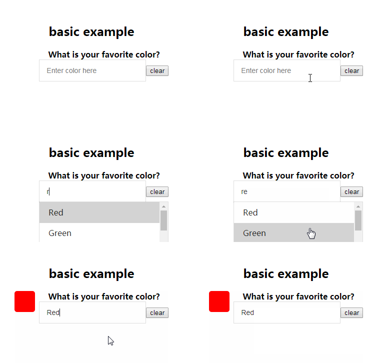
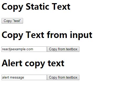
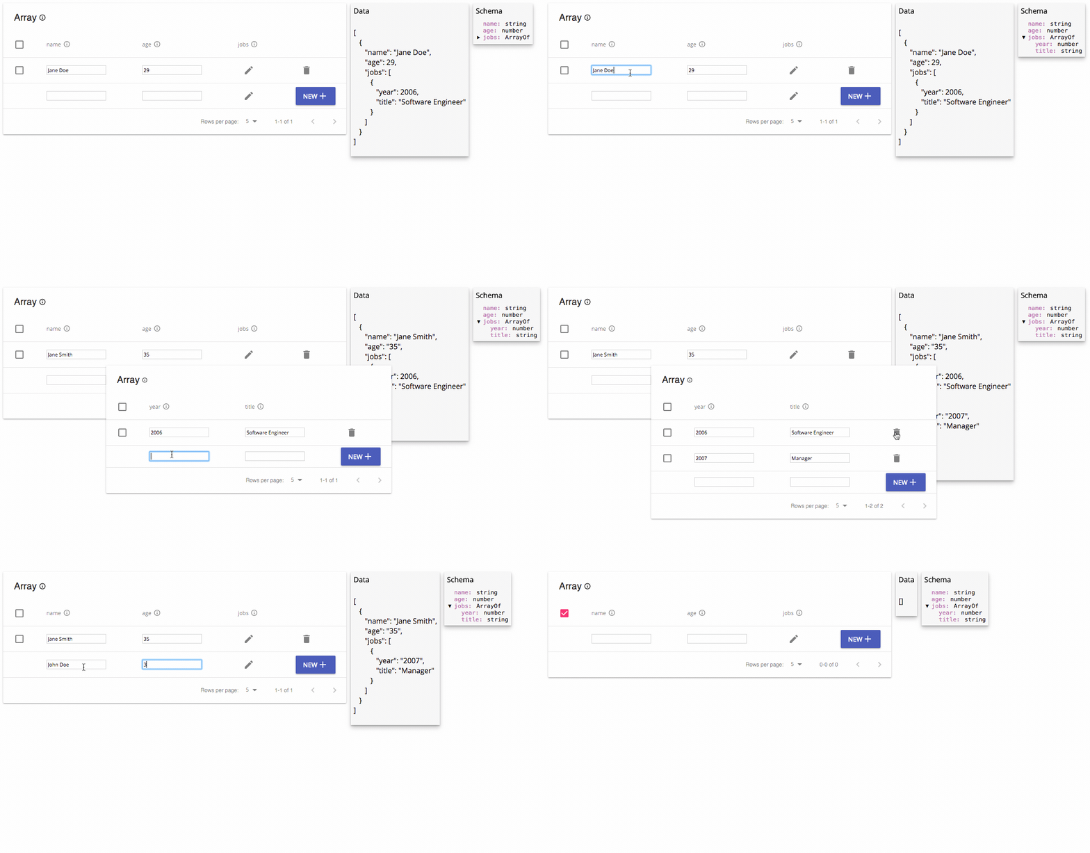
downshift
Primitives to build simple, flexible, WAI-ARIA compliant React autocomplete/dropdown/select/combobox components
The problem
You need an autocomplete/dropdown/select experience in your application and you want it to be accessible. You also want it to be simple and flexible to account for your use cases.
This solution
This is a component that controls user interactions and state for you so you can create autocomplete/dropdown/select/etc. components. It uses a render prop which gives you maximum flexibility with a minimal API because you are responsible for the rendering of everything and you simply apply props to what you're rendering.
This differs from other solutions which render things for their use case and then expose many options to allow for extensibility resulting in a bigger API that is less flexible as well as making the implementation more complicated and harder to contribute to.
Installation
This module is distributed via npm which is bundled with node and should be installed as one of your project's dependencies:
npm install --save downshift
Usage
import Downshift from 'downshift'

function BasicAutocomplete({items, onChange}) {
  return (
    <Downshift
      onChange={onChange}
      render={({
        getInputProps,
        getItemProps,
        isOpen,
        inputValue,
        selectedItem,
        highlightedIndex,
      }) => (
        <div>
          <input {...getInputProps({placeholder: 'Favorite fruit ?'})} />
          {isOpen ? (
            <div style={{border: '1px solid #ccc'}}>
              {items
                .filter(
                  i =>
                    !inputValue ||
                    i.toLowerCase().includes(inputValue.toLowerCase()),
                )
                .map((item, index) => (
                  <div
                    {...getItemProps({item})}
                    key={item}
                    style={{
                      backgroundColor:
                        highlightedIndex === index ? 'gray' : 'white',
                      fontWeight: selectedItem === item ? 'bold' : 'normal',
                    }}
                  >
                    {item}
                  </div>
                ))}
            </div>
          ) : null}
        </div>
      )}
    />
  )
}

function App() {
  return (
    <BasicAutocomplete
      items={['apple', 'orange', 'carrot']}
      onChange={selectedItem => console.log(selectedItem)}
    />
  )
}
downshift is the only component. It doesn't render anything itself, it just
calls the render function and renders that. ["Use a render
prop!"][use-a-render-prop]! <Downshift render={/* your JSX here! */} />.
Props
defaultSelectedItem
any| defaults tonull
Pass an item or an array of items that should be selected by default.
defaultHighlightedIndex
number/null| defaults tonull
This is the initial index to highlight when the menu first opens.
defaultInputValue
string| defaults to''
This is the initial input value.
defaultIsOpen
boolean| defaults tofalse
This is the initial isOpen value.
itemToString
function(item: any)| defaults to:i => (i == null ? '' : String(i))
Used to determine the string value for the selected item (which is used to
compute the inputValue).
selectedItemChanged
function(prevItem: any, item: any)| defaults to:(prevItem, item) => (prevItem !== item)
Used to determine if the new selectedItem has changed compared to the previous
selectedItem and properly update Downshift's internal state.
getA11yStatusMessage
function({/* see below */})| default messages provided in English
This function is passed as props to a Status component nested within and
allows you to create your own assertive ARIA statuses.
A default getA11yStatusMessage function is provided that will check
resultCount and return "No results." or if there are results but no item is
highlighted, "resultCount results are available, use up and down arrow keys to
navigate." If an item is highlighted it will run itemToString(highlightedItem)
and display the value of the highlightedItem.
The object you are passed to generate your status message has the following
properties:
| property | type | description |
|---|---|---|
highlightedIndex |
number/null |
The currently highlighted index |
highlightedItem |
any |
The value of the highlighted item |
inputValue |
string |
The current input value |
isOpen |
boolean |
The isOpen state |
itemToString |
function(any) |
The itemToString function (see props) for getting the string value from one of the options |
previousResultCount |
number |
The total items showing in the dropdown the last time the status was updated |
resultCount |
number |
The total items showing in the dropdown |
selectedItem |
any |
The value of the currently selected item |
onChange
function(selectedItem: any, stateAndHelpers: object)| optional, no useful
default
Called when the user selects an item and the selected item has changed. Called
with the item that was selected and the new state of downshift. (see
onStateChange for more info on stateAndHelpers).
selectedItem: The item that was just selectedstateAndHelpers: This is the same thing yourrenderprop function is
called with (see Render Prop Function)
onSelect
function(selectedItem: any, stateAndHelpers: object)| optional, no useful
default
Called when the user selects an item, regardless of the previous selected item.
Called with the item that was selected and the new state of downshift. (see
onStateChange for more info on stateAndHelpers).
selectedItem: The item that was just selectedstateAndHelpers: This is the same thing yourrenderprop function is
called with (see Render Prop Function)
onStateChange
function(changes: object, stateAndHelpers: object)| optional, no useful
default
This function is called anytime the internal state changes. This can be useful
if you're using downshift as a "controlled" component, where you manage some or
all of the state (e.g. isOpen, selectedItem, highlightedIndex, etc) and then
pass it as props, rather than letting downshift control all its state itself.
The parameters both take the shape of internal state ({highlightedIndex: number, inputValue: string, isOpen: boolean, selectedItem: any}) but differ
slightly.
changes: These are the properties that actually have changed since the last
state change. This also has atypeproperty which you can learn more about
in thestateChangeTypessection.stateAndHelpers: This is the exact same thing yourrenderprop function is
called with (see Render Prop Function)
Tip: This function will be called any time any state is changed. The best
way to determine whether any particular state was changed, you can use
changes.hasOwnProperty('propName').
stateReducer
function(state: object, changes: object)| optional
? This is a really handy power feature ?
This function will be called each time downshift sets its internal state
(or calls your onStateChange handler for control props). It allows you to
modify the state change that will take place which can give you fine grain
control over how the component interacts with user updates without having to
use Control Props. It gives you the current state and the
state that will be set, and you return the state that you want to set.
state: The full current state of downshift.changes: These are the properties that are about to change. This also has a
typeproperty which you can learn more about in the
stateChangeTypessection.
const ui = (
  <Downshift stateReducer={stateReducer}>{/* your callback */}</Downshift>
)

function stateReducer(state, changes) {
  // this prevents the menu from being closed when the user
  // selects an item with a keyboard or mouse
  switch (changes.type) {
    case Downshift.stateChangeTypes.keyDownEnter:
    case Downshift.stateChangeTypes.clickItem:
      return {
        ...changes,
        isOpen: state.isOpen,
        highlightedIndex: state.highlightedIndex,
      }
    default:
      return changes
  }
}
onInputValueChange
function(inputValue: string, stateAndHelpers: object)| optional, no useful
default
Called whenever the input value changes. Useful to use instead or in combination
of onStateChange when inputValue is a controlled prop to
avoid issues with cursor positions.
inputValue: The current value of the inputstateAndHelpers: This is the same thing yourrenderprop function is
called with (see Render Prop Function)
itemCount
number| optional, defaults the number of times you call getItemProps
This is useful if you're using some kind of virtual listing component for
"windowing" (like
react-virtualized).
highlightedIndex
number| control prop (read more about this in the "Control Props"
section below)
The index that should be highlighted
inputValue
string| control prop (read more about this in the "Control Props"
section below)
The value the input should have
isOpen
boolean| control prop (read more about this in the "Control Props"
section below)
Whether the menu should be considered open or closed. Some aspects of the
downshift component respond differently based on this value (for example, if
isOpen is true when the user hits "Enter" on the input field, then the item at
the highlightedIndex item is selected).
selectedItem
any/Array(any)| control prop (read more about this in the "Control
Props" section below)
The currently selected item.
render
function({})| required
This is called with an object. Read more about the properties of this object in
the section "Render Prop Function".
id
string| defaults to a generated ID
You should not normally need to set this prop. It's only useful if you're server
rendering items (which each have an id prop generated based on the downshift
id). For more information see the FAQ below.
environment
window| defaults towindow
You should not normally need to set this prop. It's only useful if you're
rendering into a different window context from where your JavaScript is
running, for example an iframe.
onOuterClick
function| optional
A helper callback to help control internal state of downshift like isOpen as
mentioned in this issue. The
same behavior can be achieved using onStateChange, but this prop is provided
as a helper because it's a fairly common use-case if you're controlling the
isOpen state:
const ui = (
  <Downshift
    isOpen={this.state.menuIsOpen}
    onOuterClick={() => this.setState({menuIsOpen: false})}
  >
    {/* your callback */}
  </Downshift>
)
This callback will only be called if isOpen is true.
stateChangeTypes
There are a few props that expose changes to state
(onStateChange and stateReducer).
For you to make the most of these APIs, it's important for you to understand
why state is being changed. To accomplish this, there's a type property on the
changes object you get. This type corresponds to a
Downshift.stateChangeTypes property. If you want to see what change types
are available, run this in your app:
console.log(Object.keys(Downshift.stateChangeTypes))
Control Props
downshift manages its own state internally and calls your onChange and
onStateChange handlers with any relevant changes. The state that downshift
manages includes: isOpen, selectedItem, inputValue, and
highlightedIndex. Your render prop function (read more below) can be used to
manipulate this state from within the render function and can likely support
many of your use cases.
However, if more control is needed, you can pass any of these pieces of state as
a prop (as indicated above) and that state becomes controlled. As soon as
this.props[statePropKey] !== undefined, internally, downshift will determine
its state based on your prop's value rather than its own internal state. You
will be required to keep the state up to date (this is where onStateChange
comes in really handy), but you can also control the state from anywhere, be
that state from other components, redux, react-router, or anywhere else.
Note: This is very similar to how normal controlled components work elsewhere
in react (like<input />). If you want to learn more about this concept, you
can learn about that from this the ["Controlled Components"
lecture][controlled-components-lecture] and exercises from [React
Training's][react-training] [Advanced React][advanced-react] course.
Render Prop Function
This is where you render whatever you want to based on the state of downshift.
It's a regular prop called render: <Downshift render={/* right here*/} />.
You can also pass it as the children prop if you prefer to do things that way
<Downshift>{/* right here*/}</Downshift>
The properties of this object can be split into three categories as indicated
below:
prop getters
These functions are used to apply props to the elements that you render. This
gives you maximum flexibility to render what, when, and wherever you like. You
call these on the element in question (for example: <input {...getInputProps()})). It's advisable to pass all your props to that function
rather than applying them on the element yourself to avoid your props being
overridden (or overriding the props returned). For example:
getInputProps({onKeyUp(event) {console.log(event)}}).
| property | type | description |
|---|---|---|
getToggleButtonProps |
function({}) |
returns the props you should apply to any menu toggle button element you render. |
getInputProps |
function({}) |
returns the props you should apply to the input element that you render. |
getItemProps |
function({}) |
returns the props you should apply to any menu item elements you render. |
getLabelProps |
function({}) |
returns the props you should apply to the label element that you render. |
getRootProps |
function({},{}) |
returns the props you should apply to the root element that you render. It can be optional. |
getRootProps
Most of the time, you can just render a div yourself and Downshift will
apply the props it needs to do its job (and you don't need to call this
function). However, if you're rendering a composite component (custom component)
as the root element, then you'll need to call getRootProps and apply that to
your root element.
Required properties:
refKey: if you're rendering a composite component, that component will need
to accept a prop which it forwards to the root DOM element. Commonly, folks
call thisinnerRef. So you'd call:getRootProps({refKey: 'innerRef'})and
your composite component would forward like:<div ref={props.innerRef} />
If you're rendering a composite component, Downshift checks that
getRootProps is called and that refKey is a prop of the returned composite
component. This is done to catch common causes of errors but, in some cases, the
check could fail even if the ref is correctly forwarded to the root DOM
component. In these cases, you can provide the object {suppressRefError : true} as the second argument to getRootProps to completely bypass the check.
Please use it with extreme care and only if you are absolutely sure that the ref
is correctly forwarded otherwise Downshift will unexpectedly fail.
See #235 for the discussion that lead to this.
getInputProps
This method should be applied to the input you render. It is recommended that
you pass all props as an object to this method which will compose together any
of the event handlers you need to apply to the input while preserving the ones
that downshift needs to apply to make the input behave.
There are no required properties for this method.
Optional properties:
disabled: If this is set to true, then no event handlers will be returned fromgetInputPropsand adisabledprop will be returned (effectively disabling the input).
getLabelProps
This method should be applied to the label you render. It is useful for
ensuring that the for attribute on the <label> (htmlFor as a react prop)
is the same as the id that appears on the input. If no htmlFor is provided
then an ID will be generated and used for the input and the label for
attribute.
There are no required properties for this method.
Note: You can definitely get by without using this (just provide an
idto
your input and the samehtmlForto yourlabeland you'll be good with
accessibility). However, we include this so you don't forget and it makes
things a little nicer for you. You're welcome ?
getItemProps
The props returned from calling this function should be applied to any menu
items you render.
This is an impure function, so it should only be called when you will
actually be applying the props to an item.
What do you mean by impure function?
Basically just don't do this:
items.map(item => {
  const props = getItemProps({item}) // we're calling it here
  if (!shouldRenderItem(item)) {
    return null // but we're not using props, and downshift thinks we are...
  }
  return <div {...props} />
})
Instead, you could do this:
items.filter(shouldRenderItem).map(item => <div {...getItemProps({item})} />)
Required properties:
item: this is the item data that will be selected when the user selects a
particular item.
Optional properties:
index: This is howdownshiftkeeps track of your item when updating the
highlightedIndexas the user keys around. By default,downshiftwill
assume theindexis the order in which you're callinggetItemProps. This
is often good enough, but if you find odd behavior, try setting this
explicitly. It's probably best to be explicit aboutindexwhen using a
windowing library likereact-virtualized.disabled: If this is set totrue, then all of the downshift item event
handlers will be omitted. Items will not be highlighted when hovered,
and items will not be selected when clicked.
getToggleButtonProps
Call this and apply the returned props to a button. It allows you to toggle
the Menu component. You can definitely build something like this yourself (all
of the available APIs are exposed to you), but this is nice because it will also
apply all of the proper ARIA attributes.
Optional properties:
disabled: If this is set totrue, then all of the downshift button event
handlers will be omitted (it wont toggle the menu when clicked).aria-label: Thearia-labelprop is in English. You should probably override
this yourself so you can provide translations:
const myButton = (
  <button
    {...getToggleButtonProps({
      'aria-label': translateWithId(isOpen ? 'close.menu' : 'open.menu'),
    })}
  />
)
actions
These are functions you can call to change the state of the downshift component.
| property | type | description |
|---|---|---|
clearSelection |
function(cb: Function) |
clears the selection |
clearItems |
function() |
Clears downshift's record of all the items. Only really useful if you render your items asynchronously within downshift. See #186 |
closeMenu |
function(cb: Function) |
closes the menu |
openMenu |
function(cb: Function) |
opens the menu |
selectHighlightedItem |
function(otherStateToSet: object, cb: Function) |
selects the item that is currently highlighted |
selectItem |
function(item: any, otherStateToSet: object, cb: Function) |
selects the given item |
selectItemAtIndex |
function(index: number, otherStateToSet: object, cb: Function) |
selects the item at the given index |
setHighlightedIndex |
function(index: number, otherStateToSet: object, cb: Function) |
call to set a new highlighted index |
toggleMenu |
function(otherStateToSet: object, cb: Function) |
toggle the menu open state |
reset |
function(otherStateToSet: object, cb: Function) |
this resets downshift's state to a reasonable default |
setItemCount |
function(count: number) |
this sets the itemCount. Handy in situations where you're using windowing and the items are loaded asynchronously from within downshift (so you can't use the itemCount prop. |
unsetItemCount |
function() |
this unsets the itemCount which means the item count will be calculated instead by the itemCount prop or based on how many times you call getItemProps. |
setState |
function(stateToSet: object, cb: Function) |
This is a general setState function. It uses downshift's internalSetState function which works with control props and calls your onSelect, onChange, etc. (Note, you can specify a type which you can reference in some other APIs like the stateReducer). |
otherStateToSetrefers to an object to set other internal state. It is
recommended to avoid abusing this, but is available if you need it.
state
These are values that represent the current state of the downshift component.
| property | type | description |
|---|---|---|
highlightedIndex |
number / null |
the currently highlighted item |
inputValue |
string / null |
the current value of the getInputProps input |
isOpen |
boolean |
the menu open state |
selectedItem |
any |
the currently selected item input |
props
As a convenience, the id and itemToString props which you pass to
<Downshift /> are available here as well.
Event Handlers
Downshift has a few events for which it provides implicit handlers. Several of
these handlers call event.preventDefault(). Their additional functionality is
described below.
default handlers
-
ArrowDown: moves the highlighted index down by 1. If this shift key is held
when this event fires, the highlighted index will jump down 5 indices instead of 1.
NOTE: if the current highlighed index is within the bottom 5 indices, the top-most
index will be highlighted.) -
ArrowUp: moves the highlighted index up by 1. If this shift key is held when
this event fires, the highlighted index will jump up 5 indices instead of 1. NOTE:
if the current highlighed index is within the top 5 indices, the bottom-most index
will be highlighted.) -
Enter: if the menu is open, select the currently highlighted item. If the menu
is open, the usual 'Enter' event is prevented by Downshift's default implicit enter
handler; so, for example, a form submission event will not work as one might expect
(though if the menu is closed the form submission will work normally). See below
for customizing the handlers. -
Escape: will reset downshift's state. This means thathighlightedIndexwill be
set to thedefaultHighlightedIndex, theinputValuewill be set to theitemToString
value of theselectedItem, and theisOpenstate will be set tofalse.
customizing handlers
You can provide your own event handlers to Downshift which will be called before the default handlers:
const ui = (
  <Downshift>
    {({getInputProps}) => (
      <input
        {...getInputProps({
          onKeyDown: event => {
            // your handler code
          },
        })}
      />
    )}
  </Downshift>
)
If you would like to prevent the default handler behavior in some cases, you can set the event's preventDownshiftDefault property to true:
const ui = (
  <Downshift>
    {({getInputProps}) => (
      <input
        {...getInputProps({
          onKeyDown: event => {
            if (event.key === 'Enter') {
              // Prevent Downshift's default 'Enter' behavior.
              event.preventDownshiftDefault = true

              // your handler code
            }
          },
        })}
      />
    )}
  </Downshift>
)
If you would like to completely override Downshift's behavior for a handler, in favor of your own, you can bypass prop getters:
const ui = (
  <Downshift>
    {({getInputProps}) => (
      <input
        {...getInputProps()}
        onKeyDown={event => {
          // your handler code
        }}
      />
    )}
  </Downshift>
)
Utilities
resetIdCounter
Allows reseting the internal id counter which is used to generate unique ids for Downshift component.
You should never need to use this in the browser. Only if you are running an universal React app that is rendered on the server you should call resetIdCounter before every render so that the ids that get generated on the server match the ids generated in the browser.
import Downshift from 'downshift';

Downshift.resetIdCounter();
ReactDOMServer.renderToString(...);
React Native
Since Downshift renders it's UI using render props, Downshift supports rendering on React Native with ease. Use components like <View>, <Text>, <TouchableOpacity> and others inside of your render method to generate awesome autocomplete, dropdown, or selection components.
Gotchas
- Your root view will need to either pass a ref to
getRootPropsor callgetRootPropswith{ suppressRefError: true }. This ref is used to catch a common set of errors around composite components. Learn more ingetRootProps. - When using a
<FlatList>or<ScrollView>, be sure to supply thekeyboardShouldPersistTapsprop to ensure that your text input stays focus, while allowing for taps on the touchables rendered for your items.
