Lyte
A collection of highly extensible React components, including Selectable, a beautiful (multi)select dropdown you’ve been looking for.

Installation
NPM
npm install @robertzhidealx/lyte@latest
Yarn
yarn add @robertzhidealx/lyte@latest
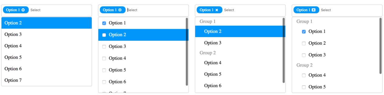
Selectable
Import
import { Selectable } from "@robertzhidealx/lyte";
Documentation
| Prop | Type | Requirement | Description |
|---|---|---|---|
width |
number | required | The width of the Selectable component. |
options |
{label: string | number; content?: ReactNode | string}[] | required | The collection of options to select from. |
_default |
string | number | string[] | number[] | required | The label of the value(s) that are selected by default. When multi is not specified or set to false, _default is a single string or number. Otherwise, it is an array. |
multi |
boolean | optional | Whether Selectable can select multiple options. Defaults to false. |
onChange |
(values: {label: string | number; content?: ReactNode | string}[]) => void | optional | Tracks changes to the selected options. When multi is not specified or set to false, values is a one-item array with the single selected option. |
Example Usage
import { Selectable } from "@robertzhidealx/lyte";

const SelectableOptions = [
  { label: 1, content: "Option 1" },
  { label: 2, content: "Option 2" },
  { label: 3, content: "Option 3" },
];

const DemoComponent = () => {
  return (
    <Selectable
      width={260}
      options={SelectableOptions}
      _default={SelectableOptions.map(({ label }) => label)}
      multi
      onChange={(values) => console.log(values)}
    />
  );
};

export default DemoComponent;