REACT MULTISELECT DROPDOWN
A React component which provides multi select functionality with various features like selection limit, CSS customization, checkbox, search option, disable preselected values, flat array, keyboard navigation for accessibility and grouping features. Also it has feature to behave like normal dropdown(means single select dropdown).
Getting Started
1. Installation
npm install multiselect-react-dropdown
2. Basic Usage
import { Multiselect } from 'multiselect-react-dropdown';

this.state = {
    options: [{name: 'Srigar', id: 1},{name: 'Sam', id: 2}]
};

<Multiselect
options={this.state.options} // Options to display in the dropdown
selectedValues={this.state.selectedValue} // Preselected value to persist in dropdown
onSelect={this.onSelect} // Function will trigger on select event
onRemove={this.onRemove} // Function will trigger on remove event
displayValue="name" // Property name to display in the dropdown options
/>

onSelect(selectedList, selectedItem) {
    ...
}

onRemove(selectedList, removedItem) {
    ...
}
3. Props
| Prop |
Type |
Default |
Description |
options |
array |
[] |
Dropdown options |
onSelect |
function |
func |
Callback function will invoked on select event. Params are selectedList & selectedItem |
onRemove |
function |
func |
Callback function will invoked on remove event. Params are selectedList & removedItem |
singleSelect |
boolean |
false |
Make it true to behave like a normal dropdown(single select dropdown) |
selectedValues |
array |
[] |
Preselected value to persist in dropdown |
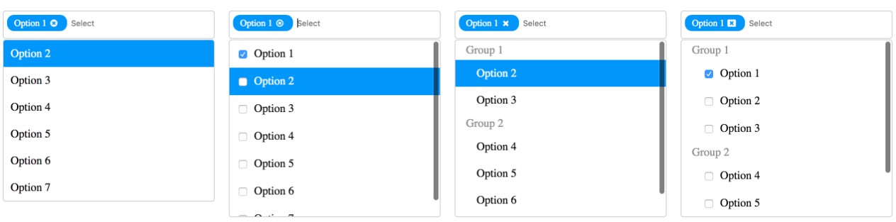
showCheckbox |
bool |
false |
To display checkbox option in the dropdown |
selectionLimit |
number |
-1 |
You can limit the number of items that can be selected in a dropdown |
placeholder |
string |
Select |
Placeholder text |
disablePreSelectedValues |
bool |
false |
Prevent to deselect the preselected values |
isObject |
bool |
true |
Make it false to display flat array of string or number Ex. ['Test1',1] |
displayValue |
string |
value |
Property name in the object to display in the dropdown. Refer Basic Usage section |
emptyRecordMsg |
string |
No options available |
Message to display when no records found |
groupBy |
string |
'' |
Group the popup list items with the corresponding category by the property name in the object |
closeIcon |
string |
circle |
Option to select close icon instead of default. Refer Close Icon section |
style |
object |
{} |
CSS Customization for multiselect. Refer below object for css customization. |
caseSensitiveSearch |
bool |
false |
Enables case sensitivity on the search field. |
closeOnSelect |
bool |
true |
Dropdown get closed on select/remove item from options. |
id |
string |
'' |
Id for the multiselect container and input field(In input field it will append '{id}_input'). |
avoidHighlightFirstOption |
bool |
false |
Based on flag first option will get highlight whenever optionlist open. |
hidePlaceholder |
bool |
false |
For true, placeholder will be hidden if there is any selected values in multiselect |
disable |
bool |
false |
For true, dropdown will be disabled |
onSearch |
function |
func |
Callback function invoked on search in multiselect, helpful to make api call to load data from api based on search. |
loading |
bool |
false |
If options is fetching from api, in the meantime, we can show loading... message in the list. |
loadingMessage |
any |
'' |
Custom loading message, it can be string or component. |
showArrow |
bool |
false |
For multiselect dropdown by default arrow wont show at the end, If required based on flag we can display |
keepSearchTerm |
bool |
false |
Whether or not to keep the search value after selecting or removing an item |
4. Ref as a prop
By using React.createRef() or useRef(), able to access below methods to get or reset selected values
| Method Name |
Description |
resetSelectedValues |
Programatically reset selected values and returns promise |
getSelectedItems |
Get all selected items |
getSelectedItemsCount |
Get selected items count |
constructor() {
  this.multiselectRef = React.createRef();
}

resetValues() {
  // By calling the belowe method will reset the selected values programatically
  this.multiselectRef.current.resetSelectedValues();
}

<Multiselect
options={this.state.options} // Options to display in the dropdown
ref={this.multiselectRef}
/>
5. CSS Customization
{
  multiselectContainer: { // To change css for multiselect (Width,height,etc..)
	....
  },
  searchBox: { // To change search box element look
	border: none;
	font-size: 10px;
	min-height: 50px;
  },
  inputField: { // To change input field position or margin
      margin: 5px;
  },
  chips: { // To change css chips(Selected options)
	background: red;
  },
  optionContainer: { // To change css for option container
	border: 2px solid;
  }
  option: { // To change css for dropdown options
	color: blue;
  },
  groupHeading: { // To chanage group heading style
	....
  }
}
6. Close Icons
| Name |
Image |
circle |
 |
circle2 |
 |
cancel |
 |
close |
 |