React-CRUD-Icons
React-CRUD-Icons is a set of SVG icons for CRUD (Create, Read, Update, Delete) apps, implemented as a React component with light & dark themes and tooltip.
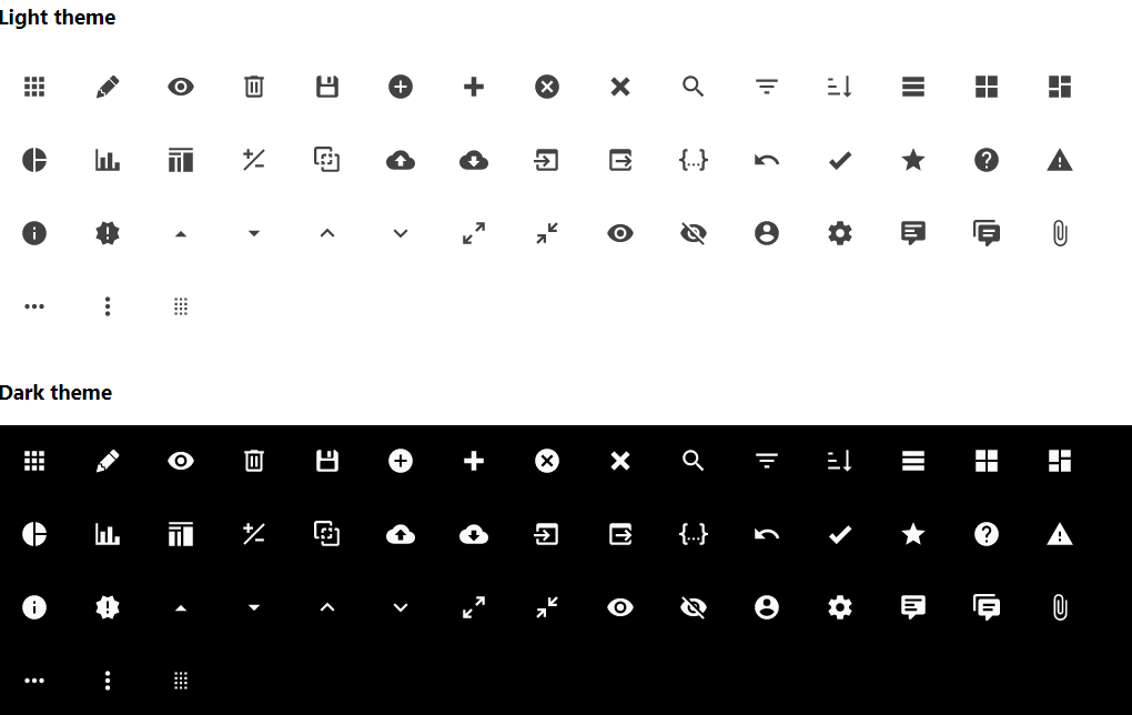
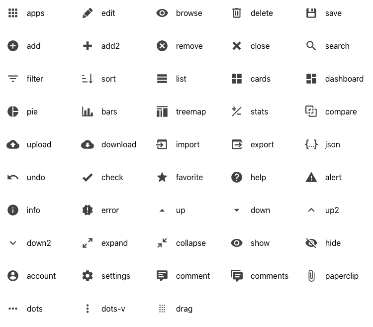
48 SVG Icons
A set of icons for CRUD applications... hand-picked among thousands at Material Design Icons.
Icon keys: account, add, add2, alert, apps, bars, browse, cards, check, close, collapse, comment, comments, compare, dashboard, delete, dots, dots-v, down, down2, download, drag, edit, error, expand, export, favorite, filter, help, hide, import, info, json, list, paperclip, pie, remove, save, search, settings, show, sort, stats, treemap, undo, up, up2, upload.
2 Themes
Themes: light, dark.
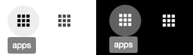
To disable the icon hover effect, set theme = "none".
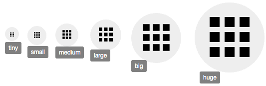
6 Sizes
Sizes: tiny, small, medium, large, big, huge.
Installation
The package can be installed via npm:
npm install react-crud-icons --save
You’ll need to install React and PropTypes separately since those dependencies aren't included in the package.
To rebuild the project:
npm install
npm run build
Usage
Below is a simple example of how to use the component in a React view. You will also need to include the CSS file from this package (or provide your own). The example below shows how to include the CSS from this package if your build system supports requiring CSS files (Webpack is one that does).
import React from "react";
import Icon from "react-crud-icons";

import "../node_modules/react-crud-icons/dist/react-crud-icons.css";

class Example extends React.Component {
  render() {
    return (
      <Icon
        name = "edit"
        tooltip = "Edit"
        theme = "light"
        size = "medium"
        onClick = { doSomething }
      />
    );
  }
}
Notes:
- Icons only take focus on tab when the "onClick" property is set and they are not disabled.
- The component uses inline SVG for faster display.