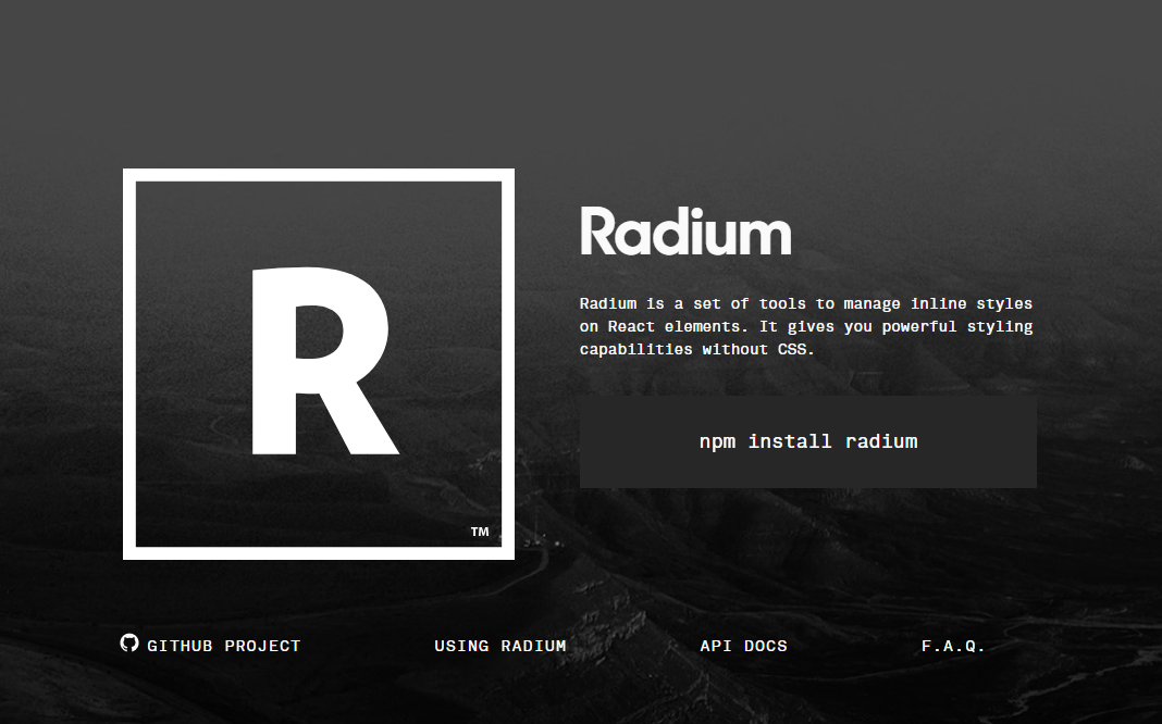
Radium
A toolchain for React component styling.
Radium is a set of tools to manage inline styles on React elements. It gives you powerful styling capabilities without CSS.
Inspired by React: CSS in JS by vjeux.
npm install radium
Eliminating CSS in favor of inline styles that are computed on the fly is a powerful approach, providing a number of benefits over traditional CSS:
- Scoped styles without selectors
- Avoids specificity conflicts
- Source order independence
- Dead code elimination
- Highly expressive
Despite that, there are some common CSS features and techniques that inline styles don't easily accommodate: media queries, browser states (:hover, :focus, :active) and modifiers (no more .btn-primary!). Radium offers a standard interface and abstractions for dealing with these problems.
When we say expressive, we mean it: math, concatenation, regex, conditionals, functions–JavaScript is at your disposal. Modern web applications demand that the display changes when data changes, and Radium is here to help.
For a short technical explanation, see How does Radium work?.
Features
- Conceptually simple extension of normal inline styles
- Browser state styles to support
:hover,:focus, and:active - Media queries
- Automatic vendor prefixing
- Keyframes animation helper
- ES6 class and
createClasssupport
Docs
- [Overview][docs_guides]
- [API Docs][docs_api]
- [Frequently Asked Questions (FAQ)][docs_faq]
Usage
Start by wrapping your component class with Radium(), like export default Radium(Component), or Component = Radium(Component), which works with classes, createClass, and stateless components (functions that take props and return a ReactElement). Then, write a style object as you normally would with inline styles, and add in styles for interactive states and media queries. Pass the style object to your component via style={...} and let Radium do the rest!
<Button kind="primary">Radium Button</Button>
import Radium from 'radium';
import React from 'react';
import color from 'color';

class Button extends React.Component {
  static propTypes = {
    kind: PropTypes.oneOf(['primary', 'warning']).isRequired
  };

  render() {
    // Radium extends the style attribute to accept an array. It will merge
    // the styles in order. We use this feature here to apply the primary
    // or warning styles depending on the value of the `kind` prop. Since its
    // all just JavaScript, you can use whatever logic you want to decide which
    // styles are applied (props, state, context, etc).
    return (
      <button
        style={[
          styles.base,
          styles[this.props.kind]
        ]}>
        {this.props.children}
      </button>
    );
  }
}

Button = Radium(Button);

// You can create your style objects dynamically or share them for
// every instance of the component.
var styles = {
  base: {
    color: '#fff',

    // Adding interactive state couldn't be easier! Add a special key to your
    // style object (:hover, :focus, :active, or @media) with the additional rules.
    ':hover': {
      background: color('#0074d9').lighten(0.2).hexString()
    }
  },

  primary: {
    background: '#0074D9'
  },

  warning: {
    background: '#FF4136'
  }
};
Importing Radium
As of v0.22.x, Radium is built as an ECMAScript Modules-first project. We now have a package.json:module entry pointing to our library files with import|export statements instead of CommonJS requires. We still support CommonJS requires with a special package.json:main entry pointing to root index.js to smooth over this transition. The basic takeaways are:
If you are using ESM with webpack or @std/esm with Node.js, imports like the following work fine without any gotchas:
import Radium from 'radium';
import Radium, { Style } from 'radium';
If you are using CommonJS with Node.js or webpack@1 requires work like normal:
const Radium = require('radium');
const { Style } = require('radium');
If you are using CommonJS with webpack@2+, however, you must instead add .default to the root Radium object import:
const Radium = require('radium').default; // CHANGED: Must add `.default`
const { Style } = require('radium');      // Works as per normal
If you cannot change the require statements directly (say Radium is included from a different library your project depends on) you can manually tweak the Radium import in your project's webpack configuration with the following:
resolve: {
  alias: {
    radium: require.resolve("radium/index")
  }
}
which will allow const Radium = require('radium'); to still work. The configuration effectively forces webpack to point to code from package.json:main (which points to /index.js) instead of what is in package.json:module.
Examples
To see the universal examples:
npm install
npm run universal
To see local client-side only examples in action, do this:
npm install
npm run examples
How does Radium work?
Following is a short technical explanation of Radium's inner workings:
- Wrap the
renderfunction - Recurse into the result of the original
render - For each element:
- Add handlers to props if interactive styles are specified, e.g.
onMouseEnterfor:hover, wrapping existing handlers if necessary - If any of the handlers are triggered, e.g. by hovering, Radium calls
setStateto update a Radium-specific field on the components state object - On re-render, resolve any interactive styles that apply, e.g.
:hover, by looking up the element's key or ref in the Radium-specific state
- Add handlers to props if interactive styles are specified, e.g.