simple-react-calendar
A component that is easy to start using, yet flexible when you need customization.
Install
Using npm
npm install simple-react-calendar
Using yarn
yarn add simple-react-calendar
Usage
import React, { Component } from 'react'

import SimpleReactCalendar from 'simple-react-calendar'

class MyApp extends Component {
  render() {
    return <SimpleReactCalendar activeMonth={new Date()} />
  }
}
Available component properties
All of the properties are optional, just rendering <Calendar /> will already give you a working calendar component.
| Properties |
PropType |
Description |
MonthHeaderComponent |
object or func |
replace the month header of the component with this node object or class function |
activeMonth |
datePropType* |
any day within the month that you want initially displayed |
blockClassName |
string |
base class name that will be used as a class prefix (see ) |
daysOfWeek |
[string] |
array of string represents the days |
disableDaysOfWeek |
bool |
disable rendering days of the week |
disabledIntervals |
[{start: datePropType, end: datePropType}] |
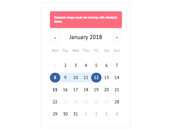
disabled intervals of dates. Array of objects [{start: Date(), end: Date()}]. When user try to select disabled date or date range which consist disabled date(s) inside, Notice will appear |
headerNextArrow |
element |
any kind of react element will be rendered into the next month button (element) |
headerNextTitle |
string |
text will be rendered as the title of the next month button Next month |
headerPrevArrow |
element |
any kind of react element will be rendered into the previous month button (element) |
headerPrevTitle |
string |
text will be rendered as the title of the previous month button, default is Previous month |
highlighted |
{start: datePropType, end: datePropType} |
highlighted dates. Object {start: Date(), end: Date()}. Undefined by default |
maxDate |
datePropType* |
latest date available for selection |
minDate |
datePropType* |
earliest date available for selection |
minNumberOfWeeks |
number |
minimum number of weeks in a month. Undefined by default |
mode |
string one of range or single |
selection mode, one of either range or single. Default is single |
onDayHover |
func |
a function that is called on mouseMove on days |
onMonthChange |
func |
a function that is called whenever user changes the month. If defined then you have to handle month changing by yourself by changing activeMonth property |
onSelect |
func |
a function that is called whenever user |
onSelectionProgress |
func |
a function that is called whenever user changes |
rangeLimit |
number |
limit number of days for selection (number) |
selected |
|
selected dates. Can be ether single Date object if mode is single, or object {start: Date(), end: Date()} if mode is range |
today |
datePropType* |
current date (useful when you want to show current date in different time zone). Default is new Date() selects a date (in single mode) or a dates range (range mode) selection. Works only in the range mode. When the function is passed then automatic range selection handing will be disabled. |
weekStartsOn |
number |
the index of the first day of the week (0 - Sunday). Default is 0 |
datePropType - number, string or instanceOf(Date)
Render Prop's Components
You can easily override any rendered part of the calendar by providing the proper render function as a Prop.
Expose date helper methods
You can easily override any helper methods, all of them exposed as pure functions.
Class Names
simple-react-calendar follows BEM-like class naming approach and uses
single block name as a prefix. Default block class name is calendar, so
elements will have names like calendar-day, calendar-month etc.
Block class name can be overrided with blockClassName prop (see above).
| Description |
Default Class Name |
Modifier Class Names |
| Calendar (root element) |
.calendar |
|
| Calendar month header |
.calendar-month_header |
|
| Calendar month header title (month name) |
.calendar-month_header_title |
|
| Calendar header button (month switcher) |
.calendar-header_button |
.is-prev - when is the previous month button.is-next - when is the next month button.is-disabled - when the button is disabled
|
| Calendar week header (week days) |
.calendar-days_of_week |
|
| Calendar week header day (week day) |
.calendar-days_of_week_day |
.is-weekend - when the day is the weekend
|
| Calendar month (weeks wrapper element) |
.calendar-month |
|
| Calendar week (days wrapper element) |
.calendar-week |
|
| Calendar day |
.calendar-day |
.is-selected - when the date is selected.is-highlighted - when the date is highlighted.is-today - when the date is current one.is-start_selection - when the date is start day of selection.is-end_selection - when the date is end day of selection.is-current_month - when the date belongs to the current month.is-prev_month - when the date belongs to the previous month.is-next_month - when the date belongs to the next month.is-weekend - when the date is the weekend.is-working_day - when the date is the working day.is-selectable - when the date can be selected.is-not_selectable - when the date can't be selected
|
| Calendar notice (notice element) |
.calendar-notice |
|
Local development environment
Fork this repository and clone your version of the repository
Install dependencies
yarn
Start example server locally
yarn start
You now have examples running on http://localhost:9000
Local StoryBook
Fork this repository and clone your version of the repository
Install dependencies
yarn
Start example server locally
yarn storybook
You now have examples running on http://localhost:6006
GitHub