react-bootstrap-dropdown-menu
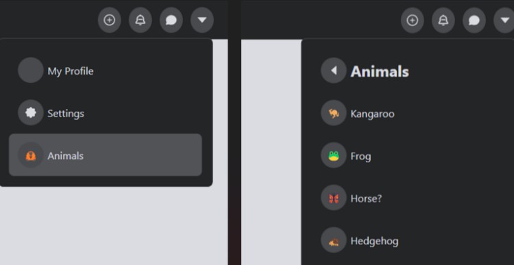
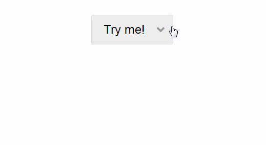
A simple Dropdown Menu for React. Commonly used as a 'User Settings' menu on websites where users login.
Installation
npm install react-bootstrap-dropdown-menu --save
Include bootstrap in your project(if not already included)
<link href="https://maxcdn.bootstrapcdn.com/bootstrap/3.3.7/css/bootstrap.min.css" rel="stylesheet" media="all">
Usage
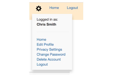
A simple example using OnClick events. Download and run the demo for more examples, or browse the examples.

import React from 'react';
import { DropdownMenu, MenuItem } from 'react-bootstrap-dropdown-menu';

class SettingsMenu extends React.Component {
  constructor() {
    super();
    this.deleteAccount = this.deleteAccount.bind(this);
    this.logout = this.logout.bind(this);
  }

  deleteAccount(e) {
    console.log("Deleting Account")
  }

  logout(e) {
    console.log("Logging out")
  }

  render() {
    return (
      <DropdownMenu userName="Chris Smith">
        <MenuItem text="Home" location="/home" />
        <MenuItem text="Edit Profile" location="/profile" />
        <MenuItem text="Change Password" location="/change-password" />
        <MenuItem text="Privacy Settings" location="/privacy-settings" />
        <MenuItem text="Delete Account" onClick={this.deleteAccount} />
        <MenuItem text="Logout" onClick={this.logout} />
      </DropdownMenu>
    );
  }
}

export default SettingsMenu;
DropdownMenu props
| Name | Type | Required | Default | Possible Values | Description |
|---|---|---|---|---|---|
| userName | String | No | undefined | Any string(e.g. 'John Doe') | When provided, will render 'Logged in as: {userName}' in the top MenuItem |
| position | String | No | right | left, center, right | Changes the menu's horizontal drop position relative to the trigger |
| triggerType | String | No | icon | icon, text, image | The Type of drop trigger |
| trigger | String | No | glyphicon glyphicon-cog | Depends on triggerType | For 'icon' triggerType: Any bootstrap glyphicon(http://getbootstrap.com/components/) For 'text' triggerType: Any String can be used For 'image' triggerType: Path to image(e.g. "/images/myimage.png") |
| triggerWidth | String | No | 50px (only applies to triggerType='image') | Any numeric value with 'px' appended(e.g. '45px') | The width to render the image trigger image. |
| triggerHeight | String | No | 50px (only applies to triggerType='image') | Any numeric value with 'px' appended(e.g. '45px') | The height to render the image trigger image. |
| caratColor | String | No | #000000 (Black) | Any 6 digit hex value (e.g. #F4E3A2) | The color of the DropDown carat (for triggerType 'image' and 'text' only) |
| fadeIn | Boolean | No | false | true or false | Dropdown menu will fade in when set to true |
MenuItem props
| Name | Type | Required | Default | Possible Values | Description |
|---|---|---|---|---|---|
| type | String | No | undefined | separator | A horizontal rule. text prop is not required when using this type. |
| text | String | Yes | undefined | Any String value | Text value of the Link in the MenuItem |
| location | String | No | undefined | Any String value | An absolute or relative path |
| linkStyle | Object | No | inherited | Hash containing javascript styles(not CSS). See examples for more info | |
| onClick | Function | No | undefined | A Function | A function that will fire when the MenuItem Link is clicked |
Download Examples
git clone https://github.com/grizzthedj/react-bootstrap-dropdown-menu.git
cd react-bootstrap-dropdown-menu
npm install
gulp demo
Browse http://localhost:8080