Pretty rating React
A small and simple library that transform you rating in icons for you web.
Getting started
To install as npm dev dependency
npm i pretty-rating-react
API Documentation
PrettyRating
This is the wrapper component that creates the pretty format of our rating.
| Name | Type | Required | Default value | Values Allowed | Description |
|---|---|---|---|---|---|
| rating | number | true | - | Positive floats or integers numbers | Rating that we will transform to icons |
| icons | object | true | - | This object receive 3 attributes (complete, half, empty) | Class names foreach elements |
| iconsNumber | number | false | 5 | Positive integers numbers | Number of icons to create |
| setColors | array | false | [#000, #000, #000] | Hexadecimal colors | Colors with which icons are rendered |
The iconsNumber determines the number of icons to render, it's related to rating. So, if the iconsNumber is 5, the rating must be from 0 to 5.
How to use it
The following snippet will show you how to use the library: (Example with icons of FontAwesome)
Using function components (without Typescript):
import React from 'react';
import PrettyRating from "pretty-rating-react";
import {
faHeart,
faHeartBroken,
faStar,
faStarHalfAlt,
} from "@fortawesome/free-solid-svg-icons";
import {
faHeart as farHeart,
faStar as farStar,
} from "@fortawesome/free-regular-svg-icons";
const icons = {
star: {
complete: faStar,
half: faStarHalfAlt,
empty: farStar,
},
heart: {
complete: faHeart,
half: faHeartBroken,
empty: farHeart,
},
};
const colors = {
star: ['#d9ad26', '#d9ad26', '#434b4d'],
heart: ['#9b111e', '#a83f39'],
};
const Main = () => (
<div>
<div>
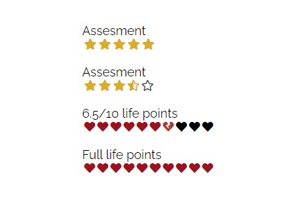
<h1>Assesment</h1>
<PrettyRating rating={5} icons={icons.star} setColors={colors.star} />
</div>
<div>
<h1>Assesment</h1>
<PrettyRating rating={3.5} icons={icons.star} setColors={colors.star} />
</div>
<div>
<h1>6.5/10 life points </h1>
<PrettyRating
rating={6.5}
icons={icons.heart}
setColors={colors.heart}
iconsNumber={10}
/>
</div>
<div>
<h1>Full life points </h1>
<PrettyRating
rating={10}
icons={icons.heart}
setColors={colors.heart}
iconsNumber={10}
/>
</div>
</div>
);
Using function components (with Typescript):
import React, { FC } from 'react';
import PrettyRating, { IconsInterface } from "pretty-rating-react";
import {
  faHeart,
  faHeartBroken,
  faStar,
  faStarHalfAlt,
} from "@fortawesome/free-solid-svg-icons";
import {
  faHeart as farHeart,
  faStar as farStar,
} from "@fortawesome/free-regular-svg-icons";

interface CustomIconsInterface {
  star: IconsInterface;
  heart: IconsInterface;
}

const icons: CustomIconsInterface = {
  star: {
    complete: faStar,
    half: faStarHalfAlt,
    empty: farStar,
  },
  heart: {
    complete: faHeart,
    half: faHeartBroken,
    empty: farHeart,
  },
};

const colors = {
 star: ['#d9ad26', '#d9ad26', '#434b4d'],
 heart: ['#9b111e', '#a83f39'],
};

const Main: FC = () => (
 <div>
  <div>
   <h1>Assesment</h1>
   <PrettyRating rating={5} icons={icons.star} setColors={colors.star} />
  </div>

  <div>
   <h1>Assesment</h1>
   <PrettyRating rating={3.5} icons={icons.star} setColors={colors.star} />
  </div>

  <div>
   <h1>6.5/10 life points </h1>
   <PrettyRating
    rating={6.5}
    icons={icons.heart}
    setColors={colors.heart}
    iconsNumber={10}
   />
  </div>

  <div>
   <h1>Full life points </h1>
   <PrettyRating
    rating={10}
    icons={icons.heart}
    setColors={colors.heart}
    iconsNumber={10}
   />
  </div>
 </div>
);