react-svg-assets
A simple SVG asset provider for React (^16.3.0) .. or better (^16.6.0).
Getting Started
Why?
At our company we always start with "Why?", so why should this component be used?
The problem we faced was that every display component we created, that contained icons in any way, had many, many imports relative to our assests. Sometimes we have apps and sites with a lot of icons in menus or as bulletpoints a.s.o.
To keep your asset management in order, we created a higher-order component with context and the possibility to defined an iconset. This allows you to wrap your component with our Icon provider and you can easily use your icons wherever you need them, just by name.
Prequisites
This module depends on the Context API as introduced in React 16.3.0. You can read more about the Context API in the official documentation.
Installation
npm install @zauberware/react-svg-assets
Usage
This package does not contain an predefined icon set, so your SVGs must be defined before using the Provider.
The icon set shall be function which returns a complete set or a single icon by name, this approach is giving us a higher flexibility when we try to display conditional or dynamic icons.
You can also use the withIcons HOC (Higher-Order-Component), if you need your icons outside the IconProvider or if you don't use the Provider pattern.
For testing purposes and for the example project you can import a minimal IconFile and use the 'default' identifier as the Icon property.
# pseudo
import { IconProvider, icons } from '@zauberware/react-svg-assets';

<IconProvider icons={icons}>
  <Icon icon={'default'} />
</IconProvider>
For more conveniece 'styled-compenets' are included. You can override the theme values and inject your custom theme via props. Common use cases like 'rotate' or different sizes, can also be controlled via props.
main.js
import React from 'react';
import ReactDOM from 'react-dom';
import { IconProvider } from '@zauberware/react-svg-assets';
import './index.css';
import App from './App';
import myIcons from './myIcons'

ReactDOM.render(
  <IconProvider icons={myIcons}>
    <App />
  </IconProvider>
  , document.getElementById('root'));
myIcons.js
import MyIcon from './path-to-my-assets/icon.svg'

export default (_icon) => {
  const icons = {
    'myIconName': MyIcon,
  }
  return _icon ? icons[_icon] : icons
}
App.js
import React, { Component } from 'react';
import { Icon } from 'react-svg-assets'

class App extends Component {
  render() {
    return (
      <main>
        <Icon icon="myIconName" />
      </main>
    );
  }
}

export default App;
PropTypes
Icon.propTypes
Icon.propTypes = {
  icon: PropTypes.string.isRequired,
  icons: PropTypes.function.isRequired,
}
Basic Styles & theme
theme.js
const theme = {
  defaultDisplay: 'flex',
  defaultSize: '16px',
  sizeMini: '8px',
  sizeMedium: '24px',
  sizeLarge: '32px'
}

export default theme
Icon properties
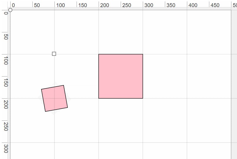
  // rotate by degrees
  <Icon icon={'default'} rotate='90' />

  // add padding
  <Icon icon={'default'} padding='5px' />

  // change cursor to pointer
  <Icon icon={'default'} clickable />

  // default size is 16px; mini: 8px, medium: 24px, large: 32px
  <Icon icon={'default'} mini|medium|large />
Todos
- Testing
- Demo page
- a minimal example can be found in the repositories /example folder
