React Display Window
React Display Window is a simple tool to write documentation for when having a full guide is overkill. React Display Window is therefore best suited for one component libraries or libraries where all of the components are related.
It's also very useful during the development stage of these components libraries because it allows you to see the code working and running like in a real usage environment.
Installation
Install it as any other dev dependency in your repo:
$ npm install --development react-display-window
Usage
First we create an .mdx file which would contain the documentation of the project. You can use React and markdown inside this file.
// my-component.mdx
import { PlayGround, Knobs, PropsTable } from 'react-display-window/lib/components';
import Button from './src';
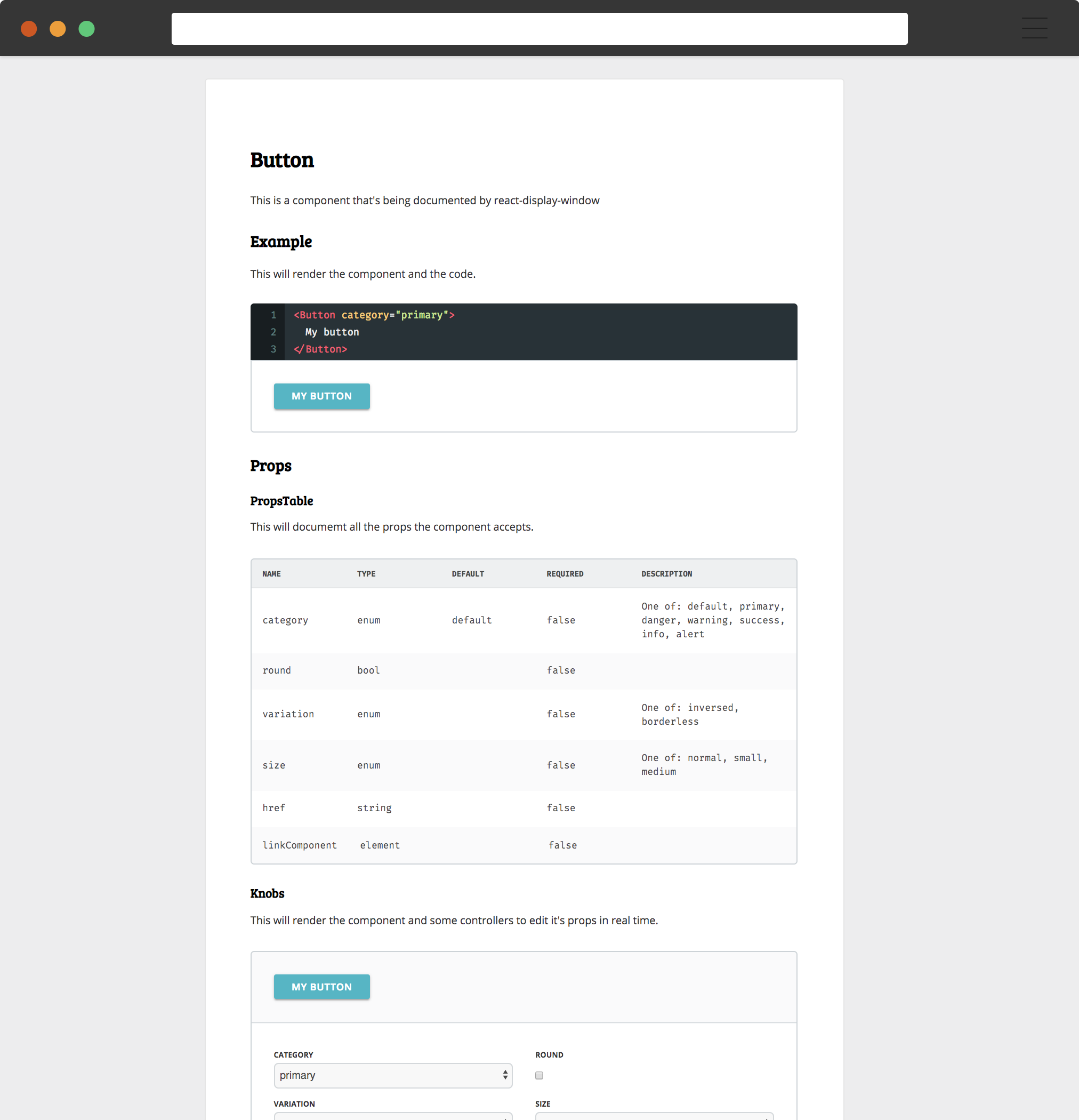
# Button
This is a component that's being documented by react-display-window
## Example
This will render the component and the code.
<PlayGround>
<Button category="primary">
My button
</Button>
</PlayGround>
## Props
### PropsTable
This will document all the props the component accepts.
<PropsTable component={Button} />
### Knobs
This will render the component and some controllers to edit it's props in real time.
<Knobs
component={Button}
defaults={{ category: 'primary' }}>
<Button>
My button
</Button>
</Knobs>
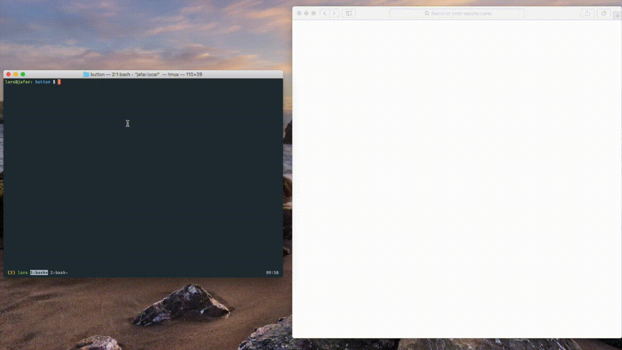
Next, we just have to run React Display Window and point it to our file:
npx rdw serve my-component.mdx
And that's it. You can now go to the url displayed in your console and have a look at your newly created display window for your component.
Once you're happy with your documentation, you can run:
npx rdw build my-component --out-dir docs/
And this will build your documentation and make it available in the folder specified. After, you can deploy it using github pages or any other static provider.
Example
An example repo can be found at Drawbotics/button
Components
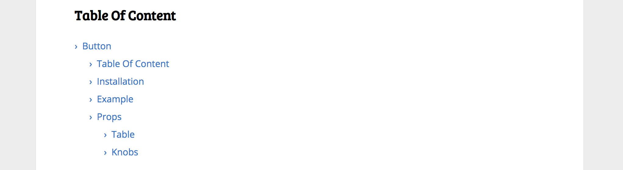
TOC
A component that will render all the headers inside the file as a table of contents with links to specific sections.
import { Toc } from 'react-display-window/lib/components';

<Toc />
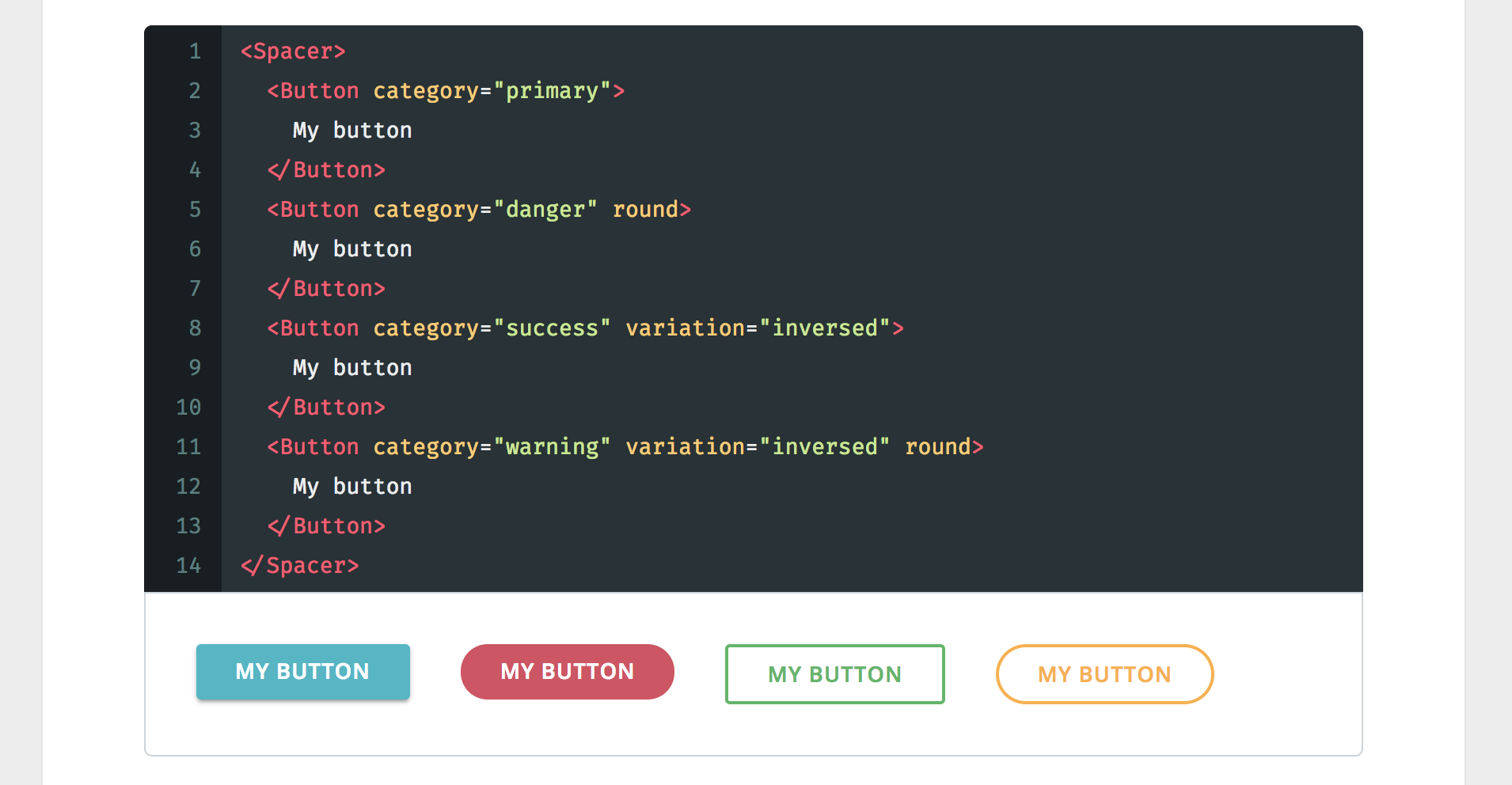
PlayGround
A component that will render children and will also display the code used.
import { PlayGround } from 'react-display-window/lib/components';
import MyComponent from './src';

<PlayGround>
  <MyComponent />
</PlayGround>
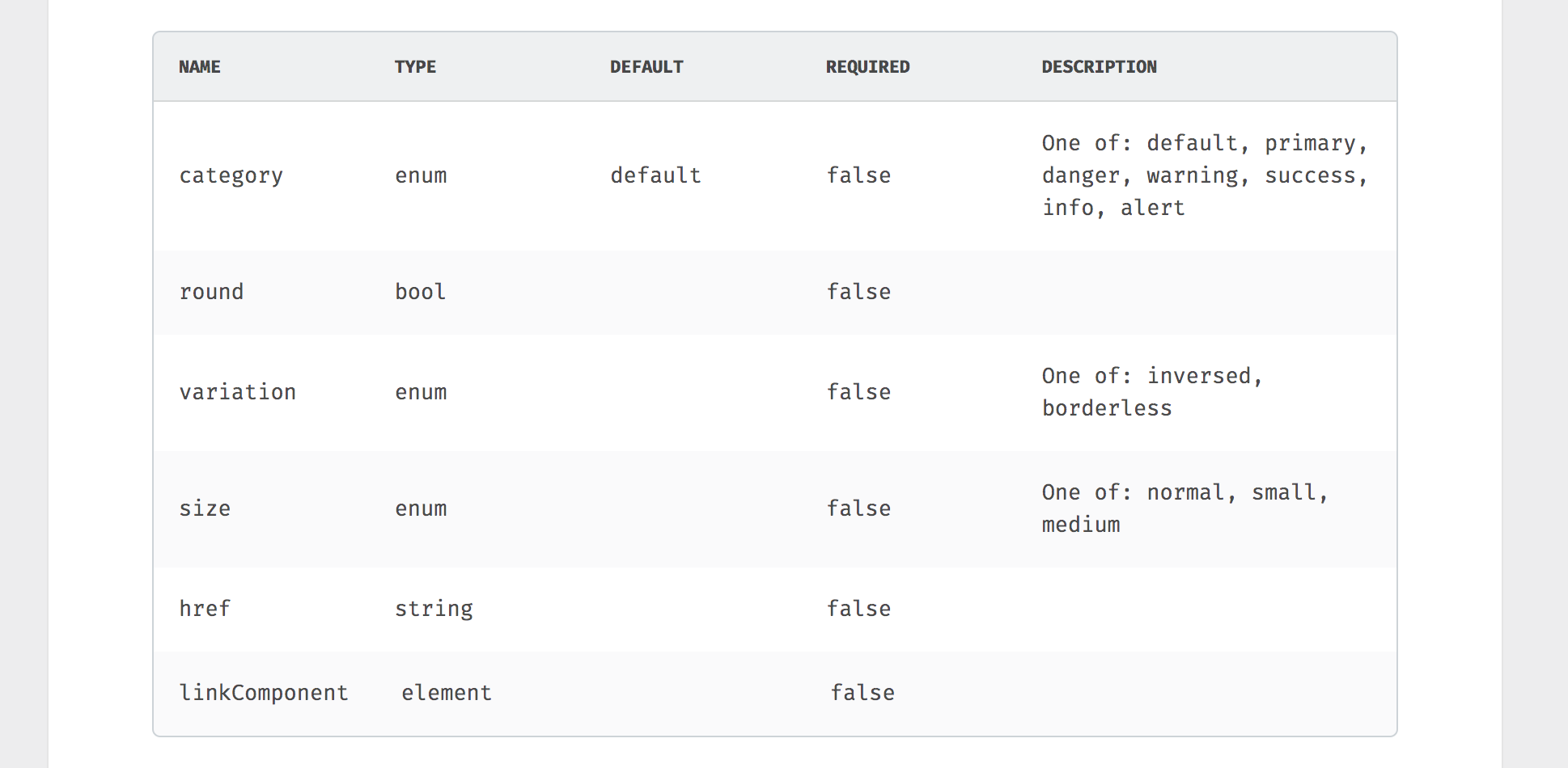
PropsTable
A component that will render a table with all the propTypes the passed component accepts.
import { PropsTable } from 'react-display-window/lib/components';
import MyComponent from './src';

<PropsTable component={MyComponent} />
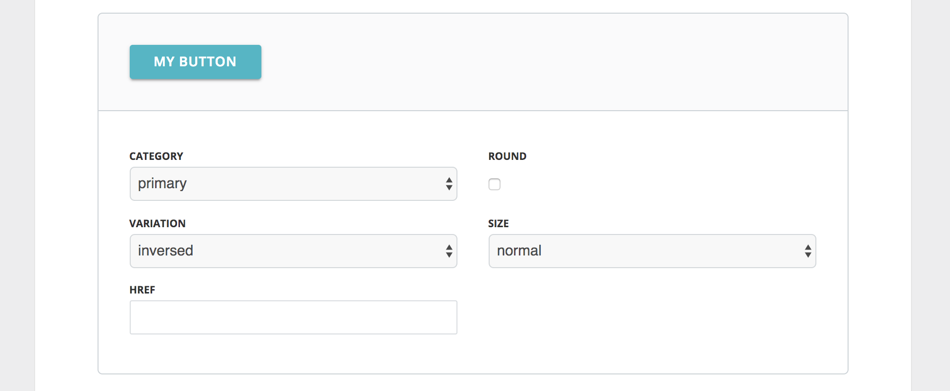
Knobs
Similar to playground in that it renders it's children but instead of showing the code used, it will display some controls to manipulate in real time the props that component accepts. It also takes a defaults props where default values for the props can be specified.
import { Knobs } from 'react-display-window/lib/components';
import MyComponent from './src';

<Knobs component={MyComponent} defaults={{ myProp: true }}>
  <MyComponent />
</Knobs>
Common Patterns
Add a custom title and dependencies
Since we can use React inside our doc file, adding a custom title or dependencies is as simple as installing react-helmet and using it at the top of our docs:
import { Helmet } from 'react-helmet';

<Helmet>
  <title>My Custom Title</title>
  <link rel="stylesheet" href="http://link-to/my-custom.css" />
</Helmet>