Atomic Layout
Atomic Layout is a spatial distribution library for React. It uses CSS Grid to define layout areas and render them as React components. This pattern encourages separation of elements and spacing, preventing contextual implementations and boosting maintenance of layouts.
import React from 'react'
import { Composition } from 'atomic-layout'
// Define layout areas: visual representation
// of what composes a layout, detached from
// what components are actually rendered.
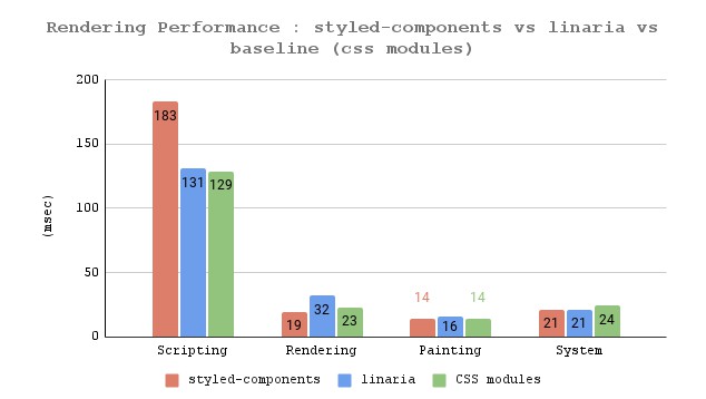
const areasMobile = `
thumbnail
header
footer
`
// Declare responsive changes of your areas.
// Operate in two dimensions, remove areas
// or introduce new ones.
const areasTablet = `
thumbnail header
thumbnail footer
`
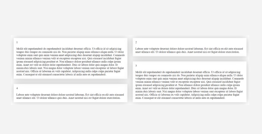
const Card = ({ title, imageUrl, actions }) => (
<Composition areas={areasMobile} areasMd={areasTablet} gap={20}>
{/* Get React components based on provided areas */}
{({ Thumbnail, Header, Footer }) => (
<React.Fragment>
<Thumbnail>
{/* Render anything, including another Composition */}
<img src={imageUrl} alt={title} />
</Thumbnail>
{/* Preserve semantics with polymorphic prop */}
<Header as="h3">{title}</Header>
{/* Responsive props: just suffix with a breakpoint name */}
<Footer padding={10} paddingMd={20}>
{actions}
</Footer>
</React.Fragment>
)}
</Composition>
)
export default Card
Atomic Layout is responsive-first. It uses Bootstrap 4 breakpoints by default, which you can always customize for your needs.
Motivation
Modern layout development is about modularity and composition. Following the best practices of Atomic design, we strive toward independent UI units that gradually compose into more meaningful pieces. While the attention paid to units implementation is thorough, we often overlook how to achieve layout composition that scales. It's as if we forget that spacing defines composition.
When it comes to distributing the spacing things get more difficult. First of all, true contextless spacing is hard. To make things worse, all present solutions couple spacing with UI elements, inevitably making small reusable pieces contextful and, thus, hard to maintain.
Atomic Layout helps you to compose your elements by introducing a dedicated spacing layer called Composition. It encourages you to separate concerns between UI elements' visual appearance and spacing between them. With the first-class responsive support at your disposal you can build gorgeous responsive permutations of your elements without leaving the dedicated spacing layer, keeping UI elements contextless and predictable. Embrace the era of a true layout composition!
Implementations
Atomic Layout has multiple implementations depending on the styling solution:
| Package name | Latest version | Styling library |
|---|---|---|
atomic-layout |
 |
styled-components |
@atomic-layout/emotion |
 |
@emotion/styled |
Documentation
See the Official documentation.
Here are some shortcuts for quick access:
Examples
Although the examples below use
atomic-layoutpackage, they are fully compatible with other styling implementations of the library (i.e.@atomic-layout/emotion).
Basics
Basic compositionCombine two UI elements into a single one using Composition. |
Responsive propsChange a prop's value depending on a breakpoint. |
Nested compositionAny element can be a composition and a composite at the same time. |
Intermediate
Conditional renderingRender or display elements conditionally based on breakpoints. |
Custom configurationConfigure a default measurement unit, custom breakpoints, and responsive behaviors. |
Shorthand media queryUse a shorthand |
Materials
|
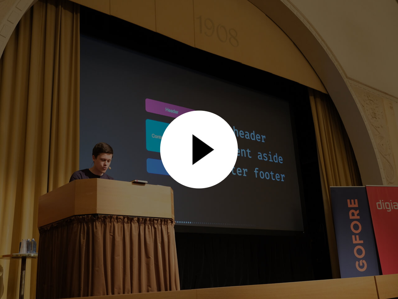
Creating layouts that last (React Finland, 2019)Find out the main aspects of a layout's maintainability and why spacing plays a crucial role in it. Learn how to wield layout composition as an actual React component–a missing glue for your elements and design systems. |

|
Layout composition as a React component (SurviveJS)Read through the extensive interview about how Atomic layout came to be, how it's different from other solutions, and which practices it encourages. |
|
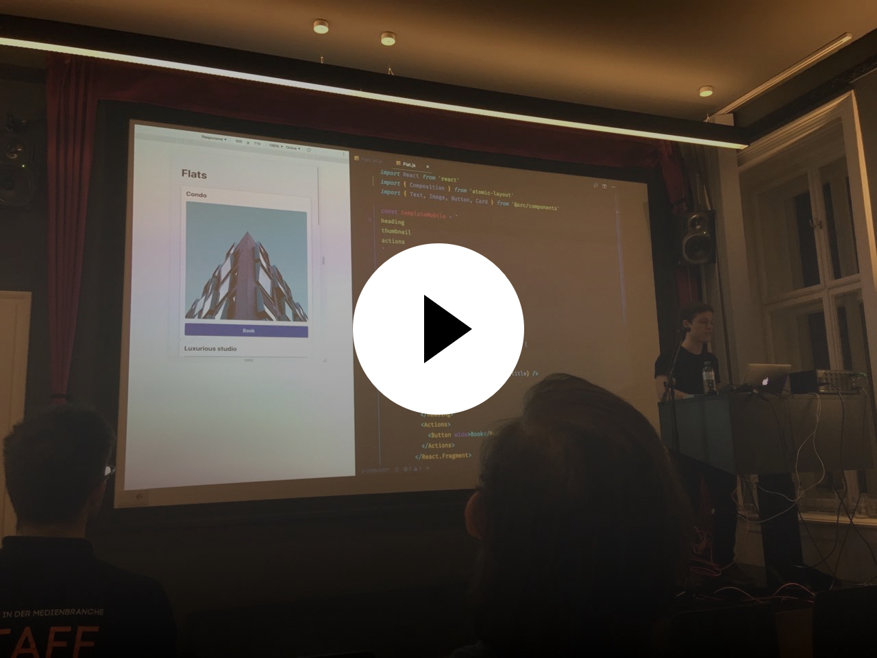
The future of layouts (React Vienna, 2018)Watch Artem discussing the biggest obstacle to achieve maintainable layouts, and showcases a way to combine existing technologies to build clean UI implementations using Atomic layout. |
Community
Reach out to us to share an awesome project you're building, or ask a question:
Browser support
Atomic Layout's browser support is made by the browser support of underlying technologies the library uses. Pay attention if your project can support CSS Grid to be sure you can use Atomic Layout.