Gridley
A simple data grid component that responsively adjusts layout based on screen widths. Uses a CSS grid layout with repeating rows. Does not fetch, sort, paginate or anything other than layout data in a grid. Those things can be built on top of Gridley if desired but are not built-in.
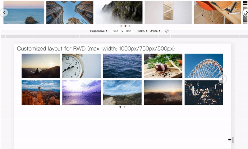
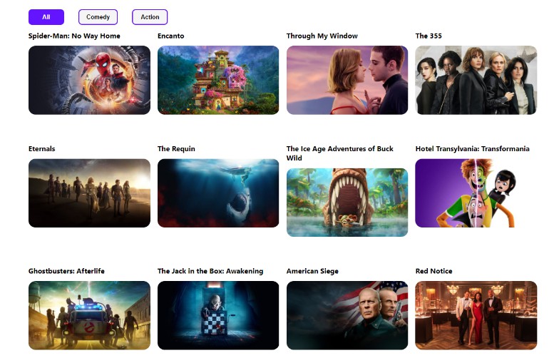
Most tabular grids are “responsive” by switching grid from a table to a “label: value” layout on mobile screens, or by just allowing rows to wrap when content doesn’t fit.
Gridley goes far beyond those techniques. It can accommodate any number of breakpoints and change column orders, alignment, and even row spanning for each size. Cell rendering is specified globally on the grid and then multiple layout’s specify how each cell is rendered. Appropriate ARIA attributes (table, rowheader, row, columnheader, cell) are applied to the elements.
Image a grid that has every row on a single line this on desktop. And on tablet, each row takes two lines, and ID appears at the end vertically centered between them. Then on mobile it uses three lines per row, the job & address switch places while spanning the entire width.

Rendering and layouts are specified in JSX without duplication. Each cell is rendered the same regardless of layout.
For an usable example of the screenshots above, try the sandbox example as well as the source in demo/demo.tsx
Gridley Components
Gridley
- data an array of either arrays or objects
- defaultLayout the id of the layout to use if none of the specified sizes match
- forceLayout Force the grid to display using the specified layout id. Useful for printing or any case where you want to force a certain display.
- caption content to insert at the top of the grid.
- rowAttributes function | HTMLAttributes
A list of attributes to be added to each row as its rendered. If a function is specified, it will be passed the row and current layout and should return HTMLAttributes
Columns
- No props, but must have one or more Column as children. Each Column listed as a child may also appear as a child of one or more Layout children
Layout
- id string (required) Identifier for the layout._
- stripe boolean | string defaults to true. When set, will set the background color of every other row. If
true, color will be a light grey. - min number | string (required) The minimum width of the layout. If a number, refers to pixels, if string can be any valid css dimension such as rem or vw.
- max number | string (required) The maximum width of the layout. If a number, refers to pixels, if string can be any valid css dimension such as rem or vw.
- cellPadding number | string | boolean (optional, defaults to 5px) Applies the given amount of padding to cells in the grid. Can be disabled by setting to
false - style CSSObject (optional) specific styles to apply to the grid when layout is active. Useful for setting header border or any other specific styles. For examples see the demo source
- children Each child of a layout must be a Column that is also included inside of the Columns element.
- headerSeparator A border to add to the bottom of the header row.
- width number | string, defaults to
1px - style (css border style, i.e. ‘dashed’, ‘solid’)
- color css color specification, defaults to “black” }.
- width number | string, defaults to
- stickyHeader
- top: number | string The “top” value for sticky positioning
- rowHeight When using sticky positioning each header row must be a fixed height so they do not overlap or have gaps between them
- background Sticky positioning requires a solid background, otherwise it will be transpararent and the table will appear behind it.
Column
When used as a child of Columns it documents how data is rendered. The parent element inside header and body may be a Cell, or any custom element. If a custom element is used, it will be passed a string id prop. That id must be rendered the the DOM as data-cell-id in order for elements to be positioned properly.
- id a unique identifier for each column
- dataPath the path to the value for each column. Uses lodash get internally. If not provided, the column id is used.
- header React.ReactElement – element to be rendered for the column in the header.
- body React.ReactElement – element to be rendered for the column for each row in the body.
When placed inside a Layout, it documents how the column is placed in the grid. Columns will appear in the order they are placed under the Layout.
- id a unique identifier for each column, must match the id given for the Column in the Columns section.
- min number | string (optional) The minimum width of the column. Pixel value when a number, when string can be any valid css dimension such as rem or vw.
- max number | string (optional) The minimum width of the column. Pixel value when a number, when string can be any valid css dimension such as rem or vw.
- colSpan number (optional, defaults to 1) How many columns to span
- rolSpan number (optional, defaults to 1) How many rows to span
- row number (optional, defaults to 1) Controls if a cell is wrapped onto a new line, and how much space to allocate when the header is sticky.
- justify any valid css justify-content value. Controls the alignment of items inside the column.
- width number | string (optional) A fixed with for the column
Gridley Hooks
useCurrentLayout()
Returns the current Layout the grid is using. For an example see the Caption component in the demo source
useIsLayoutActive(layoutId: string):boolean
True if the grid is using the layout. Really just a convenience, it calls useCurrentLayout().id internally.
Misc
There is also useGridContextState and useGridContextDispatch hooks but they’re considered internal and may change their behavior. Please notify me if you find them useful and I can document