reate-content-loader
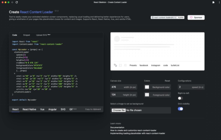
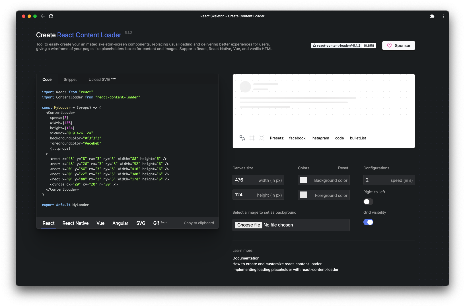
react-content-loader it is a SVG component to create placeholder loading, like Facebook cards loading or also known as skeleton UI. So using this online tool you will be able to create your own loader easily. You just need to draw using the canvas and get the snippet ready for:
- ReactJS;
- React Native;
- VueJS;
- Angular;
- SVG/HTML;
- Maybe Gif someday;
Still not clear?
Read the documentation of react-content-loader
Your contribution is welcome
Add your loading code in the gallery following the steps bellow and help the community grows.
How to insert a loader?
- Build your custom amazing loading component;
- Create a file with a custom name, here;
- Use the following boilerplate (don't forget to fill the metadata);
- Insert the file in the gallery, here;
- Open a pull request, don't you know how to do it? Read this;
Boilerplate
import React from 'react'
import ContentLoader from 'react-content-loader'

const __NAME_OF_LOADER__ = props => {
  return (
    <ContentLoader
      height={40}
      width={1060}
      backgroundColor="#d9d9d9"
      foregroundColor="#ecebeb"
      {...props}
    >
      // your loader
    </ContentLoader>
  )
}

__NAME_OF_LOADER__.metadata = {
  name: '__REPLACE_ME__', // My name
  github: '__REPLACE_ME__', // Github username
  description: '__REPLACE_ME__', // Little tagline
  filename: '__REPLACE_ME__', // filename of your loader
}

export default __NAME_OF_LOADER__
Development
Available Scripts
This project was bootstrapped with Create React App, so in the project directory, you can run:
npm install && npm run dev
Runs the app in the development mode.
Open http://localhost:3000 to view it in the browser.
The page will reload if you make edits.
You will also see any lint errors in the console.