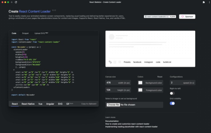
react-content-loader
React component that uses SVG to create a collection of loaders which simulates the structure of the content that will be loaded, similar to Facebook cards loaders.
Features
- Complety customizable: you can change the colors, speed and sizes;
- Create your own loading: use the
create-react-content-loader to create
your customs loadings easily; - You can use right now: there are a lot of presets to use the loader;
- Perfomance: react-content-loader uses pure SVG to work, so it's works without any javascript,
canvas, etc;
Usage
Installation
Yarn: $ yarn add react-content-loader
Npm: $ npm i react-content-loader --save
// import the component
import ContentLoader, { Facebook } from 'react-content-loader'

const MyLoader = () => <ContentLoader />
const MyFacebookLoader = () => <Facebook />
Or in custom mode, using the
online tool
const MyLoader = () => (
  <ContentLoader>
    {/* Pure SVG */}
    <rect x="0" y="0" rx="5" ry="5" width="70" height="70" />
    <rect x="80" y="17" rx="4" ry="4" width="300" height="13" />
    <rect x="80" y="40" rx="3" ry="3" width="250" height="10" />
  </ContentLoader>
)
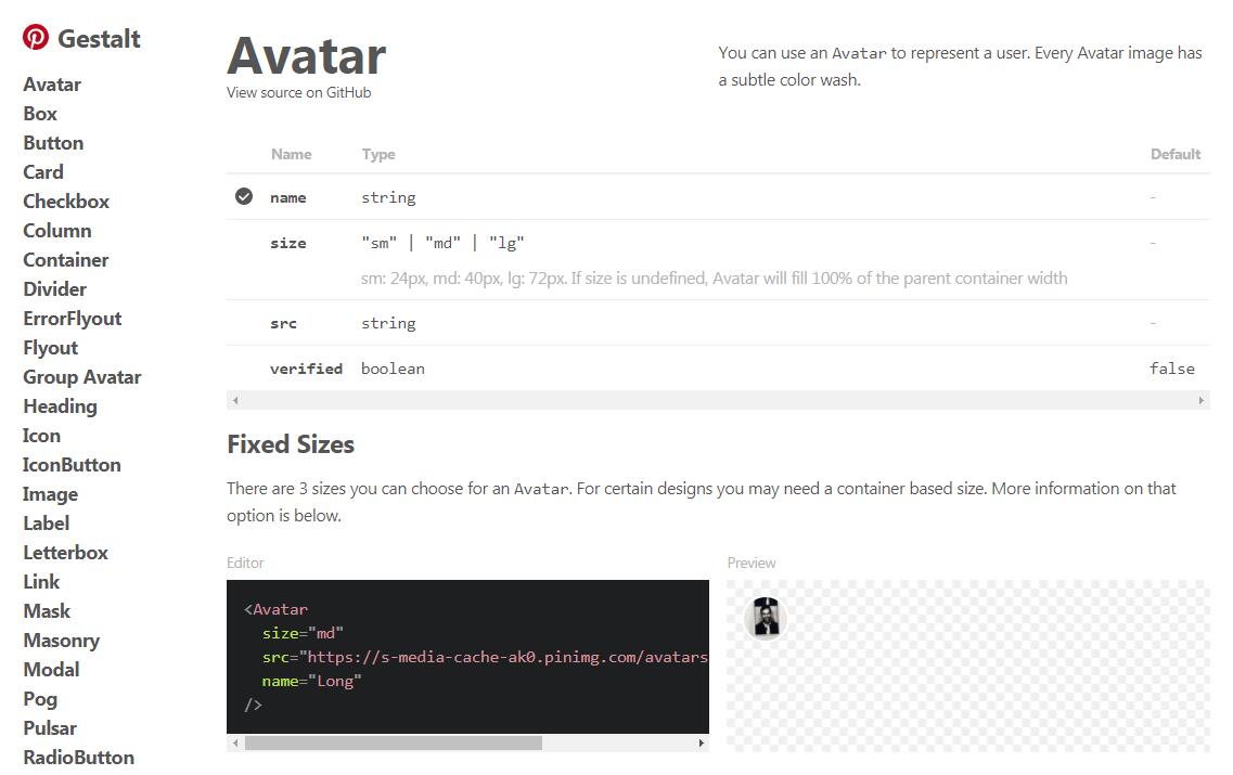
Options
| Name | Type | Default | Description |
|---|---|---|---|
| animate | {Boolean} |
true |
false to render with no animation |
| speed | {Number} |
2 |
Animation speed in seconds |
| className | {String} |
'' |
Classname in the <svg/> |
| width | {Number} |
400 |
viewBox width of <svg/> |
| height | {Number} |
130 |
viewBox height of <svg/> |
| preserveAspectRatio | {String} |
xMidYMid meet |
Aspect ratio option of <svg/> |
| primaryColor | {String} |
#f3f3f3 |
Background |
| secondaryColor | {String} |
#ecebeb |
Animation color |
| style | {Object} |
null |
Ex: { marginTop: '50px' } |
| uniquekey | {String} |
random unique id | Use the same key value, it works to Server Side Render |
Examples
Facebook Style
// import the component
import { Facebook } from 'react-content-loader'

const MyFacebookLoader = () => <Facebook />

Instagram Style
// import the component
import { Instagram } from 'react-content-loader'

const MyInstagramLoader = () => <Instagram />

Code Style
// import the component
import { Code } from 'react-content-loader'

const MyCodeLoader = () => <Code />

List Style
// import the component
import { List } from 'react-content-loader'

const MyListLoader = () => <List />

Bullet list Style
// import the component
import { BulletList } from 'react-content-loader'

const MyBulletListLoader = () => <BulletList />

Custom Style
For the custom mode, use the
online tool
const MyLoader = () => (
  <ContentLoader>
    {/* Pure SVG */}
    <rect x="0" y="0" rx="5" ry="5" width="70" height="70" />
    <rect x="80" y="17" rx="4" ry="4" width="300" height="13" />
    <rect x="80" y="40" rx="3" ry="3" width="250" height="10" />
  </ContentLoader>
)

Similars
Development
Fork the repo then clone it
$ git clone [email protected]:YourUsername/react-content-loader.git && cd react-content-loader
Install the dependencies
$ yarn
Run the storybook to see your changes
$ yarn storybook