react-tooltip
A tooltip component for React apps.
Installation
npm install --save @cypress/react-tooltip
Usage
import Tooltip from '@cypress/react-tooltip'

<Tooltip title="Hello World">
  <button>Click me</button>
</Tooltip>
The tooltip will automatically appear when mousing over the button and disappear when mousing out from the button.
Options
| option | default | description | supported values |
|---|---|---|---|
| title | undefined | Required. The tooltip content | Anything renderable by React (string, number, element, etc) |
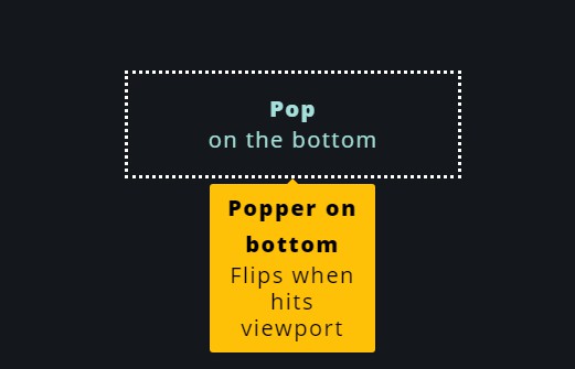
| placement | 'top' | The placement of the tooltip | Placements supported by popper.js |
| visible | undefined | Whether to show the tooltip when rendered. This overrides the default showing/hiding on mouse-over/mouse-out | true or false |
| className | 'tooltip' | Class applied to the tooltip | |
| wrapperClassName | '' | Class applied to the <span> that wraps the children of <Tooltip> |
|
| updateCue | undefined | A prop that indicates that the tooltip's position should update. If the size of the tooltip target changes while the tooltip is showing, the tooltip won't know to update its position. Set this to something that's tied to the target's size or just to a new value to trigger an update of the tooltip's position. |
