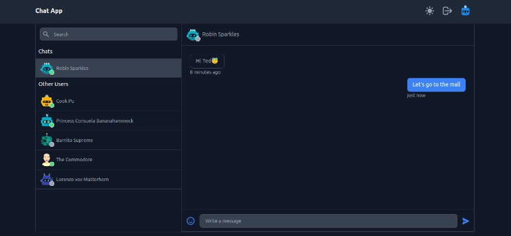
react-chat-widget
Awesome chat widget for your React App.
Features
- Plain text message UI
- Snippet style for links (only as responses for now)
- Fully customizable
- Easy to use
Installation
npm
npm install --save react-chat-widget
yarn
yarn add react-chat-widget
Usage
1- Add the Widget component to your root component
import React, { Component } from 'react';
import { Widget } from 'react-chat-widget';

import 'react-chat-widget/lib/styles.css';

class App extends Component {
  render() {
    return (
      <div className="App">
        <Widget />
      </div>
    );
  }
}

export default App;
2- The only required prop you need to use is the handleNewUserMessage, which will receive the input from the user.
import React, { Component } from 'react';
import { Widget } from 'react-chat-widget';

import 'react-chat-widget/lib/styles.css';

class App extends Component {
  handleNewUserMessage = (newMessage) => {
    console.log(`New message incomig! ${newMessage}`);
    // Now send the message throught the backend API
  }

  render() {
    return (
      <div className="App">
        <Widget
          handleNewUserMessage={this.handleNewUserMessage}
        />
      </div>
    );
  }
}

export default App;
3- Import the methods for you to add messages in the Widget. (See messages)
import React, { Component } from 'react';
import { Widget, addResponseMessage } from 'react-chat-widget';
import 'react-chat-widget/lib/styles.css';
class App extends Component {
componentDidMount() {
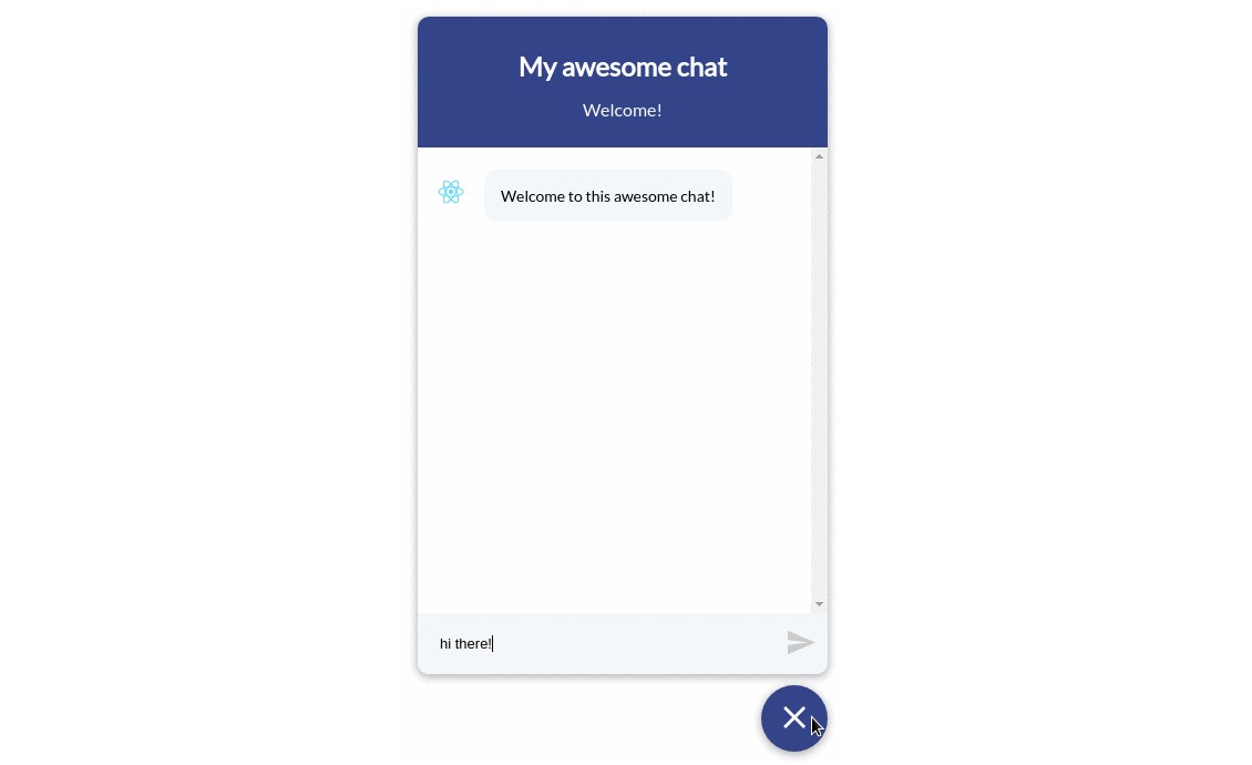
addResponseMessage("Welcome to this awesome chat!");
}
handleNewUserMessage = (newMessage) => {
console.log(`New message incomig! ${newMessage}`);
// Now send the message throught the backend API
addResponseMessage(response);
}
render() {
return (
<div className="App">
<Widget
handleNewUserMessage={this.handleNewUserMessage}
/>
</div>
);
}
}
export default App;
4- Customize the widget to match your app design! You can add both props to manage the title of the widget and the avatar it will use. Of course, feel free to change the styles the widget will have in the CSS
import React, { Component } from 'react';
import { Widget, addResponseMessage, addLinkSnippet, addUserMessage } from 'react-chat-widget';

import 'react-chat-widget/lib/styles.css';

import logo from './logo.svg';

class App extends Component {
  componentDidMount() {
    addResponseMessage("Welcome to this awesome chat!");
  }

  handleNewUserMessage = (newMessage) => {
    console.log(`New message incomig! ${newMessage}`);
    // Now send the message throught the backend API
  }

  render() {
    return (
      <div className="App">
        <Widget
          handleNewUserMessage={this.handleNewUserMessage}
          profileAvatar={logo}
          title="My new awesome title"
          subtitle="And my cool subtitle"
        />
      </div>
    );
  }
}

export default App;
API
Props
| type | required | default value | description | |
|---|---|---|---|---|
| handleNewUserMessage | PropTypes.func | YES | Function to handle the user input, will receive the full text message when submitted | |
| title | PropTypes.string | NO | 'Welcome' | Title of the widget |
| subtitle | PropTypes.string | NO | 'This is your chat subtitle' | Subtitle of the widget |
| senderPlaceHolder | PropTypes.string | NO | 'Type a message...' | The placeholder of the message input |
| profileAvatar | PropTypes.string | NO | The profile image that will be set on the responses | |
| titleAvatar | PropTypes.string | NO | The picture image that will be shown next to the chat title | |
| showCloseButton | PropTypes.bool | NO | false | Show or hide the close button in full screen mode |
| fullScreenMode | PropTypes.bool | NO | false | Allow the use of full screen in full desktop mode |
| badge | PropTypes.number | NO | 0 | Display a notification badge on the launcher if the value is greater than 0 |
| autofocus | PropTypes.bool | NO | true | Autofocus or not the user input |
| customLauncher | PropTypes.func | NO | Custom Launcher component to use instead of the default |
Styles
To change the styles you need the widget to have, simply override the CSS classes wrapping them within the containers and add your own style to them! All classes are prefixed with rcw- so they don't override your other classes in case you are not hasing them.
To verride, you can do, for expample:
.rcw-conversation-container > .rcw-header {
  background-color: red;
}

.rcw-message > .rcw-response {
  background-color: black;
  color: white;
}
That way, you can leave the JS clean and keep the styles within the CSS.
Messages
In order to add new messages, you are provided with the following methods:
-
addResponseMessage
- params:
- text
- Method to add a new message written as a response to a user input.
- params:
-
addUserMessage
- params:
- text
- This method will add a new message written as a user. Keep in mind it will not trigger the prop handleNewUserMessage()
- params:
-
addLinkSnippet
- params:
- link
- Method to add a link snippet. For now, you need to provide this method with a link object, which must be in the shape of:
{ title: 'My awesome link', link: 'https://github.com/Wolox/react-chat-widget', target: '_blank' } - By default,
targetvalue is_blankwhich will open the link in a new window.
- params:
-
renderCustomComponent
- params:
- component: Component to be render,
- props: props the component needs,
- showAvatar: boolean, default value: false; the component will be rendered with the avatar like the messages
- Method to render a custom component inse the messages container. With this method, you can add whatever component you need the widget to have.
- params:
Markdown is supported for the responses and user messages.
Widget behavior
You can also control certain actions of the widget:
-
toggleWidget
- params: No params expected
- This method is to toggle the widget at will without the need to trigger the click event on the launcher
-
toggleInputDisabled
- params: No params expected
- Method to toggle the availability of the message input for the user to write on
Widget components
Custom Launcher
You can use a custom component for the Launcher if you need one that's not the default, simply use the customLauncher prop like:
launcher={handleToggle => this.getCustomLauncher(handleToggle)}
getCustomLauncher()is a method that will return the Launchercomponent. By default, the function passed by that prop, will receive the handleToggle parammeter that is the method which toggles the widget.