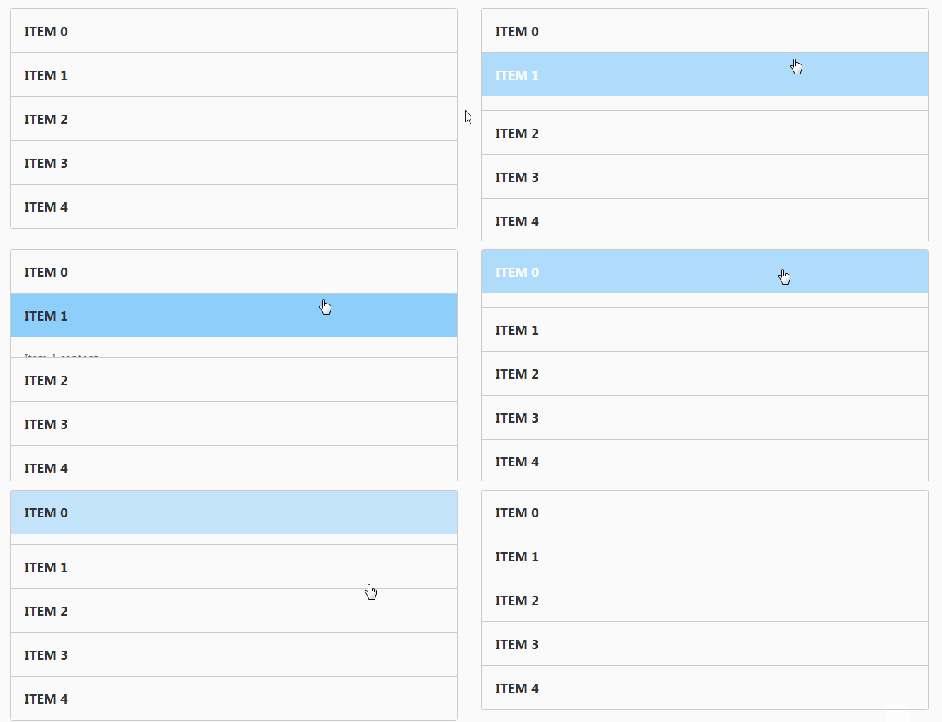
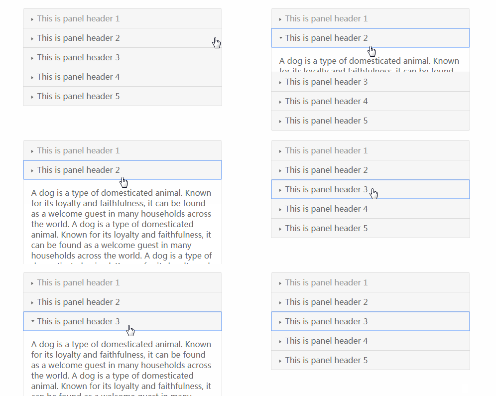
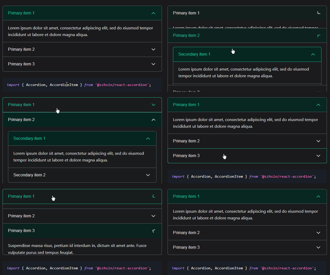
react-sanfona
React accordion component
Usage
Install via NPM:
npm install react-sanfona
Then:
import { Accordion, AccordionItem } from 'react-sanfona';

…

  render() {
    return (
      <Accordion>
        {[1, 2, 3, 4, 5].map(item => {
          return (
            <AccordionItem title={`Item ${item}`} expanded={item === 1}>
              <div>
                {`Item ${item} content`}
              </div>
            </AccordionItem>
          );
        })}
      </Accordion>
    );
  }

…
options / PropTypes
Accordion
| Property | Type | Description | Default |
|---|---|---|---|
| allowMultiple | Boolean |
Allow multiple items to be open at the same time. | false |
| openNextAccordionItem | Boolean |
Opens the next accordion item after the previous one is closed. Defaults first one as active and applies for each accordion item except the last one. | false |
| className | String |
Custom classname applied to root element | null |
| style | Object |
Inline styles applied to root element | null |
| onChange | Function |
Triggered when component updates and passes new state as an argument | null |
| rootTag | String |
Custom HTML tag used for root element | 'div' |
| duration | Number |
Open/close transition duration in milliseconds | 300 |
| easing | String |
Open/close transition easing | 'ease' |
AccordionItem
| Property | Type | Description | Default |
|---|---|---|---|
| title | String/ Object |
Text or Object to display in header. | null |
| expanded | Boolean |
If item body should be expanded or not | false |
| onExpand | Function |
Callback for when item is expanded | null |
| onClose | Function |
Callback for when item closes | null |
| className | String |
Custom classname applied to root item element | null |
| bodyClassName | String |
Custom classname applied to the accordion item body | null |
| expandedClassName | String |
Custom classname applied when accordion is expanded | null |
| titleClassName | String |
Custom classname applied to accordion item header text | null |
| disabled | Boolean |
If item should be disabled or not | false |
| disabledClassName | String |
Custom classname applied to accordion item header text when item is disabled | null |
| rootTag | String |
Custom HTML tag used for root element | 'div' |
| titleTag | String |
Custom HTML tag used for title element | 'h3' |
| bodyTag | String |
Custom HTML tag used for body element | 'div' |
| duration | Number |
Open/close transition duration in milliseconds | 300 |
| easing | String |
Open/close transition easing | 'ease' |
Styling with classnames
| Classname | Targets |
|---|---|
react-sanfona |
Accordion container |
react-sanfona-item |
AccordionItem container |
react-sanfona-item-expanded |
AccordionItem container when expanded |
react-sanfona-item-title |
AccordionItem header text |
react-sanfona-item-body |
AccordionItem body container |
react-sanfona-item-body-wrapper |
AccordionItem body children wrapper |
react-sanfona-item-disabled |
AccordionItem is disabled |
development
npm install

npm start // served on localhost:8080

npm test


