? React headless accordion
React-headless-accordion is a set of simple components ready to be inserted into your project. These unstyled components allow you to make a nested chord that matches the style you want.
Features
- ✅ Infinite nesting of the accordion
- ✅ Customization of the accordion style
- ✅ Accordion elements remain open when another element is open (Optional).
- ✅ Default opening of some element (Optional).
Why ❔
An accordion with the above characteristics is above all indispensable in many projects. It will be useful on a project where you have to make an accordion from scratch.
With react-headless-accordion we only focus on the style of the accordion rather than implementing all that logic.
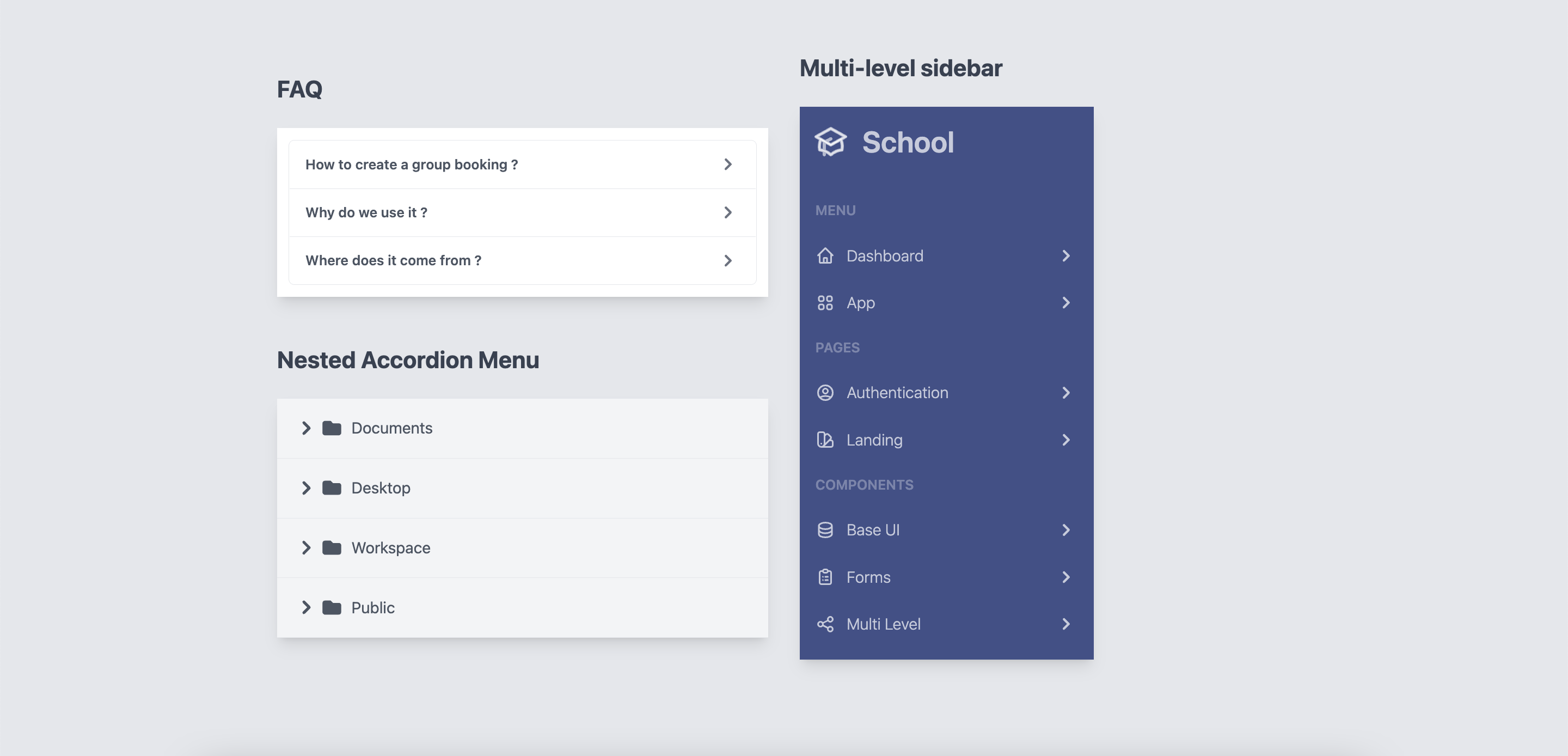
Examples of online usage
You can find examples of use at here
Install
You can use yarn
yarn add react-headless-accordion
Or via npm
npm install react-headless-accordion
Make sure you have installed the peer dependencies as well with the below versions.
"react": "^18.2.0"
Usage
This component also exports a tiny CSS file built by tailwind. All CSS classes used in designing and customizing the select component are all custom tailwind classes which ensures that an existing tailwind project would not need to include this CSS file again.
Basic example
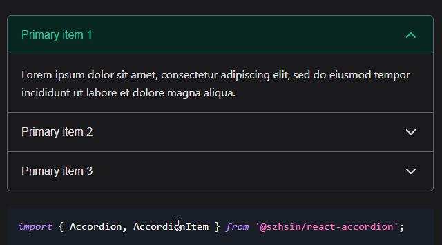
The accordion is built using the components Accordion, AccordionItem, AccordionHeader and AccordionBody.
Clicking on AccordionHeader will automatically open the AccordionBody with a transition.
import {Accordion, AccordionBody, AccordionHeader, AccordionItem} from "react-headless-accordion";

const App = () => {
    return (
        <Accordion>
            <AccordionItem>
                <AccordionHeader>
                    <h3 className={`accordion-title`}>Title 1</h3>
                </AccordionHeader>

                <AccordionBody>
                    <div className="accordion-body">
                        Lorem ipsum dolor sit amet.
                    </div>
                </AccordionBody>
            </AccordionItem>

            <AccordionItem>
                <AccordionHeader>
                    <h3 className={`accordion-title`}>Title 2</h3>
                </AccordionHeader>

                <AccordionBody>
                    <div className="accordion-body">
                        Lorem ipsum dolor sit amet.
                    </div>
                </AccordionBody>
            </AccordionItem>
        </Accordion>
    );
};

export default App;
Nested accordion
If you want to nest an accordion in another one, just put an AccordionItem in an AccordionBody.
<Accordion>
    <AccordionItem>
        <AccordionHeader>
            <h3 className={`accordion-title`}>Title 1</h3>
        </AccordionHeader>

        <AccordionBody>
            <div className="accordion-body">
                <AccordionItem>
                    <AccordionHeader>
                        <h3 className={`accordion-title`}>Title 1</h3>
                    </AccordionHeader>

                    <AccordionBody>
                        <div className="accordion-body">
                            Lorem ipsum dolor sit amet.
                        </div>
                    </AccordionBody>
                </AccordionItem>
            </div>
        </AccordionBody>
    </AccordionItem>
</Accordion>
Info
? You can nest one accordion in another infinitely.
Styling different states
Each AccordionItem exposes an open variable about its current state via render props that you can use to conditionally apply different styles or render different content.
import {Accordion, AccordionBody, AccordionHeader, AccordionItem} from "react-headless-accordion";

const App = () => {
    const data = [
        {title: "Title 1", content: "Lorem ipsum dolor sit amet."},
        {title: "Title 2", content: "Lorem ipsum dolor sit amet."},
        {title: "Title 3", content: "Lorem ipsum dolor sit amet."},
    ];
    return (
        <Accordion>
            {data.map((item, index) => (
                <AccordionItem key={index}>
                    {({open}) => (
                        <>
                            <AccordionHeader>
                                <h3 className={`accordion-title ${open ? 'accordion-active' : ''}`}>{item.title}</h3>
                            </AccordionHeader>

                            <AccordionBody>
                                <div className="accordion-body">
                                    {item.content}
                                </div>
                            </AccordionBody>
                        </>
                    )}
                </AccordionItem>
            ))}
        </Accordion>
    );
};

export default App;
Rendering a different tag for accordion components
By default, the components provided by react-headless-component except AccordionItem have a default tag. But you can change them.
| Components | Default Tags |
|---|---|
Accordion |
div |
AccordionHeader |
button |
AccordionBody |
div |
If you want to change the tag of one of the react-headless-accordion components you can use the Props as.
Example AccordionBody
<AccordionBody as={"ul"}>
    Lorem ipsum dolor sit amet.
</AccordionBody>
Styling accordion
All components exposed by react-headless-accordion except AccordionItem offer a Props className to style them.
Example using Tailwindcss
import {Accordion, AccordionBody, AccordionHeader, AccordionItem} from "react-headless-accordion";
import {Chevron} from "../components"

const App = () => {
    return (
        <Accordion transition={{duration: "300ms", timingFunction: "cubic-bezier(0, 0, 0.2, 1)"}}>
            <AccordionItem>
                {({open}) => (
                    <>
                        <AccordionHeader className="w-full flex justify-between items-center text-gray-600 border-b p-4">
                            <span>What is react-headless-accordion?</span>
                            <svg class={`w-6 h-6 ${!open ? '' : 'rotate-90'}`} fill="currentColor" viewBox="0 0 20 20" xmlns="http://www.w3.org/2000/svg"><path fillRule="evenodd" d="M7.293 14.707a1 1 0 010-1.414L10.586 10 7.293 6.707a1 1 0 011.414-1.414l4 4a1 1 0 010 1.414l-4 4a1 1 0 01-1.414 0z" clipRule="evenodd" /></svg>
                        </AccordionHeader>

                        <AccordionBody>
                            <div className="p-5 font-light">
                                Lorem ipsum dolor sit amet.
                            </div>
                        </AccordionBody>
                    </>
                )}
            </AccordionItem>
        </Accordion>
    );
};

export default App;
Transition
To animate the opening/closing of the accordion, use the Props transition available on the Accordion component.
<Accordion transition={{duration: "300ms", timingFunction: "cubic-bezier(0, 0, 0.2, 1)"}}>
    <AccordionItem>
        <AccordionHeader>{/* ... */}</AccordionHeader>
        <AccordionBody>{/* ... */}</AccordionBody>
    </AccordionItem>
</Accordion>
Props
Accordion
| Props | Type | Default | Description |
|---|---|---|---|
as |
String |
div |
The HTML tag that will be used to render Accordion. |
alwaysOpen |
Boolean |
false |
Accordion items stay open when another item is opened. |
className |
string |
“ | CSS classes to style the component |
transition |
Object |
{duration: "300ms", timingFunction: "cubic-bezier(0, 0, 0.2, 1)"} |
The transition of opening / closing of the accordion. |
AccordionItem
| Props | Type | Default | Description |
|---|---|---|---|
isActive |
Bollean |
false |
Indicates if the AccordionItem is open / closed by default |
Info
? To avoid any unexpected behavior. Remember not to be
isActiveto true for Accordion of the same level while thealwaysOpenis not to true..
AccordionHead
| Props | Type | Default | Description |
|---|---|---|---|
as |
String |
button |
The HTML tag that will be used to render AccordionHead. |
className |
string |
“ | CSS classes to style the component. |
onClick |
Function |
undefined |
This function is called when you click on AccordionHead. |
AccordionBody
| Props | Type | Default | Description |
|---|---|---|---|
as |
String |
button |
The HTML tag that will be used to render AccordionBody. |
className |
String |
button |
CSS classes to style the component. AccordionBody. |
Contributing
Got ideas on how to make this better? Open an issue!
Thanks
These components are inspired by the react version of headlessui headlessui.
I thank you in advance for your contribution to this project.
License
MIT Licensed. Copyright (c) Lewhe Onesine 2022.