React-contexify
A declarative context menu for React !
⚠️ The v3 introduces a lot of breaking changes. Please consider reading the migration guide.
Installation
$ yarn add react-contexify
or
$ npm install --save react-contexify
Usage
The gist
import { ContextMenu, Item, Separator, Submenu, ContextMenuProvider } from 'react-contexify';
import 'react-contexify/dist/ReactContexify.min.css';

const onClick = ({ event, ref, data, dataFromProvider }) => console.log('Hello');
// create your menu first
const MyAwesomeMenu = () => (
    <ContextMenu id='menu_id'>
       <Item onClick={onClick}>Lorem</Item>
       <Item onClick={onClick}>Ipsum</Item>
       <Separator />
       <Item disabled>Dolor</Item>
       <Separator />
       <Submenu label="Foobar">
        <Item onClick={onClick}>Foo</Item>
        <Item onClick={onClick}>Bar</Item>
       </Submenu>
    </ContextMenu>
);

const App = () => (
    <div>
        <h1>Welcome to My App</h1>
        <ContextMenuProvider id="menu_id">
            <div>Some Content ... </div>
        </ContextMenuProvider>
        <MyAwesomeMenu />
    </div>
);
Wrap component with the Component of your choice
The ContextMenuProvider expose a component prop to let you do render a custom component or any valid html tag.
Html tag
If you just want to replace the default html tag, just pass the desired tag to component:
const ComponentWithMenu = (props) => (
  <ContextMenuProvider id="menu_id" component="li">
    <h4>{props.cel1}</h4>
    <h4>{props.cel2}</h4>
  </ContextMenuProvider>
);
Custom Component
If you want to use a custom component, it works like react-router. Don't forget to render the chilren and
to grab the event to trigger the context menu:
const CustomComponent = ({ children, ...rest  }) => (
 <aside {...rest}>
    <div>
        {children}
    </div>
 </aside>
);

const ComponentWithMenu = (props) => (
  <ContextMenuProvider id="menu_id" component={CustomComponent}>
    <h4>{props.cel1}</h4>
    <h4>{props.cel2}</h4>
  </ContextMenuProvider>
);
Using a render props
You can also use a render props:
const ComponentWithMenu = (props) => (
  <ContextMenuProvider id="menu_id" render={({ children, ...rest  }) => (
      <aside {...rest}>
        <div>
            {children}
        </div>
    </aside>)}
    >
    <h4>{props.cel1}</h4>
    <h4>{props.cel2}</h4>
  </ContextMenuProvider>
);
Disable an Item
You can disable an Item with a boolean or a callback. When a callback is used, a boolean must be returned. The callback has access to the same parameter as the onClick callback.
const isDisabled = ({ event, ref, data, dataFromProvider }) => {
    return true;
}

<ContextMenu id='menu_id'>
    <Item disabled>Foo</Item>
    <Item disabled={isDisabled}>Bar</Item>
</ContextMenu>
Disable a submenu
Disable a Submenu is simple as disabling an Item. The disabled callback is slightly different, there is no data param.
<ContextMenu id='menu_id'>
    <Item>Foo</Item>
    <Submenu label="Submenu" disabled>
        <Item>Bar</Item>
    </Submenu>
</ContextMenu>
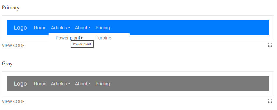
Change the Submenu arrow
<ContextMenu id='menu_id'>
    <Item>Foo</Item>
    <Submenu label="Submenu" arrow="?">
        <Item>Bar</Item>
    </Submenu>
    <Separator />
    <Submenu label="Submenu" arrow={<i className="rocket">?</i>}>
        <Item>Bar</Item>
    </Submenu>
</ContextMenu>
The onClick callback
The onClick callback of the Item component gives you access to an object with 4 properties:
event
The event property refers to the native event which triggered the menu. It can be used to access the mouse coordinate or any other event prop.
const onClick = ({ event, ref, data, dataFromProvider }) => {
    // Accessing the mouse coordinate
    console.log(event.clientX, event.clientY);
}
ref
If you wrap a single react component ref will be the mounted instance of the wrapped component.
If you wrap more than one component ref will be an array containing a ref of every component.
ref will be an instance of the react component only if the component is declared as a class
For more details about ref please read this
- With a single component
const Wrapped = () => (
    <ContextMenuProvider id="id">
        <Avatar id="foobar" />
    </ContextMenuProdider>
);

const onClick = ({ event, ref, data, dataFromProvider }) => {
   // Retrieve the Avatar id
   console.log(ref.props.id);
}
- With more than one component
const Wrapped = () => (
    <ContextMenuProvider id="id">
        <Avatar id="foobar" />
        <Avatar id="plop" />
    </ContextMenuProdider>
);

const onClick = ({ event, ref, data, dataFromProvider }) => {
   // Print foobar
   console.log(ref[0].props.id);

   // Print plop
   console.log(ref[1].props.id);
}
- With an html node, the ref contains the html node ?
const Wrapped = () => (
    <ContextMenuProvider id="id">
        <div id="foobar" data-xxx="plop">bar</div>
    </ContextMenuProdider>
);

const onClick = ({ event, ref, data, dataFromProvider }) => {
   // Retrieve the div id
   console.log(ref.id);

   // Access the data attribue
   console.log(ref.dataset.xxx);
}
With more than one html node wrapped you get an array as well.
data
const onClick = ({ event, ref, data, dataFromProvider }) => {
   // Print Ada
   console.log(data.name);
}

const YourMenu = () => (
    <ContextMenu>
        <Item data={name: 'Ada'} onClick={onClick}>Hello</Item>
    </ContextMenu>
);
dataFromProvider
The data prop passed to the ContextMenuProvider is accessible for every Item as dataFromProvider.
const Wrapped = () => (
    <ContextMenuProvider id="id" data={name: 'Ada'}>
        <div id="foobar" data-xxx="plop">bar</div>
    </ContextMenuProdider>
);

const onClick = ({ event, ref, data, dataFromProvider }) => {
   // Print Ada Again
   console.log(dataFromProvider.name);
}
Why use destructuring assignment?
- As a developer, pick only what you want:
({ ref }) => {} - As a maintainer, easier to extend the library:
({ event, ref, data, dataFromProvider, theFithParameter }) => {} 'destructuring'.substring(-1, 8)?
Api
ContextMenuProvider
| Props | Default | Required | Description |
|---|---|---|---|
| id: string | number | - | ✓ | Id used to map your component to a context menu |
| component: node | 'div' | ✘ | The component used to wrap the child component |
| render: function | - | ✘ | Render props |
| event: string | 'onContextMenu' | ✘ | Same as React Event (onClick, onContextMenu ...). Event used to trigger the context menu |
| data: any | - | ✘ | Data are passed to the Item onClick callback. |
| storeRef: boolean | true | ✘ | Store ref of the wrapped component. |
| className: string | - | ✘ | Additional className |
| style: object | - | ✘ | Additional style |
<ContextMenuProvider id="menu_id" data={foo: 'bar'}>
    <MyComponent />
</ContextMenuProvider>
ContextMenu
| Props | Required | Possible Value | Description |
|---|---|---|---|
| id: string | number | ✓ | - | Used to identify the corresponding menu |
| style: object | ✘ | - | An optional style to apply |
| className: string | ✘ | - | An optional css class to apply |
| theme: string | ✘ | light | dark | Theme is appended to react-contexify__theme--${given theme} |
| animation: string | ✘ | fade | flip | pop | zoom | Animation is appended to .react-contexify__will-enter--${given animation} |
// You can set built-in theme and animation using the provided helpers as follow
import { ContextMenu, Item, theme, animation } from 'react-contexify';

<ContextMenu id="foo" theme={theme.dark} animation={animation.pop}>
    <Item>Foo</Item>
    <Item disabled>Bar</Item>
    {/* and so on  */}
</ContextMenu>
Submenu
| Props | Default | Required | Description |
|---|---|---|---|
| label: node | - | ✓ | Submenu label. It can be a string or any node element like <div>hello</div> |
| disabled: bool | ({ event, ref, dataFromProvider }) => bool | false | ✘ | Disable the item. If a function, it must return a boolean. |
| arrow: node | - | ✘ | Define a custom arrow |
Item
| Props | Default | Required | Description |
|---|---|---|---|
| disabled: bool | ({ event, ref, data, dataFromProvider }) => bool | false | ✘ | Disable the item. If a function, it must return a boolean. |
| onClick: ({ event, ref, data, dataFromProvider }) => void | - | ✘ | Callback when the item is clicked |
| data: any | - | ✘ | Additional data that will be passed to the callback |
Separator
Don't expect any props. It's just a separator xD.
<Separator />
IconFont
| Props | Required | Description |
|---|---|---|
| className: string | ✘ | Additional className |
| style: object | ✘ | Additional style |
The icon font renders a i tag. It's just a helper
//example with Font Awesome
<Item>
    <IconFont className="fa fa-trash" />Delete
</Item>
//example with material icons
<Item>
    <IconFont className="material-icons">remove_circle</IconFont>Delete
<Item>
To-Do
- [ ] Allow keyboard navigation
- [ ] Switch or not to styled component?
- [ ] Accessibility
- [ ] RTL support
Migration from v2 to v3
A huge part of the code has been reviewed. The api has been simplified.
- There is no more
leftIconandrightIconon theItemcomponent. Do<Item><IconFont className="fa fa-delete" /> delete</Item>instead - The
menuProviderHOC has been removed. You can create yours easely - The
onClickcallback use destructuring assignment over explicit parameter renderTagas been replaced bycomponentandrenderprops. Same api as react-router