wc-toast
Add notifications component easily using wc-toast. Vanilla JavaScript web component notification inspired by react-hot-toast
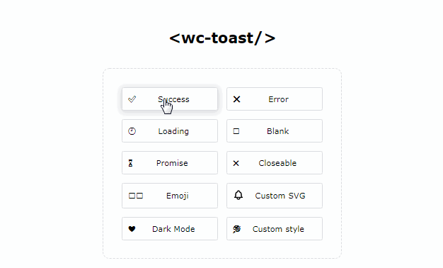
Features
- ✍? Easy to use
- ? Use anywhere you like – React? Vue? Svelte? Everywhere!
- ?? Emoji and SVG Support
- ? Customizable
- ? Promise API
- ✅ Accessible – Tested using Windows 10 Narrator
- ? Lightweight – Only ~3.6KB Minified+Gzipped including styles
- ? Dark Mode
Installation
Add from NPM
npm i wc-toast
or import from CDN
import { toast } from 'https://cdn.skypack.dev/wc-toast';
Demo
or just try it on https://abdmmar.github.io/wc-toast
Usage and Example
Basic Usage
-
Make sure you’ve add
wc-toastto your app through NPM or CDN. See Installation for more details. -
Add
wc-toastto your app and placed it at the top.<body> <wc-toast></wc-toast> <button class="toast"></button> </body> -
Start toasting! Call it from anywhere in your app.
import { toast } from 'wc-toast'
// or if you use CDN:
// import { toast } from 'https://cdn.skypack.dev/wc-toast';

document.querySelector('.toast').addEventListener('click', () => {
  toast('Hello world!');
});
Example
Guide
Styling
You can customize style of wc-toast-item through custom properties
Default
wc-toast-item
--wc-toast-background: #fff;
--wc-toast-max-width: 350px;
--wc-toast-stroke: #2a2a32;
--wc-toast-color: #000;
--wc-toast-font-family: 'Roboto', sans-serif;
--wc-toast-font-size: 16px;
--wc-toast-border-radius: 8px;
--wc-toast-content-margin: 4px 10px;
API
toast()
toast(
   message: string,
   options: {
      icon: {
        type: 'success' | 'loading' | 'error' | 'custom' | 'svg';
        content: string;
   };
   duration: number | 4000;
   theme: {
      type: 'light' | 'dark' | 'custom';
      style: {
         background: string;
         color: string;
         stroke: string;
      };
   };
})
wc-toast
<wc-toast position="top-left | top-right | top-center | bottom-left | bottom-right | bottom-center">
   <slot></slot>
</wc-toast>
wc-toast-item
<wc-toast-item
   type="success | loading | error | blank | custom"
   theme="light | dark | custom"
   duration="number | 3500 | 6000000">
   <slot></slot>
</wc-toast-item>
wc-toast-icon
<wc-toast-icon icon="string" type="success | loading | error | blank | custom">
   <slot name="svg"></slot>
</wc-toast-icon>
wc-toast-content
<wc-toast-content message="string">
   <slot name="message"></slot>
   <slot name="content"></slot>
</wc-toast-content>
wc-toast-close-button
<wc-toast-close-button></wc-toast-close-button>
Contributing
See CONTRIBUTING.md
Credit
Thanks to react-hot-toast for an amazing library and such an inspiration. If you build a React project and need notifications, you should check out this library.