buttered-toast
An incredibly simple toast notification system for React.
- Only 894 byte (gzipped)
- No dependencies
- No styling, only logic
- No configuration
- No nonsense
- Render components
- No JSX during usage
This is a solution I’m using in several projects, so I decided to extract this into its own package. The existing libraries out there require you to add JSX elements to your React tree and render them based on conditions (controlled way). I never liked such solutions, I prefer a simple function call to show my toast.
Installation
npm install buttered-toast
Usage
Add context provider
import { ToastContextProvider } from 'buttered-toast'

const App = ({ children }) => <ToastContextProvider>{children}</ToastContextProvider>
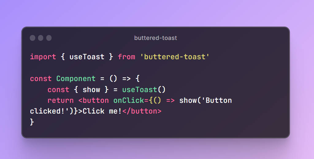
useToast hook
import { useToast } from 'buttered-toast'

const Component = () => {
    const { show } = useToast()
    return <button onClick={() => show('Button clicked!')}>Click me!</button>
}
API and Customization
Exports
ToastContextProvideruseToastdefaultOptionsToastContext
ToastContextProvider
This is a React context provider that provides the state for useToast hooks. You must have this at least once in your
React tree.
Props
options– An object of options to override the default options. SeedefaultOptionsfor more information.
useToast
This is a React hook that provides the show function to show a toast.
const { show } = useToast()
show
This function takes a two arguments argument. The content to show in the toast and an optional options object to
override the options for this specific toast.
content– The content to show in the toast. This can be anything that React can render aschildren.options(optional) – An object of options to override the default options. SeedefaultOptionsfor more information.
show(<>Button clicked!</>)
show(<MyToastStyle>Button clicked!</MyToastStyle>)
defaultOptions
An object of default options. These options can be overridden by passing an options object to the
ToastContextProvider.
duration– The duration in milliseconds to show the toast. Defaults to3000.ref– A ref to the toast element. Defaults tonull. In case arefis provided, React’screatePortalwill be used to render the toast. If norefis provided, the toast will be rendered in theToastContextProvider.Wrapper– A wrapper component to wrap the toast in. Defaults to and “empty component”:({ children }) => children.wrapperProps– Props to pass to the wrapper component. Defaults to{}.
ToastContext
This is the React context that is provided by the ToastContextProvider. You can use this context to create your own.
Styling
This library does not provide any styling. You can style your toast by creating your own Toast component, and/or by styling your Wrapper element.
Advanced example
import { ToastContextProvider, defaultOptions } from 'buttered-toast'

const App = ({ children }) => (
    <ToastContextProvider
        options={{
            ...defaultOptions,
            duration: 5000,
            Wrapper: ({ children, title }) => (
                <div className="my-wrapper">
                    <div className="my-title">{title}</div>
                    {children}
                </div>
            ),
            wrapperProps: { title: 'System notification' }
        }}
    >
        {children}
    </ToastContextProvider>
)
import { useToast } from 'buttered-toast'

const Component = () => {
    const { show } = useToast()
    return (
        <button
            onClick={() =>
                show(<ToastStyle>Button clicked!</ToastStyle>, {
                    duration: 10000,
                    wrapperProps: { title: 'What just happened?' }
                })
            }
        >
            Click me!
        </button>
    )
}