@datepicker-react/styled
An easily internationalizable, accessible, mobile-friendly datepicker library for the web, build with styled-components.
Live Playground
To run that demo on your own computer:
- Clone this repository
yarn install && yarn bootstrapyarn storybook- Visit
ttp://localhost:6006/
Getting Started
Install
yarn add @datepicker-react/styled styled-components
Include component
import {DateRangeInput, DateSingleInput, Datepicker} from '@datepicker-react/styled'
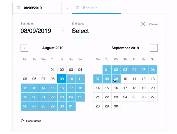
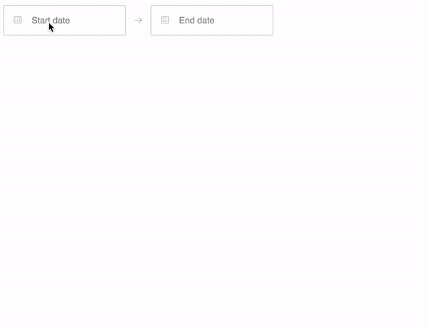
DateRangeInput
The DateRangeInput is a fully controlled component that allows users to select a date range. You
can control the selected dates using the startDate, endDate, and onDatesChange props as shown
below. Similarly, you can control which input is focused as well as calendar visibility (the
calendar is only visible if focusedInput is defined) with the focusedInput and onFocusChange
props as shown below.
Here is the minimum REQUIRED setup you need to get the DateRangeInput working:
import React, {useReducer} from 'react'
import {DateRangeInput} from '@datepicker-react/styled'

const initialState = {
  startDate: null,
  endDate: null,
  focusedInput: null,
}

function reducer(state, action) {
  switch (action.type) {
    case 'focusChange':
      return {...state, focusedInput: action.payload}
    case 'dateChange':
      return action.payload
    default:
      throw new Error()
  }
}

function App() {
  const [state, dispatch] = useReducer(reducer, initialState)

  return (
    <DateRangeInput
      onDatesChange={data => dispatch({type: 'dateChange', payload: data})}
      onFocusChange={focusedInput => dispatch({type: 'focusChange', payload: focusedInput})}
      startDate={state.startDate} // Date or null
      endDate={state.endDate} // Date or null
      focusedInput={state.focusedInput} // START_DATE, END_DATE or null
    />
  )
}
The following is a list of other OPTIONAL props you may provide to the DateRangeInput to
customize appearance and behavior to your heart's desire.
displayFormat?: string | FormatFunction // Default: 'MM/DD/YYYY'
phrases?: DateRangeInputPhrases
showStartDateCalendarIcon?: boolean // Default: true
showEndDateCalendarIcon?: boolean // Default: true
onClose?(): void
vertical?: boolean // Default: false
showResetDates?: boolean // Default: true
showSelectedDates?: boolean // Default: true
showClose?: boolean // Default: true
rtl?: boolean // Default: false
placement?: 'top' | 'bottom' // Default: bottom
minBookingDate?: Date
maxBookingDate?: Date
numberOfMonths?: number // Default: 2
minBookingDays?: number // Default: 1
exactMinBookingDays?: boolean // Default: false
firstDayOfWeek?: FirstDayOfWeek // Default: 1
initialVisibleMonth?(numberOfMonths: number): MonthType[]
isDateBlocked?(date: Date): boolean
dayLabelFormat?(date: Date): string
weekdayLabelFormat?(date: Date): string
monthLabelFormat?(date: Date): string
onDayRender?(date: Date): React.ReactNode
Datepicker
The Datepicker is a fully controlled component that allows users to select a date range. You can
control the selected dates using the startDate, endDate, and onDatesChange props as shown
below. Similarly, you can control which input is focused with the focusedInput prop.
Here is the minimum REQUIRED setup you need to get the Datepicker working:
import React, {useState} from 'react'
import {Datepicker, START_DATE} from '@datepicker-react/styled'

function App() {
  const [state, setState] = useState({
    startDate: null,
    endDate: null,
    focusedInput: START_DATE,
  })

  function handleDatesChange(data: OnDatesChangeProps) {
    if (!data.focusedInput) {
      setState({...data, focusedInput: START_DATE})
    } else {
      setState(data)
    }
  }

  return (
    <Datepicker
      onDatesChange={handleDatesChange}
      startDate={state.startDate} // Date or null
      endDate={state.endDate} // Date or null
      focusedInput={state.focusedInput} // START_DATE, END_DATE or null
    />
  )
}
The following is a list of other OPTIONAL props you may provide to the Datepicker to customize
appearance and behavior to your heart's desire.
phrases?: DatepickerPhrases
displayFormat?: string | FormatFunction // Default: 'MM/DD/YYYY'
onClose?(): void
showResetDates?: boolean // Default: true
showSelectedDates?: boolean // Default: true
showClose?: boolean // Default: true
vertical?: boolean // Default: false
rtl?: boolean // Default: false
minBookingDate?: Date
maxBookingDate?: Date
numberOfMonths?: number // Default: 2
minBookingDays?: number // Default: 1
exactMinBookingDays?: boolean // Default: false
firstDayOfWeek?: FirstDayOfWeek // Default: 0
initialVisibleMonth?(numberOfMonths: number): MonthType[]
isDateBlocked?(date: Date): boolean
dayLabelFormat?(date: Date): string
weekdayLabelFormat?(date: Date): string
monthLabelFormat?(date: Date): string
onDayRender?(date: Date): React.ReactNode
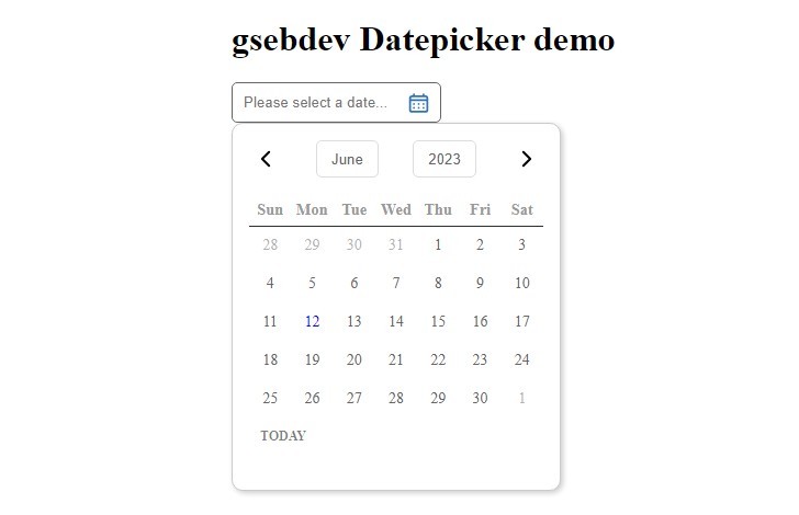
DateSingleInput
The DateSingleInput is a fully controlled component that allows users to select a date. You can
control the selected date using the date and onDateChange props as shown below. Similarly, you
can control calendar visibility (the calendar is only visible if showDatepicker is true) with
the showDatepicker and onFocusChange props as shown below.
Here is the minimum REQUIRED setup you need to get the DateSingleInput working:
import React, {useReducer} from 'react'
import {DateSingleInput} from '@datepicker-react/styled'

const initialState = {
  date: null,
  showDatepicker: false,
}

function reducer(state, action) {
  switch (action.type) {
    case 'focusChange':
      return {...state, showDatepicker: action.payload}
    case 'dateChange':
      return action.payload
    default:
      throw new Error()
  }
}

function App() {
  const [state, dispatch] = useReducer(reducer, initialState)

  return (
    <DateSingleInput
      onDateChange={data => dispatch({type: 'dateChange', payload: data})}
      onFocusChange={focusedInput => dispatch({type: 'focusChange', payload: focusedInput})}
      date={state.date} // Date or null
      showDatepicker={state.showDatepicker} // Boolean
    />
  )
}
The following is a list of other OPTIONAL props you may provide to the DateSingleInput to
customize appearance and behavior to your heart's desire.
minBookingDate?: Date
maxBookingDate?: Date
numberOfMonths?: number
firstDayOfWeek?: FirstDayOfWeek
displayFormat?: string | FormatFunction
phrases?: DateSingleInputPhrases
showCalendarIcon?: boolean
vertical?: boolean
showResetDate?: boolean
showClose?: boolean
rtl?: boolean
placement?: 'top' | 'bottom'
initialVisibleMonth?(numberOfMonths: number): MonthType[]
isDateBlocked?(date: Date): boolean
onClose?(): void
dayLabelFormat?(date: Date): string
weekdayLabelFormat?(date: Date): string
monthLabelFormat?(date: Date): string
onDayRender?(date: Date): React.ReactNode
Theming
@datepicker-react/styled supports theming with Styled components ThemeProvider and
Styled System theme-based style.
<ThemeProvider
  theme={{
    breakpoints: ['32em', '48em', '64em'],
    reactDatepicker: {
      daySize: [36, 40],
      fontFamily: 'system-ui, -apple-system',
      colors: {
        accessibility: '#D80249',
        selectedDay: '#f7518b',
        selectedDayHover: '#F75D95',
        primaryColor: '#d8366f',
      },
    },
  }}
>
  ...
</ThemeProvider>