reaction-component-library
This is a single project with a package of commerce-focused React UI components and the code for the Reaction Design System website:
- @reactioncommerce/components: See the package.json in /package folder.
- Reaction Design System: See the root package.json.
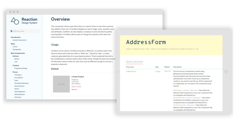
We use the React Styleguidist package to run and build the Reaction Design System website, and running the style guide locally doubles as an interactive playground for developing and testing the components.
The Reaction Style Guide and component library is documentation of the components we use to build Reaction Commerce apps. The style guide includes design guidelines, patterns, examples, and theming information. You can play with the component examples and see what happens. All of these components can also be imported into your own browser apps from the @reactioncommerce/components NPM package.