POC Next SSR media queries
TLDR: useMediaQuery is more versatile, and future prood. Fresnel is ok.
The Problem
How can we best deliver Server Side Rendered (SSR) pages that drastically differ
from mobile to desktop views to an extent where rendering the wrong version on
the server would be undesirable when compared to performing no SSR at all.
Scenario
We have a page that is built from two API queries. Each of them are quite slow.
The mobile design only requires one of these queries to be complete while the
browser version requires both of them.
Implementations
Implementation 0: Baseline
In the initial scenario we hide the mobile part of the application using CSS
and no pre-fetching is done on the server:
<Grid item xs={0} display={{ xs: "none", sm: "block" }} sm={3}>
    <UserProfile />
</Grid>
<Grid item xs={12} sm={9}>
    <AddressesTable />
</Grid>
The good:
- Without JS, the first render is appropriate to the current device size
The bad:
- Since data is loaded after mounting, the first render will be incomplete
- Since we are using CSS to hide unwanted parts of the app, those parts of the
app will still be part of the initial HTML load. - Likewise, on mobile, the unnecessary query from
<UserProfile />will still be
performed. - Since the React tree will include nodes that are not part of the DOM.
- Testing for visibility is hard since the visibility of the tree is determined by CSS
- Readability is hard, specially given that the
displaycontrol would probably end up
in a css distant from the JSX.
Implementation 1: Custom Component
The first improvement is the addition of a custom component that abstracts away
the css logic. Implementation logic looks like this:
const MobileOnly = styled("div")(({ theme }) => ({
  all: "inherit",

  [theme.breakpoints.up("sm")]: {
    display: "none",
  },
}));
And usage of these components like this:
    <AppContainer title={"Example 1: Css based components"}>
      <DesktopOnly>
        <HomePageDesktop />
      </DesktopOnly>
      <MobileOnly>
        <HomePageMobile />
      </MobileOnly>
    </AppContainer>
Although this may look enticing at first glance it pretty much keeps the same
problems of the first implementation. It improves code readability and consistency,
but also deteriorates the DOM representation by the addition of one additional node
that is otherwise not necessary.
Implementation 2: Media query hook
This is the most kosher solution available:
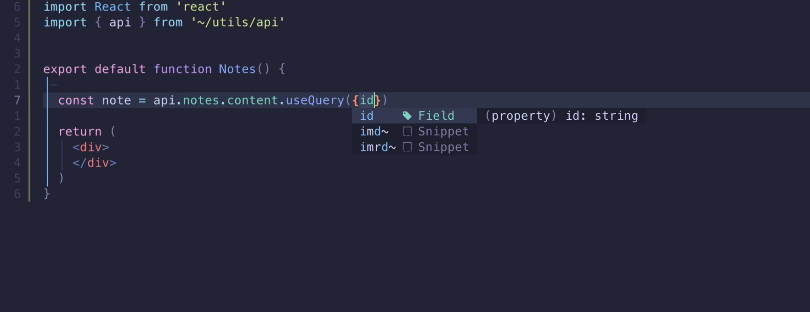
const IndexPage: NextPage = () => {
  const isDesktop = useMediaQuery<Theme>((theme) => theme.breakpoints.up("sm"));
  return (
    <AppContainer title={"Example 2: media query hook"}>
      {isDesktop ? <HomePageDesktop /> : <HomePageMobile />}
    </AppContainer>
  );
The good:
- Correct tree representation, which makes testing trivial.
- This is the most idiomatic solution, and therefore the most readable.
- With correct default value, we can do “mobile first”, guaranteeing the ideal layout
for the critical scenario - No useless HTML sent on first render
- Since only half of the three is computed, no useless requests are fired
The bad:
- Defaults to mobile first on first render, completely missing the mark for the desktop
scenario
Implementation 3: Fresnel
Fresnel as a library provides a more complete
implementation of solution 1. How does the code look:
    <AppContainer title={"Example 3: Fresnel"}>
      <Media at="xs">
        <HomePageDesktop />
      </Media>
      <Media greaterThanOrEqual="sm">
        <HomePageMobile />
      </Media>
    </AppContainer>
The good:
- Fresnel uses css for the initial layout, but then JS takes over so that we have
the best “of both worlds” - Correct tree representation, which makes testing trivial.
- Since only half of the three is computed, no useless requests are fired
- Purely declarative approach makes for a readable solution.
- The API allows for more than a simple
isMobile ? : a : bwith no damage
to code readability
The bad:
- Useless HTML is still sent to the client on first render.
Summary of Examples with client side queries
MY conclusions as a table:
| 0: Baseline | 1: Custom Component | 2: Media query hook | 3: Fresnel | |
|---|---|---|---|---|
| [Perf] Correct first render with no JS (M) | ✅ | ✅ | ✅ | ✅ |
| [Perf] Correct first render with no JS (D) | ✅ | ✅ | ❌ | ✅ |
| [Perf] Correct data on first request (M) | ❌ | ❌ | ✅ | ✅ |
| [Perf] Correct data on first request (D) | ✅ | ✅ | ✅ | ✅ |
| [Perf] Correct HTML on first request (M) | ❌ | ❌ | ✅ | ❌ |
| [Perf] Correct HTML on first request (D) | ❌ | ❌ | ❌ | ❌ |
| [DX] Correct tree representation | ❌ | ❌ | ✅ | ✅ |
| [DX] Code readability / safeness | ❌ | ✅ | ✅ | ✅ |
| [DX] Testability | ❌ | ❌ | ✅ | ✅ |
There are therefor 2 viable options: Fresnel and Media query hook.
The main difference between the 2 comes down to which API you like the most. useMediaQuery returns a JS primitive which means the sky is the
limit. Multiple queries can be combined and more complex scenarios devisedas. On the other hand, Fresnel declarative approach allows for clear
code to be clear. Objectively, I would consider this a tie between the two. Subjectively, I prefer the most versatile, future proof, and well
established useMediaQuery solution
In terms of delivery each of these libraries has an advantage and disadvantage.
useMediaQuery only renders one path of the tree, which we should default to the mobile one. Fresnel computes the entire tree and all
possible paths so that both scenarios are ready to show on the client. So in the end we have to choose whether we value reducing the
payload we sent to the customer or we prefer to have a solution that covers all basis. I expect that the payload and server time difference will
be minimal so Fresnel has an edge in this regard.
SSR queries pre fetching
In these scenarios we do server side query pre-fetching before showing the page. Only Fresnel and Media query hook are considered
since the other solutions already provide no advantage.
Implementation 4: Media query hook with pre-fetching
In this scenario we do a pre fetch of all the queries:
export const getServerSideProps: GetServerSideProps<
  ReactQueryPageProps
> = async () => {
  const queryClient = new QueryClient();

  await Promise.all([
    prefetchAddresses(queryClient),
    prefetchUserData(queryClient),
  ]);

  return {
    props: {
      dehydratedState: dehydrate(queryClient),
    },
  };
};
This takes the load of doing the requests to the server, where we can assume that they would happen significantly faster.
However, we will be doing both queries in all scenarios leading to a useless query being done on the mobile scenario.
Implementation 5: Media query hook with smart pre-fetching
Altough not a feature of any of the two libraries, we can still make a smart guess of which type the device the user
is using. Device user-agent manipulation is rare on mobile, so we can use that for an educated first guess of which
version of the page to show:
export const getServerSideProps: GetServerSideProps<IndexPageProps> = async ({ req }) => {
  const queryClient = new QueryClient();
  const userAgent = req.headers["user-agent"];
  const isDesktop =
    !!userAgent && !Boolean(userAgent.match(MATCH_MOBILE_USER_AGENTS));

  await Promise.all([
    prefetchAddresses(queryClient),
    isDesktop && prefetchUserData(queryClient),
  ]);

  return {
    props: {
      isDesktopDeviceDetected: isDesktop,
      dehydratedState: dehydrate(queryClient),
    },
  };
};

// On the component
  const isDesktop = useMediaQuery<Theme>((theme) => theme.breakpoints.up("sm"), {
    defaultMatches: isDesktopDeviceDetected,
  });
This basically brings useMediaQuery to an ideal scenario. Where it does the correct first
render both Mobile and Desktop, as well as avoiding unnecessary data acquisition. There will
be edge cases where the wrong page is computed on the SSR and the client will make some adaptations
and follow up requests, but those should be the exception and not the rule.
Implementation 6: Fresnel with smart pre-fetching
Fresnel Can also leverage this strategy for the pre-fetching, making sure that only the necessary
queries are fetched on the server. However, with fresnel the entire DOM tree will still get computed
leading to unnecessary Server work, and unnecessary payload being delivered in the form of HTML.
Summary of Examples with server side queries
| 4: Media query with pre-fetching | 5: Media query with (smart) pre-fetching | 6: Fresnel with (smart) pre-fetching | |
|---|---|---|---|
| [Perf] Correct first render with no JS (M) | ✅ | ✅ | ✅ |
| [Perf] Correct first render with no JS (D) | ❌ | ✅ | ✅ |
| [Perf] Correct data on first request (M) | ✅ | ✅ | ✅ |
| [Perf] Correct data on first request (D) | ❌ | ✅ | ✅ |
| [Perf] Correct HTML on first request (M) | ✅ | ✅ | ❌ |
| [Perf] Correct HTML on first request (D) | ❌ | ✅ | ❌ |
| [DX] Correct tree representation | ✅ | ✅ | ✅ |
| [DX] Code readability / safeness | ✅ | ✅ | ✅ |
| [DX] Testability | ✅ | ✅ | ✅ |
Discussion
My subjective opinion is that Fresnel although an interesting API represents a risk without enough benefits
to justify it.
From a pure React point of view, Fresnel breaks one of the ground rules of React where elements that are not
intended to be part of the DOM should not get rendered. Fresnel does this so that feature complete HTML is
delivered. This makes perfect sense for static websites where it’s feasible to deliver a product that does not
require JS to execute. This is however the type of product Hublo is delivering.
useMediaQuery on the other hand provides a much more kosher react API, that, since it’s JS based, is more
future proof. In fact, The logic done on implementation 5, could be abstracted away into a custom Hook that
delivers the same functionality in a similar fashion.
Fresnel is a valid option if we are not performing any complex server side rendering with most of our data
fetching queries being done on the client. IT however locks us out of more complex implementations in the future
and should not be chosen pur app is more of PWA than a blog.