Chroma React
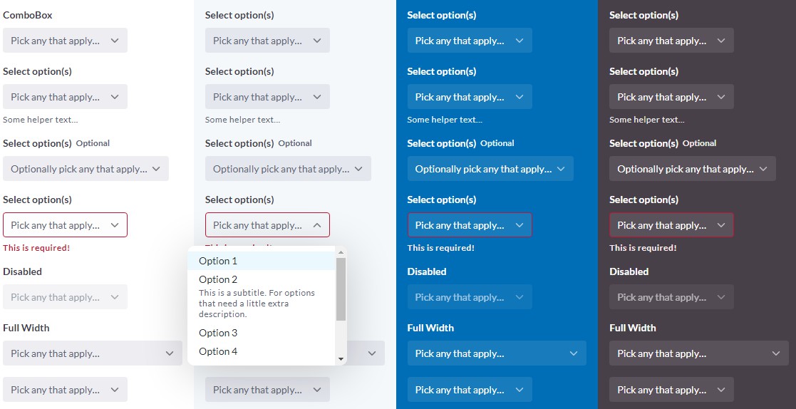
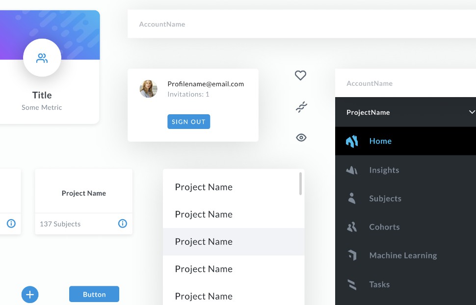
Chroma is an open source design system from the team at LifeOmic. It is built with React and TypeScript. The goal of Chroma is to provide design-approved components to developers to speed up their development process and build visual consistency throughout web applications.


Usage
To get started with Chroma, follow these steps:
- Install dependencies
yarn add @lifeomic/chroma-react @material-ui/styles react-router-dom
Chroma leverages @material-ui/styles for CSS-in-JS and react-router-dom for link-related components.
- Wrap your application with the
ThemeProviderprovided by Chroma.
import { ThemeProvider } from '@lifeomic/chroma-react/styles';

function App({ children }) {
  return <ThemeProvider>{children}</ThemeProvider>;
}
- Start using components!
import { Button } from '@lifeomic/chroma-react/components/Button';

<Button variant="contained">Button</Button>;
Theming
Want to override the default theme of Chroma? No problem!
- Create your component-level overrides and palette overrides. Chroma leverages Material-UI's global theme variation to override specific component styles.
// theme.ts
import {
  createPalette,
  createTheme,
  Theme,
} from '@lifeomic/chroma-react/styles';
import { Overrides } from '@lifeomic/chroma-react/styles/overrides';

// The overrides specified here will be *global* component overrides!
export const overrides = (theme: Theme): Overrides => ({
  ChromButton: {
    root: {
      background: 'red',
    },
    outlined: {
      border: '1px solid red',
    },
  },
});

export const palette = createPalette({
  primary: {
    main: '#02bff1',
  },
});

export const theme = createTheme({
  overrides,
  palette,
});
- Update your theme provider.
import { ThemeProvider } from '@lifeomic/chroma-react/styles';
import { theme } from './theme';

function App({ children }) {
  return <ThemeProvider theme={theme}>{children}</ThemeProvider>;
}
Importing Component Styles Only?
Need to build a custom component, but want to use the styles hook of an existing Chroma component?
import { useStyles } from '@lifeomic/chroma-react/components/Button/Button';

const CustomButton = ({}) => {
  const classes = useStyles({});
  return <button className={classes.root}>Custom Button</button>;
};


