Introduction
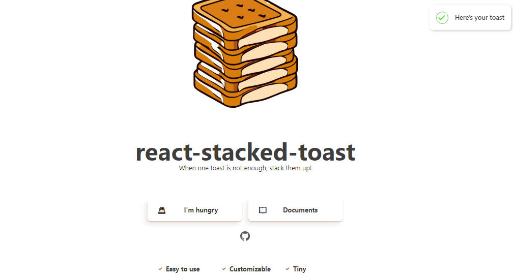
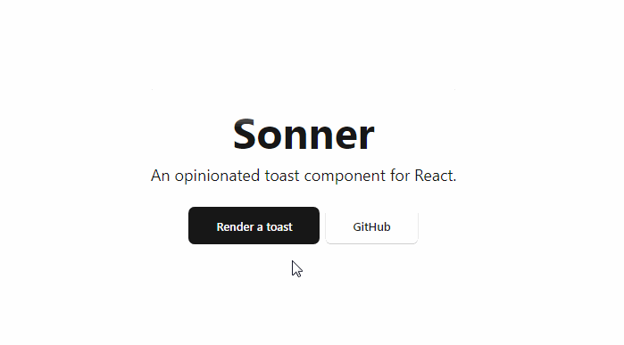
Sonner is an opinionated toast component for React. It’s customizable, but styled by default. Comes with a swipe to dismiss animation.
Usage
To start using the library, install it in your project:
npm install sonner
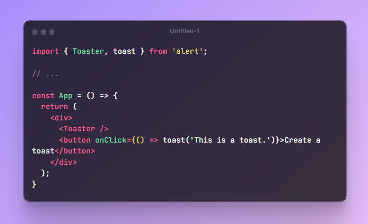
Add <Toaster /> to your app, it will be the place where all your toasts will be rendered.
After that you can use toast() from anywhere in your app.
import { Toaster, toast } from 'sonner';

// ...

function App() {
  return (
    <div>
      <Toaster />
      <button onClick={() => toast('My first toast')}>Give me a toast</button>
    </div>
  );
}
Types
Default
Most basic toast. You can customize it (and any other type) by passing an options object as the second argument.
toast('Event has been created');
With icon and description:
toast('Event has been created', {
  description: 'Monday, January 3rd at 6:00pm',
  icon: <MyIcon />,
});
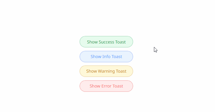
Success
Render a checkmark icon in front of the message.
toast.success('Event has been created');
Error
Renders an error icon in front of the message.
toast.error('Event has not been created');
Action
Renders a button.
toast('Event has been created', {
  action: {
    label: 'Undo',
    onClick: () => console.log('Undo'),
  },
});
Promise
Starts in a loading state and will update automatically after the promise resolves or fails.
toast.promise(() => new Promise((resolve) => setTimeout(resolve, 2000)), {
  loading: 'Loading',
  success: 'Success',
  error: 'Error',
});
Custom
Render custom JSX.
toast.custom(() => <div>This is a custom component</div>);
Customization
Theme
You can change the theme using the theme prop. Default theme is light.
<Toaster theme="dark" />
Position
You can change the position through the position prop on the <Toaster /> component. Default is bottom-right.
// Available positions
// top-left, top-center, top-right, bottom-left, bottom-center, bottom-right

<Toaster position="top-center" />
Expanded
Toasts can also be expanded by default through the expand prop. You can also change the amount of visible toasts which is 3 by default.
<Toaster expand visibleToasts={9} />
Styling for all toasts
You can style your toasts globally with the toastOptions prop in the Toaster component.
<Toaster toastOptions={{ style: { background: 'red' }, className: 'my-toast' }} />
Styling for individual toast
toast('Event has been created', {
  style: {
    background: 'red',
  },
  className: 'my-toast',
});
Close button
Add a close button to all toasts that shows on hover by adding the closeButton prop.
<Toaster closeButton />
Rich colors
You can make error and success state more colorful by adding the richColors prop.
<Toaster richColors />
Custom offset
Offset from the edges of the screen.
<Toaster offset="80px" />
Keyboard focus
You can focus on the toast area by pressing ⌥/alt + T. You can override it by providing an array of event.code values for each key.
<Toaster hotkey={['KeyC']} />