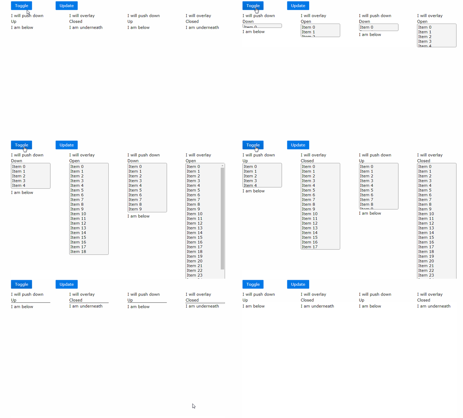
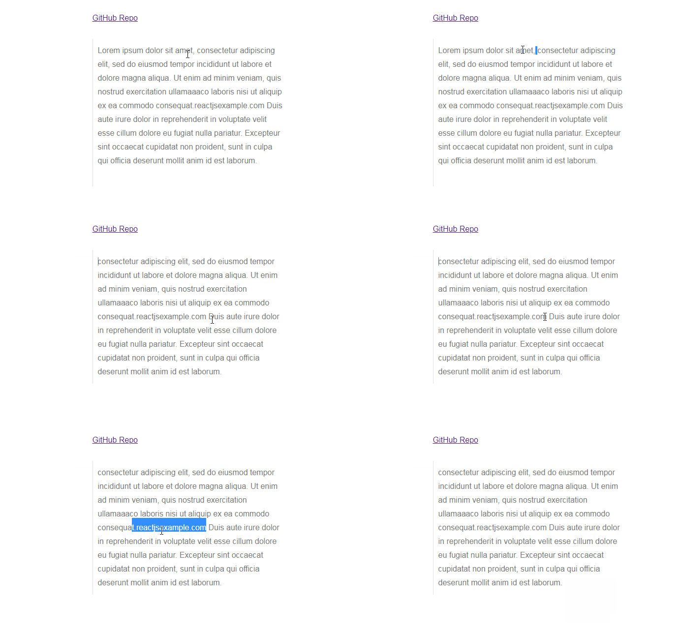
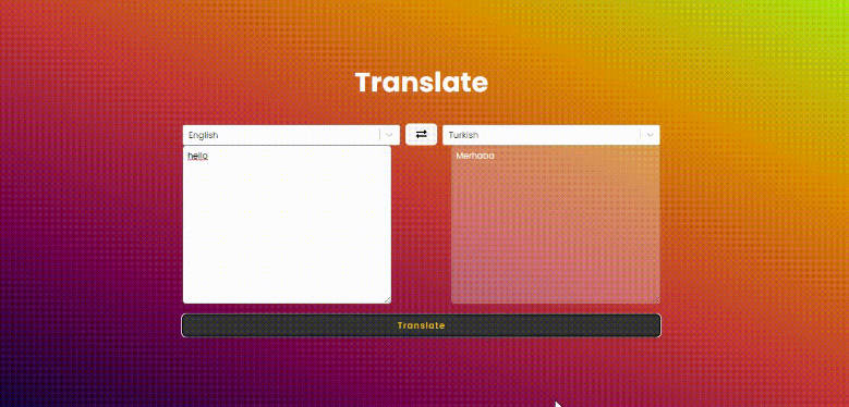
react-slidedown
React component which uses CSS to animate a child from its current height to height: auto when mounting/updating/unmounting.
Overview
CSS does not currently support animating element height to height: auto and so normally javascript is used to achieve this effect.
This component uses CSS to perform the animation, following an algorithm (first described here). The desired height of the element is calculated, and then css is used to transition that height. After the transition has completed the height is set to height: auto.
react-slidedown is perfect for dropdown lists, popup menus, accordions and closeable panels which have varying sized content.
I am not aware of any cross-browser issues from IE10 and onwards.
Installation
npm install react-slidedown --save
Usage
Simply wrap the component you want to slide with the SlideDown component:
import React from 'react'

import {SlideDown} from 'react-slidedown'
import 'react-slidedown/lib/slidedown.css'

export function MyDropdown(props) {
  return (
    <SlideDown className={'my-dropdown-slidedown'}>
      {props.open ? props.children : null}
    </SlideDown>
  )
}
In the example above the css file needed by react-slidedown is included via JavaScript which is the normal way of doing things when using webpack css-loader, it is also populated in the style property of package.json so if you are using parcelify it should get included automatically. Otherwise it is also possibe to import it from css:
@import "node_modules/react-slidedown/lib/slidedown.css";
Props
| Property | Type | Default | Required? | Description |
|---|---|---|---|---|
| closed | Boolean | false |
No | If false renders in closed mode, if true then slides down |
| className | String | No | CSS class name to be used in addition to the react-slidedown class name |
|
| transitionOnAppear | Boolean | true |
No | Do a transition animation on componentWillAppear() |
Example
To quickly see a live demonstration of react-slidedown go here.
To build and run this example project:
git clone https://github.com/frankwallis/react-slidedown.git
cd react-slidedown
npm install
npm start
Customisation
You can customise the transition used for the animation by overriding styles on the SlideDown component:
.react-slidedown.my-dropdown-slidedown {
    transition-duration: 1.2s;
    transition-timing-function: cubic-bezier(0.1, 0.7, 1.0, 0.1);
}
The default values used are:
.react-slidedown {
    transition-duration: .5s;
    transition-timing-function: ease-in-out;
}
