react-toggled
Component to build simple, flexible, and accessible toggle components.
The problem
You want a toggle component that's simple and gives you complete control over rendering and state.
This solution
This follows the patterns in downshift to expose an API that renders nothing and simply encapsulates the logic of a toggle component.
Installation
This module is distributed via [npm][npm] which is bundled with [node][node] and
should be installed as one of your project's dependencies:
npm install --save react-toggled
This package also depends on
reactandprop-types. Please make sure you
have those installed as well.
Note also this library supports
preactout of the box. If you are using
preactthen look in thepreact/folder and use the module you want.
You should be able to simply do:import Toggle from 'react-toggled/preact'
Usage
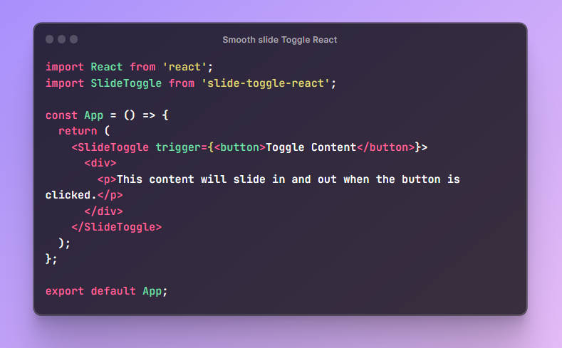
import React from 'react'
import {render} from 'react-dom'
import Toggle from 'react-toggled'

render(
  <Toggle>
    {({on, getTogglerProps}) => (
      <div>
        <button {...getTogglerProps()}>Toggle me</button>
        <div>{on ? 'Toggled On' : 'Toggled Off'}</div>
      </div>
    )}
  </Toggle>,
  document.getElementById('root'),
)
react-toggled is the only component. It doesn't render anything itself, it just
calls the child function and renders that. Wrap everything in
<Toggle>{/* your function here! */}</Toggle>.
Props:
defaultOn
boolean| defaults tofalse
The initial on state.
onToggle
function(on: boolean, object: TogglerStateAndHelpers)| optional, no useful default
Called when the toggler is clicked.
on: The new on stateTogglerStateAndHelpers: the exact same thing you get in your child render
prop function.
on
boolean| control prop
react-toggled manages its own state internally and calls your onToggle
handler whenever the on state changes. Your child render prop function
(read more below) can be used to manipulate this state from within the render
function and can likely support many of your use cases.
However, if more control is needed, you can pass the on state as a prop
and that state becomes controlled. As soon as
this.props.on !== undefined, internally, react-toggled will determine
its state based on your prop's value rather than its own internal state. You
will be required to keep the state up to date (this is where onToggle comes in
really handy), but you can also control the state from anywhere, be
that state from other components, redux, react-router, or anywhere else.
Note: This is very similar to how normal controlled components work elsewhere
in react (like<input />). If you want to learn more about this concept, you
can learn about that from this the
["Controlled Components" lecture][controlled-components-lecture] and
exercises from [React Training's][react-training] > [Advanced React][advanced-react] course.
children
function({})| required
This is called with an object.
This is where you render whatever you want to based on the state of react-toggled.
The function is passed as the child prop:
<Toggle>{/* right here*/}</Toggle>
| property | category | type | description |
|---|---|---|---|
on |
state | boolean |
The current on state of toggle |
getTogglerProps |
prop getter | function(props: object) |
returns the props you should apply to the button element you render. Includes aria- attributes |
getInputTogglerProps |
prop getter | function(props: object) |
returns the props you should apply to the input (checkbox) element you render. Includes aria- attributes |
getElementTogglerProps |
prop getter | function(props: object) |
returns the props you should apply to the element you render. Use this if you are not using a button or input—for example, a span. Includes aria- attributes |
setOn |
action | function() |
Sets the on state to true |
setOff |
action | function() |
Sets the on state to false |
toggle |
action | function() |
Toggles the on state (i.e. if it's currently true, will set to false) |
Examples
Examples exist on [codesandbox.io][examples]:
If you would like to add an example, follow these steps:
- Fork this codesandbox
- Make sure your version (under dependencies) is the latest available version.
- Update the title and description
- Update the code for your example (add some form of documentation to explain what it is)
- Add the tag:
react-toggled:example
You'll find other examples in the stories/examples folder of the repo.
And you'll find
a live version of those examples here
Inspiration
I built this while building [an example of using glamorous with next.js][glamorous-with-next]
Other Solutions
You can implement any of the other solutions using react-toggled, but if
you'd prefer to use these out of the box solutions, then that's fine too. There
are tons of them, so just
checkout npm.


