React Expandify ?
Animated, lightweight expandable components for React. No extras, just effortless expand and collapse.
? Demo

? Features
- ? Plug and Play: Get started instantly, no complicated setup!
- ? Elemental Freedom: Use any HTML element as your expandable container.
- ? Your Style, Your Rules: Easy-to-add custom classes.
- ⏱ Tick Tock Goes The Clock: Control the expand and collapse speed to the millisecond!
? Installation
Add React Expandify to your project with npm:
npm install react-expandify
Or use yarn:
yarn add react-expandify
? Usage
Basic example:
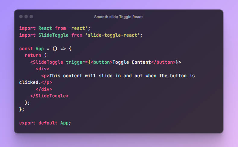
import { Expandable } from 'react-expandify';
import 'react-expandify/dist/style.css';

const MyApp = () => (
  <Expandable expanded>
    <p>Your awesome content here!</p>
  </Expandable>
);
? Documentation
| Property | Type | Default | Description |
|---|---|---|---|
expanded |
boolean |
false |
Determines whether the content is expanded or not. |
children |
ReactNode |
– | Children to be rendered inside the component. |
elementType |
JSX.IntrinsicElements |
'div' |
The HTML element type for the Expandable component. |
expandDuration |
number |
300 |
Duration for the expand animation in milliseconds. |
collapseDuration |
number |
300 |
Duration for the collapse animation in milliseconds. |
easing |
string |
ease-in-out |
Easing function for the expand and collapse animations. |
className |
string |
– | Additional className for the Expandable component. |
onCollapse |
() => void |
– | Callback when the content has collapsed. |
onExpand |
() => void |
– | Callback when the content has expanded. |
✨ What You Can Create
Tree view |
Accordion component |
Toggles |
More examples coming soon… |


? Contributing
Got ideas or bug reports? Open an issue or send a pull request!
? License
Licensed under the MIT License. See LICENSE for more details.
Crafted with ? by Armen Nersisyan