cardon
Allows to create the cards used on the pages once and allows them to be called as an async function on all screens.
Make reusable React cards, pop-ups or modals as an async function.
Installation
Install cardon as a dependency
# Yarn
$ yarn add cardon

# NPM
$ npm install cardon
Usage
Just need the 'CardonContainer' and 'withCardon' methods to use it.
| Component Name | Description |
|---|---|
| CardonContainer | Creates an instance for the cards and all cards are displayed inside here. |
| withCardon | Wraps the component you want to show as a card and injects properties named 'visible' and 'get' inside it and then returns an interface to use it. |
withCardon Injected props
| Name | Type | Description |
|---|---|---|
| visible | boolean | The prop indicates whether the card should be visible or not. This value will change according to the call of the 'show' or 'hide' function |
| get | WithCardonGet | The prop is a callback generator function and all callback function must be created by calling the 'get' function to return the desired callback value. Only created callback functions via 'get' should be used in cards to works properly. |
Every card returns two functions named 'show' and 'hide' when called it
withCardon methods after wrapped
| Name | Type |
Description |
|---|---|---|
| show | (props?: P, callback?: (result: R) => void) => Promise<R> | The function to be called to show the card. It returns a promise with the data and waits until the card is closed or can be used the callback function with the second parameter. The card will be hidden automatically after the result return it. |
| hide | () => void | Allows the card to be canceled and hidden without waiting for data to return. It does not need to be used generally, but can be used according to the situation. |
We could pass options with the second parameter for withCardon(component, props)
withCardon props
| Name | Type | Default Value | Description |
|---|---|---|---|
| destroyOnHide | boolean | false | Enables destroy the component while hiding. When you do not change this property, the component will not be removed from the root and you will need to hide it with the 'visible' property manually. |
Example
There are few simple steps to use:
- Put the
CardonContainercomponent to the root file
// App.js
function App() {
  return (
    <div>
       <Main />
+      <CardonContainer />
    </div >
  );
}
export default App;
-
Create a folder named
'cardon'or any name and after put your cards there. -
Wrap the component you want to use as a card like below
Example reusable card:
// ./cardon/MyModalCard.jsx
import { withCardon } from "cardon";
import React from "react";
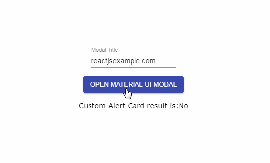
function MyModalCard({ visible, get, title }) {
return (
<Modal open={visible} onClose={get(null)}>
My Reusable '{title}' Modal!
<button onClick={get(true)}>Yes</button>
<button onClick={get(false)}>No</button>
</Modal>
);
}
export default withCardon(MyModalCard);
Or with Typescript:
// ./cardon/MyModalCard.tsx
import { withCardon } from "cardon";
import React from "react";

interface Props {
    title: string
}
function MyModalCard({ visible, get, title }) {
  return (
    <div>
      My Reusable '{title}' Card!
      <button onClick={get(true)}>Yes</button>
      <button onClick={get(false)}>No</button>
    </div>
  );
}
export default withCardon<Props, boolean>(MyModalCard)
Alternative card usage with 'destroyOnHide' options:
(It is required to destroy the card if the card is not using the 'visible' prop)
// ./cardon/MyModalCard.jsx
import React from "react";
import { withCardon } from "cardon";

function MyModalCard({ get, title }) {
  return (
    <div>
      My Reusable '{title}' Card!
      <button onClick={get(true)}>Yes</button>
      <button onClick={get(false)}>No</button>
    </div>
  );
}
export default withCardon(MyModalCard, { destroyOnHide: true });
- Import the component and call the '
show' function to show it, pass props as optional to card and get the result asynchronously
Example call:
let result = await MyModalCard.show({ title: "Awesome" });
Example usage:
import React from "react";
import { MyModalCard } from "./cardon/MyModalCard";
function HomePage() {
  const [modalResult, setModalResult] = React.useState(false);
  const showModal = async () => {
    let result = await MyModalCard.show({ title: "Awesome" });
    setModalResult(result);
  };

  return (
    <>
      {modalResult ? "Yes" : "No"}
      <button onClick={showModal}>Show</button>
    </>
  );
}
API
Check here for the API document