Tailwind-Styled-Component
Create tailwind css react components like styled components with classes name on multiple lines

Before ?
<div className=`flex ${primary ? "bg-indigo-600" : "bg-indigo-300"} inline-flex items-center border border-transparent text-xs font-medium rounded shadow-sm text-white hover:bg-indigo-700 focus:outline-none`>
After ?
<Button $primary={false}>
const Button = tw.div`
    ${(p) => (p.$primary ? "bg-indigo-600" : "bg-indigo-300")}

    flex
    inline-flex
    items-center
    border
    border-transparent
    text-xs
    font-medium
    rounded
    shadow-sm
    text-white

    hover:bg-indigo-700
    focus:outline-none
`
Features
♻️ Reusable
? Extendable
? Compatible with Styled Components
⚡️ Use props like every React Component
? Stop editing 400+ characters lines
? Cleaner code in the render function
Install
Using npm
npm i -D tailwind-styled-components
Using yarn
yarn add -D tailwind-styled-components
⚠️ This extension requires TailwindCSS to be installed and configured on your project too. Install TailwindCSS
[Optional] Configure IntelliSense autocomplete on VSCode
First, install Tailwind CSS IntelliSense VSCode extension
https://marketplace.visualstudio.com/items?itemName=bradlc.vscode-tailwindcss
Then add these user settings (How to edit VSCode settings?)
"tailwindCSS.includeLanguages": {
    "typescript": "javascript", // if you are using typescript
    "typescriptreact": "javascript"  // if you are using typescript with react
},
"editor.quickSuggestions": {
    "strings": true // forces VS Code to trigger completions when editing "string" content
},
"tailwindCSS.experimental.classRegex": [
    "tw`([^`]*)", // tw`...`
    "tw\\.[^`]+`([^`]*)`", // tw.xxx<xxx>`...`
    "tw\\(.*?\\).*?`([^`]*)" // tw(Component)<xxx>`...`
]
Usage
Import
import tw from "tailwind-styled-components"
Basic
Create a Tailwind Styled Component with Tailwind rules that you can render directly
const Container = tw.div`
    flex
    items-center
    justify-center
    flex-col
    w-full
    bg-indigo-600
`
render(
    <Container>
        <div>Use the Container as any other React Component</div>
    </Container>
)
Will be rendered as
<div class="flex items-center justify-center flex-col w-full bg-indigo-600">
    <div>Use the Container as any other React Component</div>
</div>
Conditional class names
Set tailwind class conditionally with the same syntax as styled components
interface ButtonProps {
   $primary: boolean
}

const Button = tw.button<ButtonProps>`
    flex
    ${(p) => (p.$primary ? "bg-indigo-600" : "bg-indigo-300")}
`
Tailwind Styled Components supports Transient Props
Prefix the props name with a dollar sign ($) to prevent forwarding them to the DOM element
<Button $primary={true} />
Will be rendered as
<button class="flex bg-indigo-600">
    <!-- children -->
</button>
and
<Button $primary={false} />
Will be rendered as
<button class="flex bg-indigo-300">
    <!-- children -->
</button>
Be sure to set the entire class name
✅ Do ${p => p.$primary ? "bg-indigo-600" : "bg-indigo-300"}
❌ Don't bg-indigo-${p => p.$primary ? "600" : "300"}
Extends
const DefaultContainer = tw.div`
    flex
    items-center
`
const RedContainer = tw(DefaultContainer)`
    bg-red-300
`
Will be rendered as
<div class="flex items-center bg-red-300">
    <!-- children -->
</div>
Careful it does not overrides parent classes
Extends Styled Component
Extend styled components
const StyledComponentWithCustomCss = styled.div`
    filter: blur(1px);
`

const  = tw(StyledComponentWithCustomCss)`
   flex
`
Css rule filter is not supported by default on TailwindCSS
Will be rendered as
<div class="flex" style="filter: blur(1px);">
    <!-- children -->
</div>
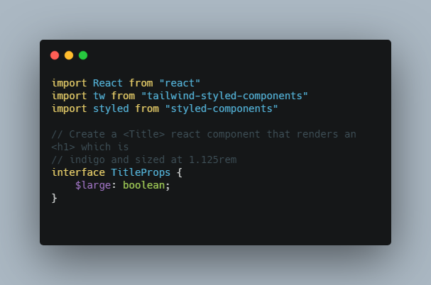
Example
import React from "react"
import tw from "tailwind-styled-components"
import styled from "styled-components"

// Create a <Title> react component that renders an <h1> which is
// indigo and sized at 1.125rem
interface TitleProps {
    $large: boolean;
}

const Title = tw.h1<TitleProps>`
  ${(p) => (p.$large ? "text-lg" : "text-base")}
  text-indigo-500
`

// Create a <SpecialBlueContainer> react component that renders a <section> with
// a special blue background color
const SpecialBlueContainer = styled.section`
    background-color: #0366d6;
`

// Create a <Container> react component that extends the SpecialBlueContainer to render
// a tailwind <section> with the special blue background and adds the flex classes
const Container = tw(SpecialBlueContainer)`
    flex
    items-center
    justify-center
    w-full
`

// Use them like any other React component – except they're styled!
render(
    <Container>
        <Title $large={true}>Hello World, this is my first tailwind styled component!</Title>
    </Container>
)