Headless UI
A set of completely unstyled, fully accessible UI components, designed to integrate beautifully with Tailwind CSS.
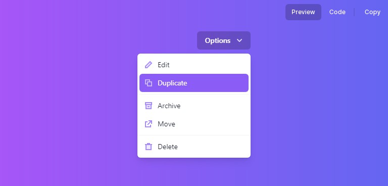
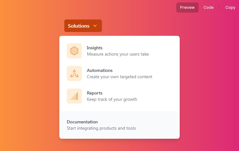
Menu (Dropdown)
Menus offer an easy way to build custom, accessible dropdown components with robust support for keyboard navigation.
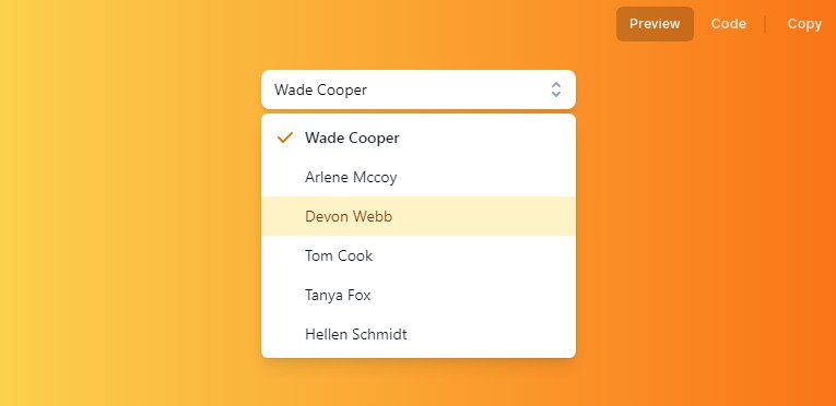
Listbox (Select)
Listboxes are a great foundation for building custom, accessible select menus for your app, complete with robust support for keyboard navigation.
Switch (Toggle)
Switches are a pleasant interface for toggling a value between two states, and offer the same semantics and keyboard navigation as native checkbox elements.

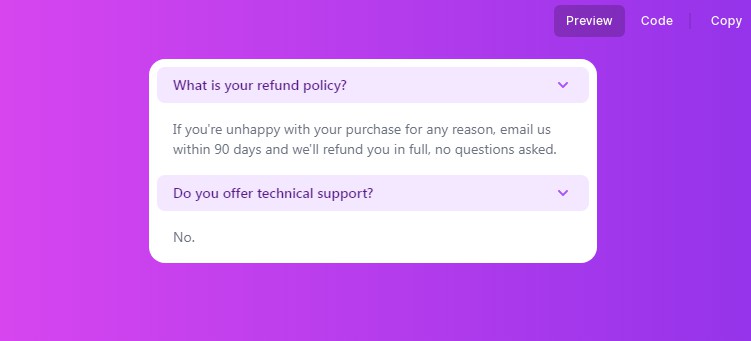
Disclosure
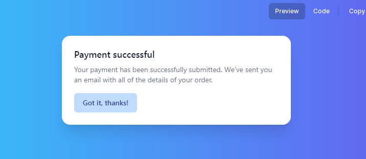
Dialog (Modal)
A fully-managed, renderless dialog component jam-packed with accessibility and keyboard features, perfect for building completely custom modal and dialog windows for your next application.
Popover
Popovers are perfect for floating panels with arbitrary content like navigation menus, mobile menus and flyout menus.
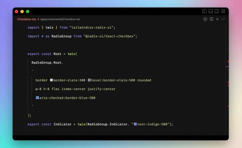
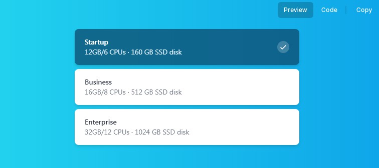
Radio Group
Radio Groups give you the same functionality as native HTML radio inputs, without any of the styling. They're perfect for building out custom UIs for selectors.
Transition
The Transition component lets you add enter/leave transitions to conditionally rendered elements, using CSS classes to control the actual transition styles in the different stages of the transition.

Tabs
Easily create accessible, fully customizable tab interfaces, with robust focus management and keyboard navigation support.