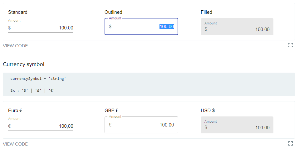
Material-ui currency Textfield
CurrencyTextField is a Material-ui react component. It provides a user friendly experience while inputing currency numbers.
CurrencyTextField wraps the functionality of autonumeric and it is a port of react-numeric in Material-ui.
Main features:
- Adds thousands separator automatically.
- Adds automatically the decimals on blur.
- Smart input. User can only type the accepted characters depending on the current value.
- Lots of config options...
Install
npm install @unicef/material-ui-currency-textfield --save
Usage
Documentation and live demo is available here
import React from 'react'
import CurrencyTextField from '@unicef/material-ui-currency-textfield'
export default function MyComponent() {
const [value, setValue] = React.useState();
return (
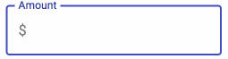
<CurrencyTextField
label="Amount"
variant="standard"
value={value}
currencySymbol="$"
//minimumValue="0"
outputFormat="string"
decimalCharacter="."
digitGroupSeparator=","
onChange={(event, value)=> setValue(value)}
/>
);
}
Development
In order to extend the component, clone the project and install the dependencies.
$ git clone https://github.com/unicef/material-ui-currency-textfield.git
$ npm install
The following commands are available:
npm start
Builds the component outputing it in the dist folder. It is refreshed everytime you make changes in the code.
npm start
To see the output in the browser run the example app (/example)
 cd example
 npm install (only first time)
 npm start
Runs the app in the development mode. Open http://localhost:3000 to view the app in the browser.
It will reload automatically upon edits. Lint errors are also displayed on the console.
npm run build
Outputs the build for production to the dist folder.
npm run styleguide
Generates the documentation available on.
Open http://localhost:6060 to view it in the browser.
It watches for changes and automatically reloads the browser.
We use styleguidelist for documenting our custom components.
npm run styleguide:build
Builds the styleguide documentation for production. The output targets the styleguide folder.