Custom react-table-component / Storybook User Guide
react-table-component is based from React-Table v7: collection of hooks for building powerful tables and datagrid experiences. These hooks are lightweight, composable, and ultra-extensible, but do not render any markup or styles for you. This effectively means that React Table is a “headless” UI library

greets to
If you’re new to TypeScript and React, checkout this handy cheatsheet
Installation
You can install React Table with NPM,
Yarn, or a good ol’ <script> via
unpkg.com.
npm install @maherunlocker/react-table-component --save
or
yarn add @maherunlocker/react-table-component
@maherunlocker/react-table-component is compatible with React v16.8+ and works with ReactDOM and React Native.
How to use
Storybook
Run inside another terminal:
yarn storybook
This loads the stories from ./stories.
NOTE: Stories should reference the components as if using the library, similar to the example playground. This means importing from the root project directory. This has been aliased in the tsconfig and the storybook webpack config as a helper.
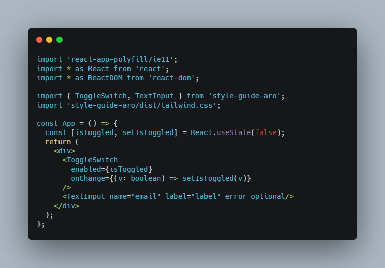
Example
import Dynamictable from @maherunlocker/react-table-component
<DynamicTable
//put your backed api url
url={apiUrl}
//optionnal props
actionColumn={
}
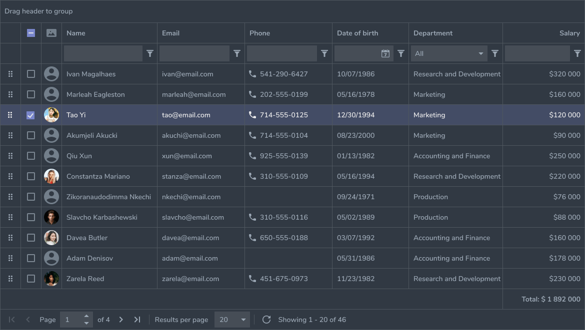
canGroupBy
canSort
canResize
canSelect
/>

TypeScript
tsconfig.json is set up to interpret dom and esnext types, as well as react for jsx. Adjust according to your needs.
This example uses:
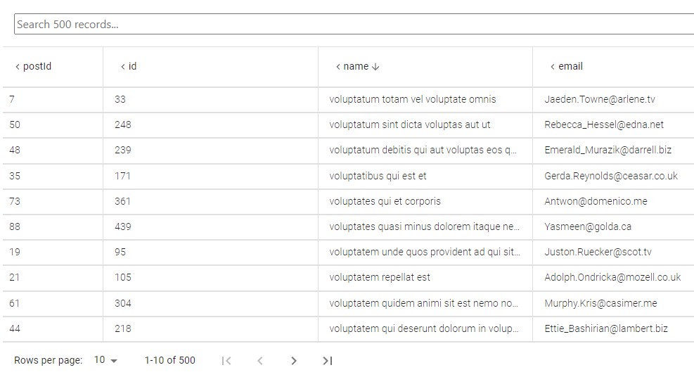
useGroupByto enable header groupsuseFiltersfor per-column filters. Note that filters are displayed in a separate filter dropdown rather than being embedded in each column header.useSortByfor column sortinguseExpandedto allow expansion of grouped columnsuseFlexLayoutfor a scalable full width tableusePaginationfor paginationuseResizeColumnsfor resizable columnsuseRowSelectfor row selection