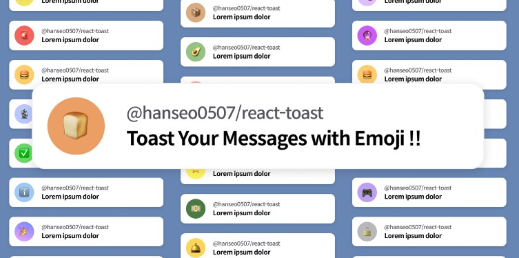
? use-toast-notification
React hooks library to display notification toast.


Install
npm install use-toast-notification

# or

yarn add use-toast-notification
Usage
Simple Usage
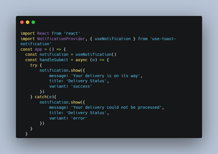
import React from 'react'
import NotificationProvider, { useNotification } from 'use-toast-notification'

const App = () => {
  const notification = useNotification()

  const handleSubmit = async (e) => {
    try {
        notification.show({
            message: 'Your delivery is on its way',
            title: 'Delivery Status',
            variant: 'success'
        })
    } catch(e){
        notification.show({
            message: 'Your delivery could not be processed',
            title: 'Delivery Status',
            variant: 'error'
        })
    }
  }

  return (
    <div>
        <form onSubmit={handleSubmit}>
            <input name='address'/>
            <button type='submit'>Submit</button>
        </form>
    </div>
  )
}


const Main = () =>{
    return (
        <NotificationProvider
			config={{
				position: 'top-right',
				isCloseable: false,
				showTitle: true,
				showIcon: true,
				duration: 5,
			}}
		>
            <App/>
        </NotificationProvider>
    )
}


export default Main
| Name | Type | Default | Description |
|---|---|---|---|
| title | String | notify | Title of the notification |
| message | ReactNode | The body of the notification required |
|
| duration | Number | config.duration |
The duration in seconds |
⚙️ Config
You can customize your notification toast
all configurations are optional
import React from 'react'
import NotificationProvider from 'use-toast-notification'

const App = () => {
  ...
}

const Main = () =>{
    return (
        <NotificationProvider
			config={{
				position: 'center',
				showClose: true,
				showIcon: false,
				showTitle: true,
				duration: 30,
			}}
            overrideStyles={{
				cardContainer: {
                    ...
                },
                ...
			}}
		>
            <App/>
        </NotificationProvider>
    )
}

export default Main
Available Config Properties
| Name | Type | Default | Description |
|---|---|---|---|
| position | String | ‘top-right’ | The position of the card |
| duration | Number | 5 | The duration in seconds |
| isCloseable | Boolean | false | Toggle close button |
| showIcon | Boolean | true | Toggle card heading icon |
| showTitle | Boolean | true | Toggle card heading (icon and title) button |
| closeIcon | ReactNode | Custom close icon | |
| successIcon | ReactNode | Custom success icon | |
| errorIcon | ReactNode | Custom error icon | |
| infoIcon | ReactNode | Custom info icon | |
| errorColor | string | ‘red’ | color for the error variant if no custom Icon |
| successColor | string | ‘green’ | color for the success variant if no custom Icon |
| infoColor | string | ‘blue’ | color for the info variant if no custom Icon |
position is one of
'top-left' | 'top-right' | 'bottom-left' | 'bottom-right' | 'top-center' | 'bottom-center' | 'center';
Available overrideStyles Properties
| Name | Type | Description |
|---|---|---|
| container | CSSProperties | The style for the wrapper for all notification boxes |
| cardContainer | CSSProperties | The style for the container for a single notification box |
| cardContent | CSSProperties | The style for the content for a single notification |
| icon | CSSProperties | The icon sizes |
| closeButton | CSSProperties | The close button style |
| cardMessage | CSSProperties | The style for the message of the notification |
| cardIcon | CSSProperties | The style for the icons container |
| cardTitle | CSSProperties | The style for the title of the notification |
License
MIT © thelamina