react-avatar-group

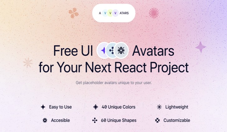
Developer-friendly React component to display responsive user avatars. Avatar images are powered by UI Avatars. Some wilder variations can be seen here.
Basic Usage
npm install react-avatar-group
import React from 'react';
import AvatarGroup from 'react-avatar-group';

function App() {
  return (
    <AvatarGroup
      avatars={["James", "Amy", "Will" /* or IAvatar objects */]}
      initialCharacters={1}
      max={3}
      size={60}
      displayAllOnHover
      shadow={2}
    />
  )
}
Props
avatars: (string | IAvatar)[]
Array of strings with avatar names or Avatar object for more control
onAvatarClick?(avatar: string | IAvatar, index: number): any
Click handler for individual avatars
max?: number
Limit the number of avatars that can be shown at once. If the avatar array length is greater than this number, an overflow avatar will be shown detailing how many avatars are hidden.
displayAllOnHover?: boolean
If max is provided and displayAllOnHover is true, even the overflowing avatars will be shown when the mouse hovers over the group element
square?: boolean
Should the avatars be square instead of rounded
size?: number
Avatar image size in pixels. Between: 16 and 512
randomBackgroundColors?: string[]
Array of Hex colors to choose from as background colors, without the hash (#). This will be overridden by backgroundColor
shadow?: number
Box-shadow elevation as an integer from 1 to 5
style?: React.CSSProperties
avatarStyle?: React.CSSProperties
Styles applied to all individual avatar components
hideTooltip?: boolean
Don’t display a tooltip when the mouse hovers over an individual avatar
fontSize?: number
Font size in percentage of size. Between 0.1 and 1
uppercase?: boolean
Decide if the API should uppercase the name/initials
bold?: boolean
Boolean specifying if the returned letters should use a bold font
initialCharacters?: number
Length of the generated initials
backgroundColor?: string
Hex color for the image background, without the hash (#). Overrides randomBackgroundColors
fontColor?: string
Hex color for the font, without the hash (#)
tooltipStyle?: React.CSSProperties
Styles applied to all tooltips
tooltipArrow?: boolean
Display a small arrow on the tooltip
IAvatar
This is an object that can be passed in the avatars array (instead of a string) for more control over individual avatars. All of these props will override the corresponding ones above.
avatar: string
The required avatar string
tooltip?: string
Custom text to put in the tooltip, rather than the avatar string
backgroundColor?: string
fontColor?: string
style?: React.CSSProperties
fontSize?: number
Built With
TODO
- Allow for custom image urls
- Codepen example
- Avoid global tooltip css