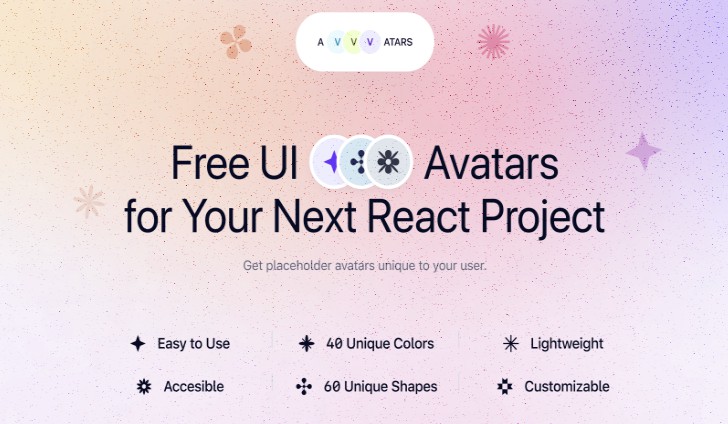

Avvvatars
Beautifully crafted unique avatar placeholder for your next react project
Lightweight and customizable ❤️
demo.mp4
Built by Nusu Alabuga and Oguz Yagiz Kara
? Special thanks to Monika Michalczyk for awesome shapes ?
Features
- ? 40 Colors – Colors are so on point that most of the projects can use it without changing it
- ? 60 Shapes – Beautifully crafted shapes that are unique to your user with color combination
- ? Text or Shapes ? – Use letters (eg. JD for John Doe) or unique shapes
- ? Unique to user – Generated avatars are unique to the string that you provide, it means if you pass [email protected] you will always get the same avatar
- ? Lightweight – less than 20kb compressed + gzipped
- ✍️ Customizable – use shadows, change size, provide alternative text to display
Installation
With yarn
yarn add avvvatars-react
With npm
npm install avvvatars-react
Getting Started
Import Avvvatars to your app, then use it anywhere you want.
import Avvvatars from 'avvvatars-react'

export default function MyAvatar() {
  return (
    <Avvvatars value="[email protected]" />
  )
}
Customization
value: string
This is required for plugin to work, each value generates a random avatar to unique to this value, so each time plugin renders, you will get the same results.
<Avvvatars value="[email protected]" />
displayValue?: string
Override default text by providing displayValue
for example if you provide value=”[email protected]” the character output will be the first 2 letters of value which is “BE”, if you pass displayValue=”BU” you can override it to BU
<Avvvatars value="[email protected]" displayValue="BE" />
style?: character | shape (default character)
Use shape or character as avatar.
<Avvvatars value="[email protected]" style="character" />
size?: number (default 32)
Override default size (32px) by providing a number.
<Avvvatars value="[email protected]" size={32} />
shadow?: boolean (default false)
Enable shadow around the avatar.
<Avvvatars value="[email protected]" shadow={false} />
border?: boolean (default false)
Toggle border
<Avvvatars value="[email protected]" border={false} />
borderSize?: number (default 2)
Override border width
<Avvvatars value="[email protected]" borderSize={2} />
borderColor?: string (default #fff)
Override border color
<Avvvatars value="[email protected]" borderColor="#fff" />
Figma
If you want to access design files to change something or customize it to your own, use our Figma File
License
MIT

