React Filter Box
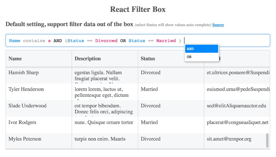
A Simple filter box mainly used to filter data in Grid or Table, which supports Condition AND/OR, and struture Category-operator-Value. This library is inspired by React Structured Filter library, but built completely different based on PEGjs and CodeMirror
Features:
- Support Syntax Highlight
- Support AutoComplete
- Allow to add/custom Operator
- Allow to custom AutoComplete rendering
- The result of filter is in Json format
Getting started:
Install react-filter-box using npm.
npm install react-filter-box
Import library, and default stylesheet.
import ReactFilterBox, {AutoCompleteOption,SimpleResultProcessing} from "react-filter-box";
import "react-filter-box/lib/react-filter-box.css"
How to use:
Simple case:
import ReactFilterBox, {SimpleResultProcessing} from "react-filter-box";
import "react-filter-box/lib/react-filter-box.css"


export default class App extends React.Component {

    constructor(props){
        super(props);

         this.options = [
            {
                columnField: "Name",
                type:"text"
            },
            {
                columnField: "Description",
                type:"text"
            },
            {
                columnField: "Status",
                type:"selection" // when using type selection, it will automatically sugest all posible values
            },
            {
                columnText: "Email @",
                columnField: "Email",
                type:"text"
            }
        ];
    }

    onParseOk(expressions){
        var data = [];
        var newData = new SimpleResultProcessing(this.options).process(data,expressions);
        //your new data here, which is filtered out of the box by SimpleResultProcessing
    }

    render(){
         return <div className="main-container">
                    <h2>React Filter Box</h2>

                        <ReactFilterBox

                            data={data}
                            options={this.options}
                            onParseOk={this.onParseOk.bind(this)}
                            />

                    </div>
    }
}
Properties
query:string: binding your text to query of Component
options:Option[]: array of option which helps to construct AutoComplete information.
export interface Option {
    columnField:string; // required
    columnText?:string; // optional
    type: string; // require "text" or "selection"
}
data: any[]: (optional) data is used to construct AutoComplete only if
you specify in options with type = "selection", which it will
show all posibles values get from data
Events
onChange(query: String, expressions: Expression[]|Error): event raised every change of
query, together with expressions if parse is ok, otherwise is error
interface Expression {
    conditionType?: "OR" | "AND";
    category?: string;
    operator?: string;
    value?: string;
    expressions?:Expression[];
}
to see more about the structure of Expression which parsed from query, please
take a look at: unit test
onParseOk(expressions:Expression[]): event raised when parsing is ok
onParseError(error:Error): event raised when parsing error
Custom Functions
customRenderCompletionItem(self:HintResult,data:Completion, registerAndGetPickFunc:Function): ReactComponent:
provide your custom AutoComplete Rendering for each Item.
- self:HintResult: ignore for now
- data:Completion:
export interface Completion{
    value:string | Object; // Your value as text, Object if your custom AutoCompleteHandler return Object
    type?:string;    // "catetory" or "value" or "operator" or "literal"
}
- registerAndGetPickFunc:Function: you only call this function in case you want
to handle the way user wants to select your value in AutoComplete popup.
In default behavior, user will press enter to select an item.
But if for example, your component is DatePicker, and you want user to select any date,
by clicking on your component, in order to achive that, you must call this method to
register with system you want to handle this by yourself.
This method will return another function ** (value:string):void **, which you can call it
and provide the value will be inserted into query.
You can look into file demo3.js for detail
autoCompleteHandler: BaseAutoCompleteHandler
How to work this project
- Run demo application
yarn start - Run test
yarn test - Package as library
yarn component-package
