useRipple – Material UI ripple effect
Fully customizable, lightweight React hook for implementing Google’s Material UI style ripple effect


Installation
npm install use-ripple-hook
or
yarn add use-ripple-hook
Usage
import React from "react";
import useRipple from "use-ripple-hook";

function Button() {
    const [ripple, event] = useRipple();

    return (
        <button ref={ripple} onMouseDown={event}>
            Default Ripple
        </button>
    );
}
Options
Default options
useRipple({
    duration: 450,
    color: "rgba(255, 255, 255, .3)",
    cancelAutomatically: false,
    timingFunction: "cubic-bezier(.42,.36,.28,.88)",
    disabled: false,
    ref: internalRef,
    onSpawn: undefined,
});
Options reference
| Property | Description | Type | Default | Optional |
|---|---|---|---|---|
duration |
Duration in milliseconds of the ripple effect | number |
450 |
✔️ |
color |
Color of the ripple effect | string |
rgba(255, 255, 255, .3) |
✔️ |
cancelAutomatically |
If true, the ripple will begin to cancel after 40% of the duration | boolean |
false |
✔️ |
timingFunction |
Transition timing function of the transform animation | string |
cubic-bezier(.42,.36,.28,.88) |
✔️ |
disabled |
If true, no ripple will be spawned | boolean |
false |
✔️ |
ref |
Optional outside ref, if unset, internal ref will be used | React.RefObject<T> |
undefined |
✔️ |
onSpawn |
A callback which is triggered when a ripple is spawned | options.onspawn | undefined |
✔️ |
options.onSpawn
Type
type OnSpawnCB = (ctx: {
    /** the ripple element */
    readonly ripple: HTMLDivElement;

    /** cancels the current ripple animation */
    readonly cancelRipple: () => void;

    /** the ref to the ripple host element */
    readonly ref: React.RefObject<T>;

    /** the event that triggered the ripple (ts: casting required) */
    readonly event: unknown;
}) => void;
Example
useRipple({
    /* ... */
    onSpawn: ({
      ripple, ref, event
    }) => {
        console.table({ ripple, ref, event });
    }
});
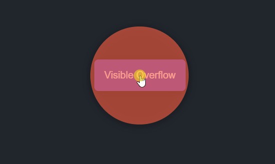
Perfect circle
As demonstrated in the below GIF, useRipple adjusts the circle size according to always for the host element’s box.

Higher order function (HOF)
If you want to memoize a configuration for your ripple you can use the built in customRipple() function.
You can override the options you memoized for your custom ripple hook. The two options will be merged.
Usage
import { customRipple } from "use-ripple-hook";

const useMyRipple = customRipple({
    color: "rgb(144, 238, 144, .7)",
    duration: 700,
});

function Button() {
    const [ripple, event] = useMyRipple({}); // Optionally override previous config

    return (
        <button ref={ripple} onMouseDown={event}>
            Memoized Ripple
        </button>
    );
}
This is useful if you want to avoid repetition in your code or if you want multiple different ripple effects for different components.
Examples
For examples of useRipple usage please click here.
Dos and don’ts
✔ Do this:
Using components ?
import React from "react";
import useRipple from "use-ripple-hook";

function App() {
    return (
        <>
            <Button color="red" />
            <Button color="yellow" />
        </>
    )
}

function Button({ color }) {
    const [ripple, event] = useRipple({ color });

    return (
        <button ref={ripple} onMouseDown={event}>
            Button
        </button>
    );
}
❌ Don’t do this:
Sharing references ?
import React from "react";
import useRipple from "use-ripple-hook";

function App() {
    const [ripple, event] = useRipple();

    /* This will NOT work! Do not do this */
    return (
        <>
            <button color="red" ref={ripple} onMouseDown={even}>
                Button
            </button>
            <button color="yellow" ref={ripple} onMouseDown={even}>
                Button
            </button>
        </>
    )
}
Contributing
Contributions of any form are appreciated, opening issues on the Github repository as well as creating pull requests are both welcomed for anyone to do.

