react-compound-slider
Welcome to the future. React Compound Slider is a tiny (5kb) slider component with no opinion about markup or styles.
Installation
React Compound Slider is available as an npm package.
To install and save in your package.json dependencies, run:
npm install react-compound-slider
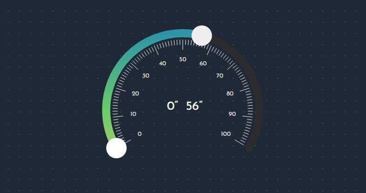
Slider Features
- Small size (5kb)
- Makes no assumptions about your markup
- Supports typescript
- Precise control over user interactions and styling
- Horizontal/vertical display
- The display of values can be reversed
- Supports mouse and touch events (tested in IE9+, Chrome, Firefox & Safari)
- Supports keyboard events so handles can be moved using arrow keys
- Create any type of slider (value, range, n-handled sliders)
- Generates uniformly spaced, human-readable tick values to label your slider
- Integrates seemlessly with any app styling approach (CSS, CSS-in-JS, Inline-styles)
- Interaction modes (Allow crossing, Prevent crossing, Pushable mode, Create your own mode)
- Works as a controlled component
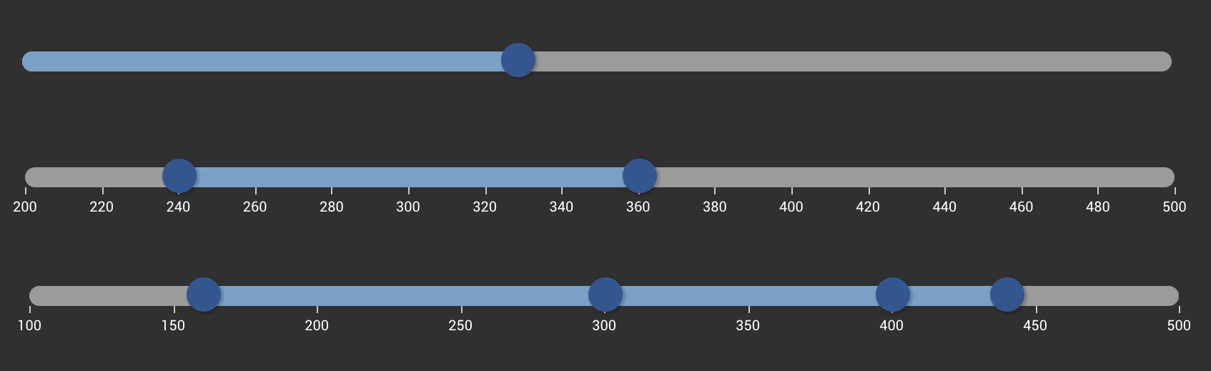
Example Usage
You have full control of everything that is rendered. Just create your own local handle, track and tick components. You can use whatever style library / approach you prefer. You can use these components from the demos to jumpstart your slider:
Starter Components - Horizontal
Starter Components - Material UI
import { Slider, Handles, Tracks } from 'react-compound-slider'
import { Handle, Track, Tick } from './your-local-slider-components'

  <Slider
    rootStyle={sliderStyle}
    domain={[0, 100]} // [min, max]
    values={[20, 60, 80]} // slider values
  >
    <Rail>
      {({ getRailProps }) => (
        <div style={railStyle} {...getRailProps()} /> // render your clickable rail!
      )}
    </Rail>
    <Handles>
      {({ handles, getHandleProps }) => (
        // render your handles!
      )}
    </Handles>
    <Tracks left={false} right={false}>
      {({ tracks, getTrackProps }) => (
        // render your (optional) tracks!
      )}
    </Tracks>
    <Ticks count={10}>
      {({ ticks }) => (
        // render your (optional) ticks!
        // count prop = auto generate approximately 10 uniformly spaced, human-readable ticks
      )}
    </Ticks>
  </Slider>
Approach
This library takes a compound component approach to creating sliders that separates the data/logic from presentation.
If your familiar with Kent Dodd's work on Paypal's downshift or react-toggled then the pattern should seem familiar.
The components use the function as child components pattern.
In practical terms this means you can create just about any kind of slider you can imagine and use whatever style approach you want.
By taking this approach it also frees you up to render whatever markup you want to customize your slider.
The Slider streams you the data and really only cares about the dimensions of the outer div where it takes its measurements from.
In general slider components are composed of a relatively positioned outer div with elements absolutely positioned inside by a percentage.
In this library the Handles, Tracks, and Ticks components are used as children to the Slider component and they let you tap into a stream of values and percentages that you can then use to render your own components.