React Headless Pagination
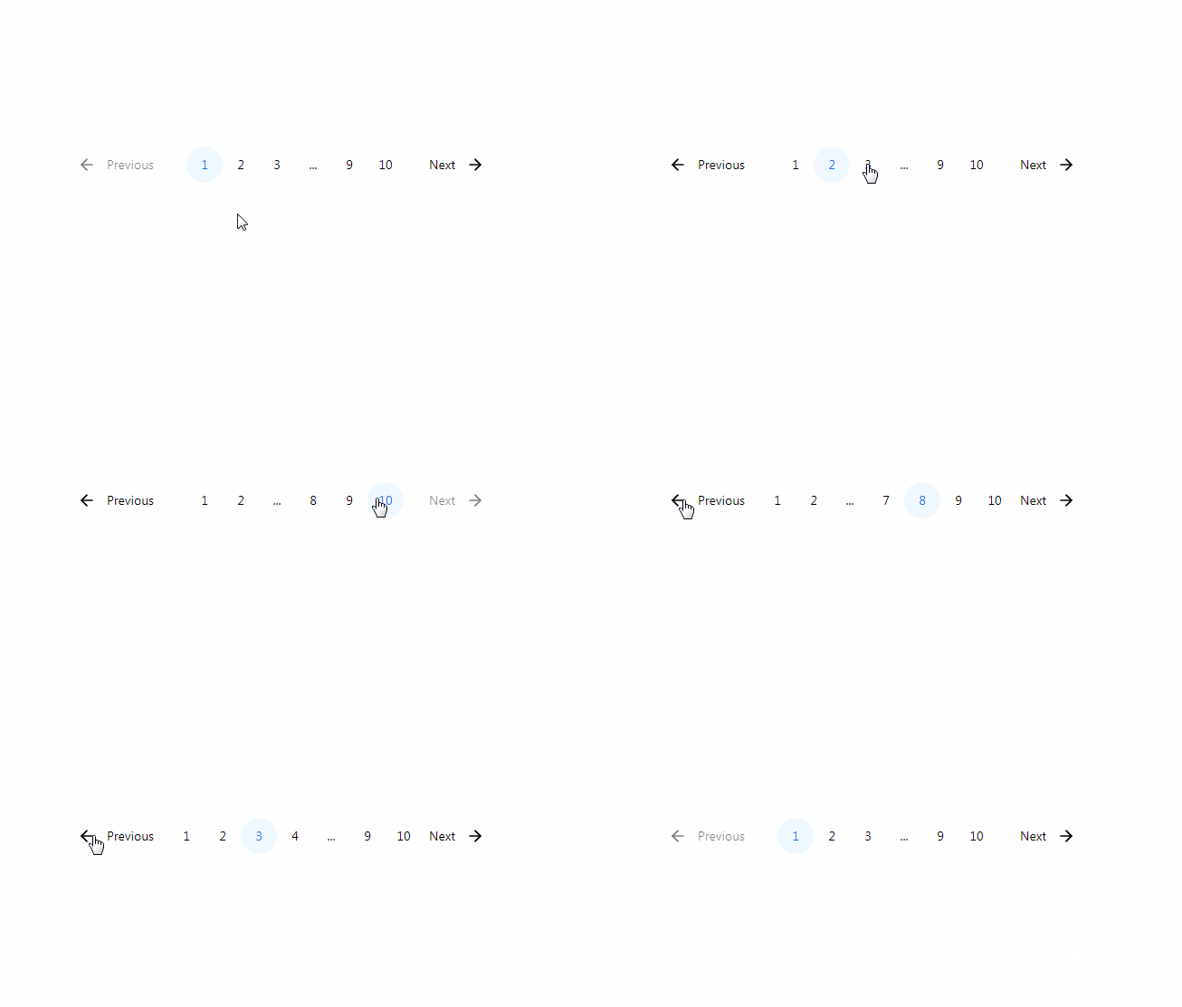
Do you want to design your own pagination component, but do not want to worry about the logic of pagination? Then this tiny and performant package is for you. react-headless-pagination is ideal if you are working with a utility-based css framework like TailwindCSS. react-headless-pagination offers plenty of customization and is also fully typed.
Install
yarn add react-headless-pagination
Demo: Unstyled & TailwindCSS
Usage
import { Pagination } from "react-headless-pagination";


...
const [page, setPage] = React.useState<number>(0);

const handlePageChange = (page: number) => {
  setPage(page);
};

return (
  <>
    Current page: {page}
    <Pagination
      currentPage={page}
      setCurrentPage={handlePageChange}
      totalPages={10}
      edgePageCount={2}
      middlePagesSiblingCount={2}
      className=""
      truncableText="..."
      truncableClassName=""
    >
      <Pagination.PrevButton className="">Previous</Pagination.PrevButton>

      <div className="flex items-center justify-center flex-grow">
        <Pagination.PageButton
          activeClassName=""
          inactiveClassName=""
          className=""
        />
      </div>

      <Pagination.NextButton className="">Next</Pagination.NextButton>
    </Pagination>
  </>
);
An example of a styled version can be found in stories/PaginationTailwind.stories.tsx.
Pagination props
currentPage
Type: number
The value of current page. Required.
setCurrentPage
Type: (page: number) => void
Callback function once a page is updated. Can be directly used with a setState (see example above).
totalPages
Type: number
The number pages. Required.
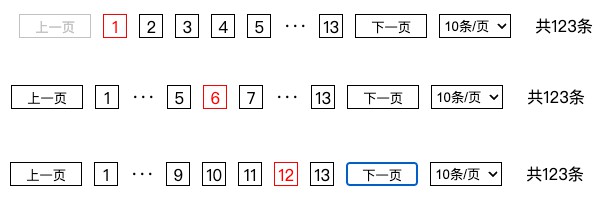
edgePageCount
Type: number
The items size of one side of the edge of pagination. Default: 2
middlePagesSiblingCount
Type: number
The items size of one side of the middle of pagination. Default: 2
className
Type: string
Styles for the pagination container.
truncableText
Type: string
Text to render if a one or more pages are truncated.
truncableClassName
Type: string
Styles which can be applied to the TruncableElement.
Pagination.PrevButton props
children
Type: string | React.ReactNode
Content for the previous button.
className
Type: string
Styles for the previous button.
Pagination.NextButton props
children
Type: string | React.ReactNode
Content for the next button.
className
Type: string
Styles for the next button.
Pagination.PageButton props
className
Type: string
activeClassName
Type: boolean
Styles in case the page button is active.
inactiveClassName
Type: boolean
Styles in case the page button is inactive.
Authors
Taken inspiration from @makotot/paginated.
